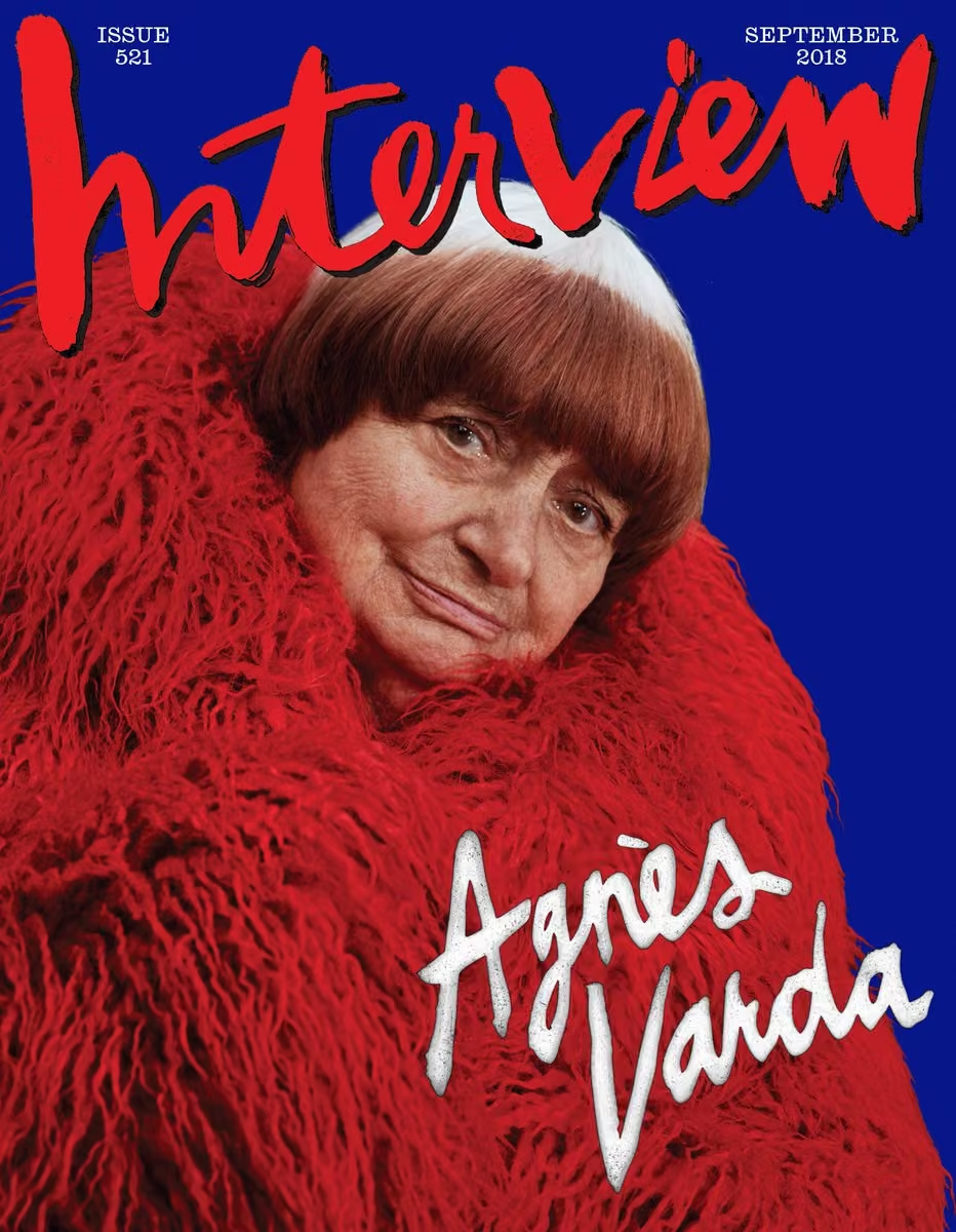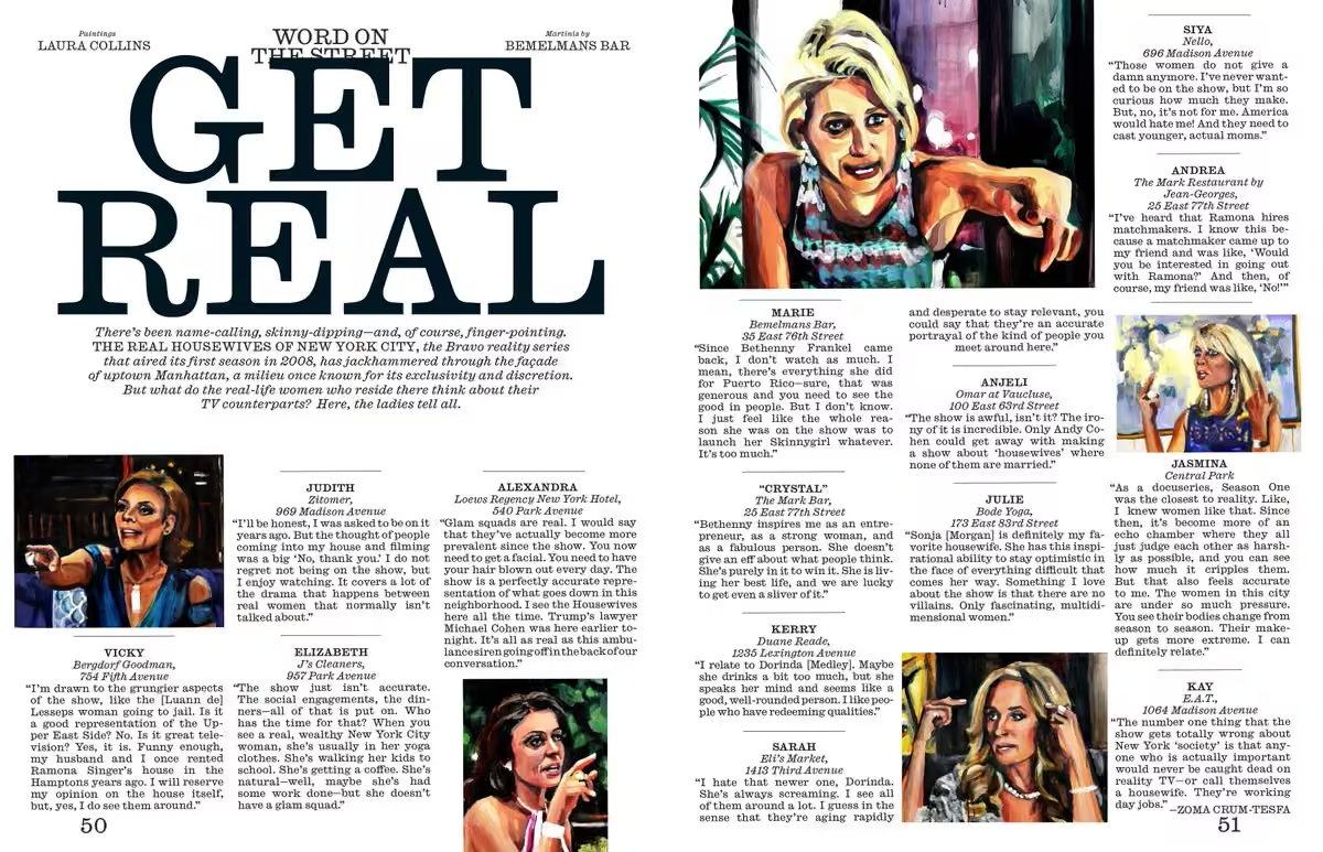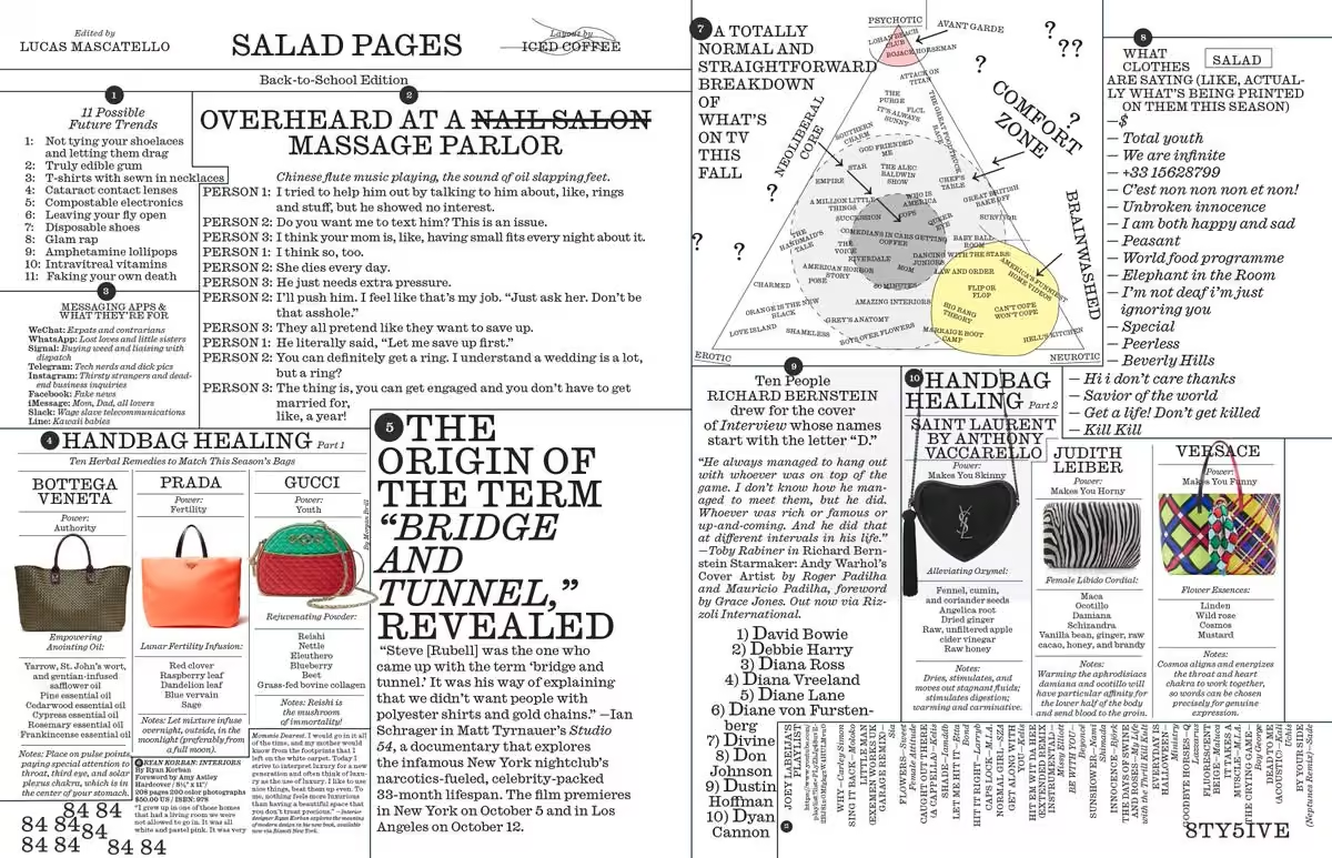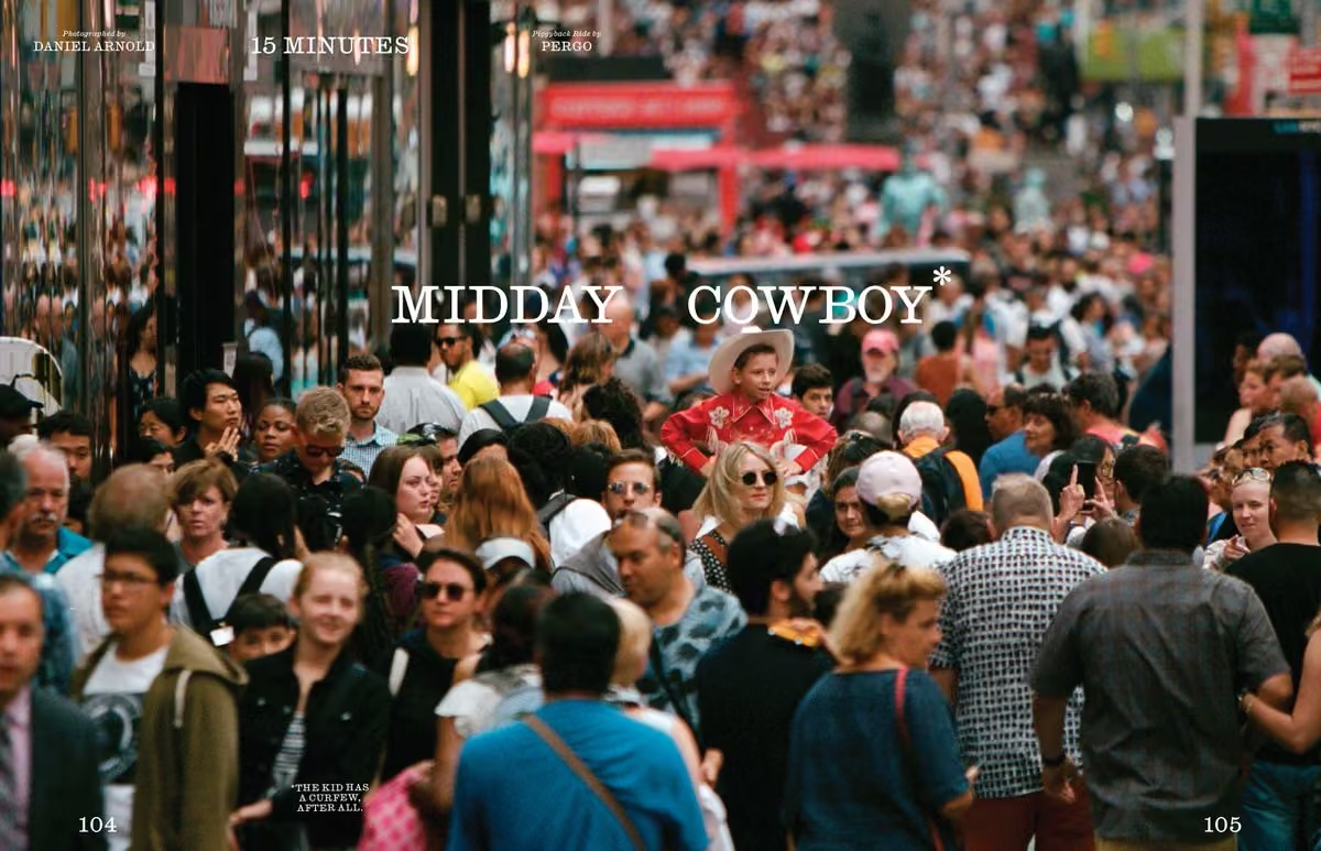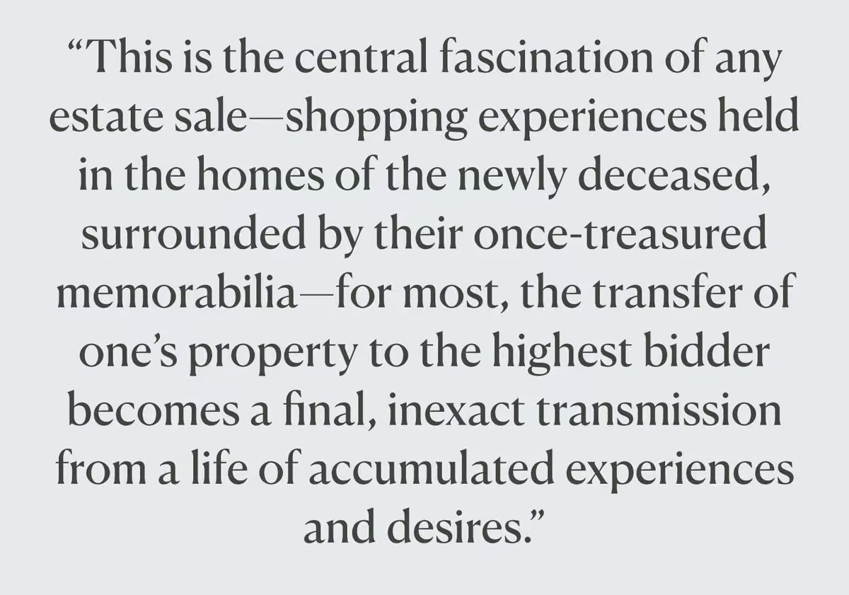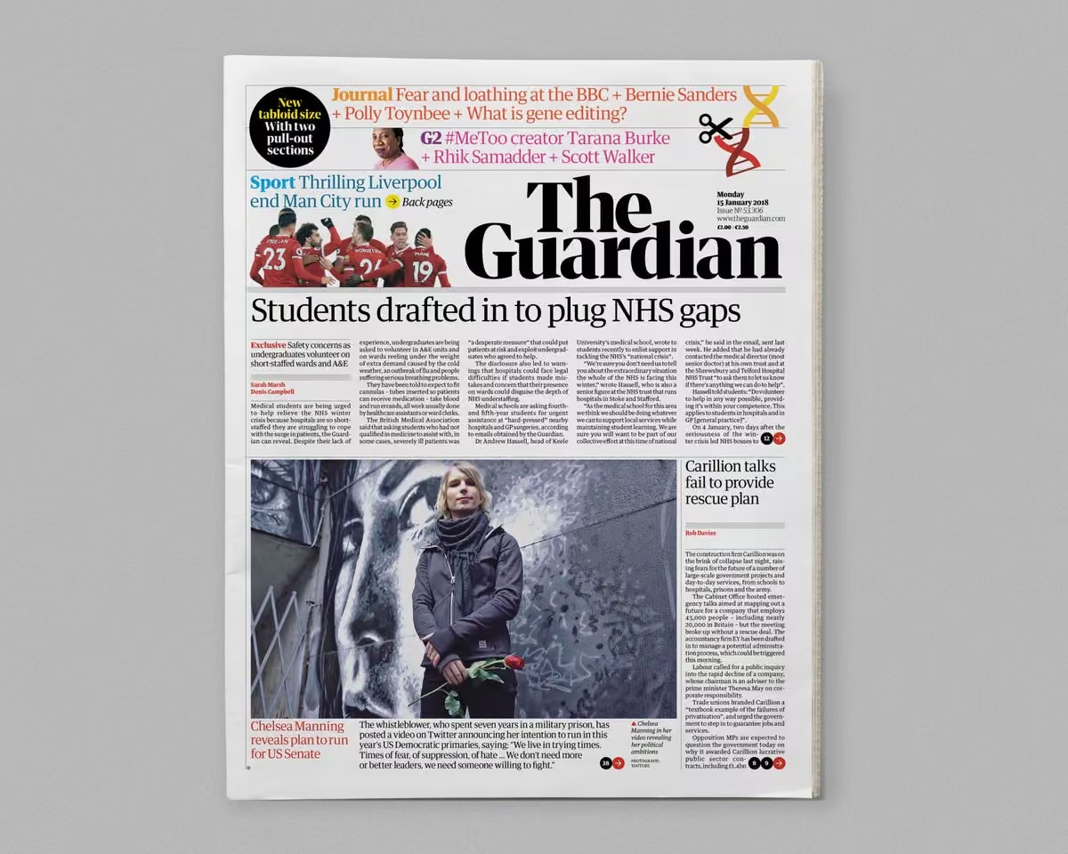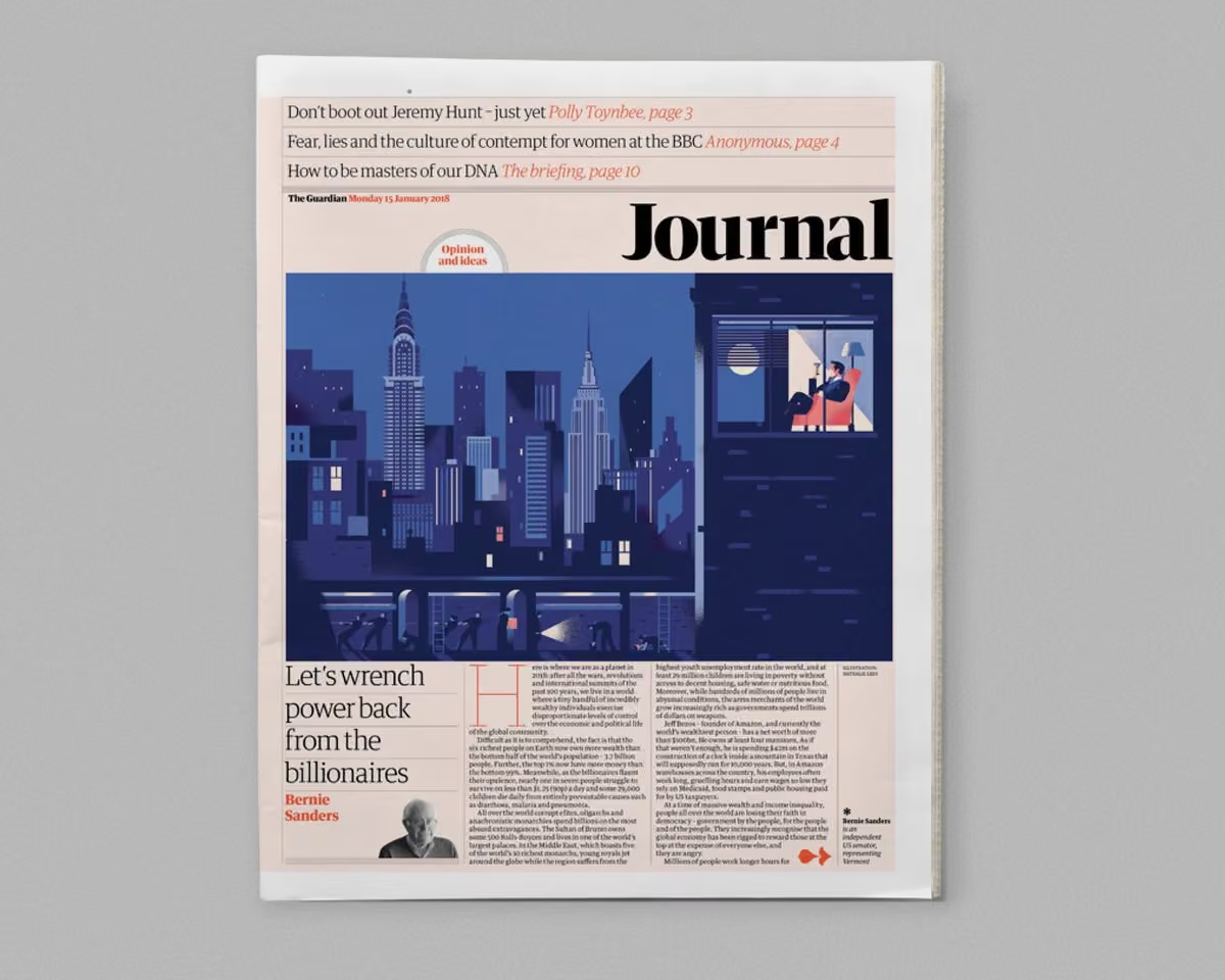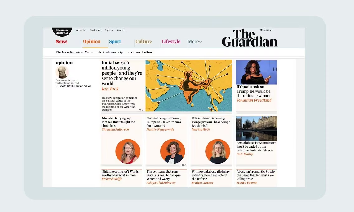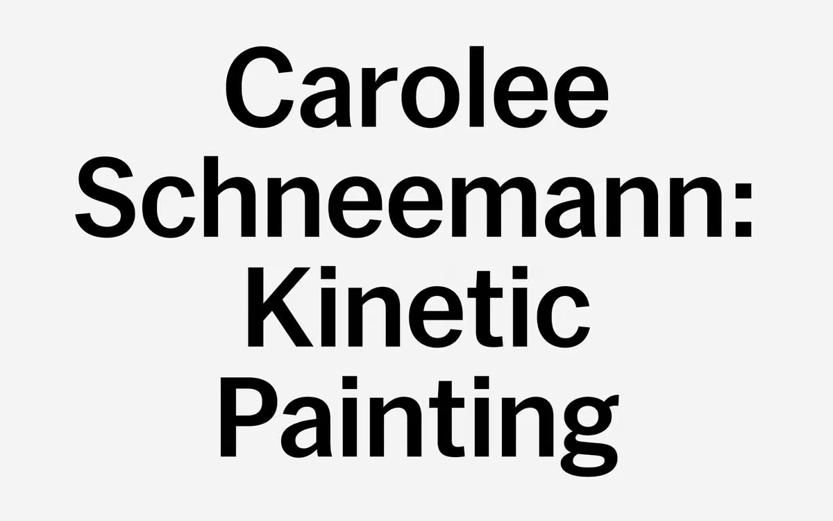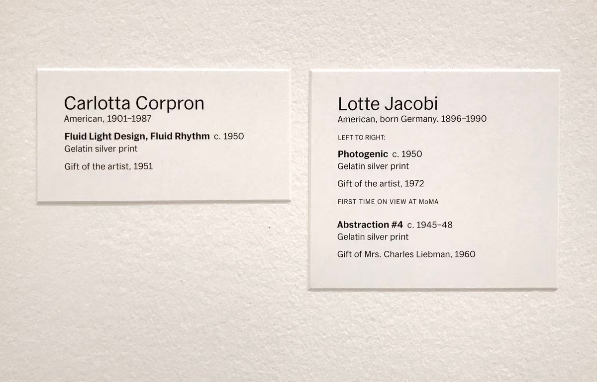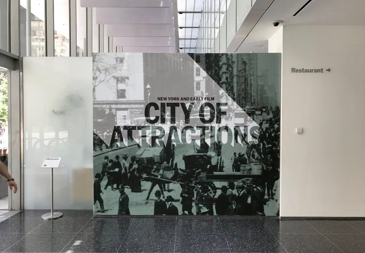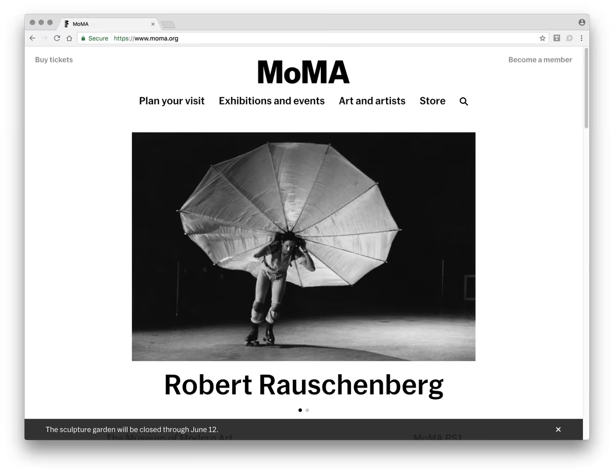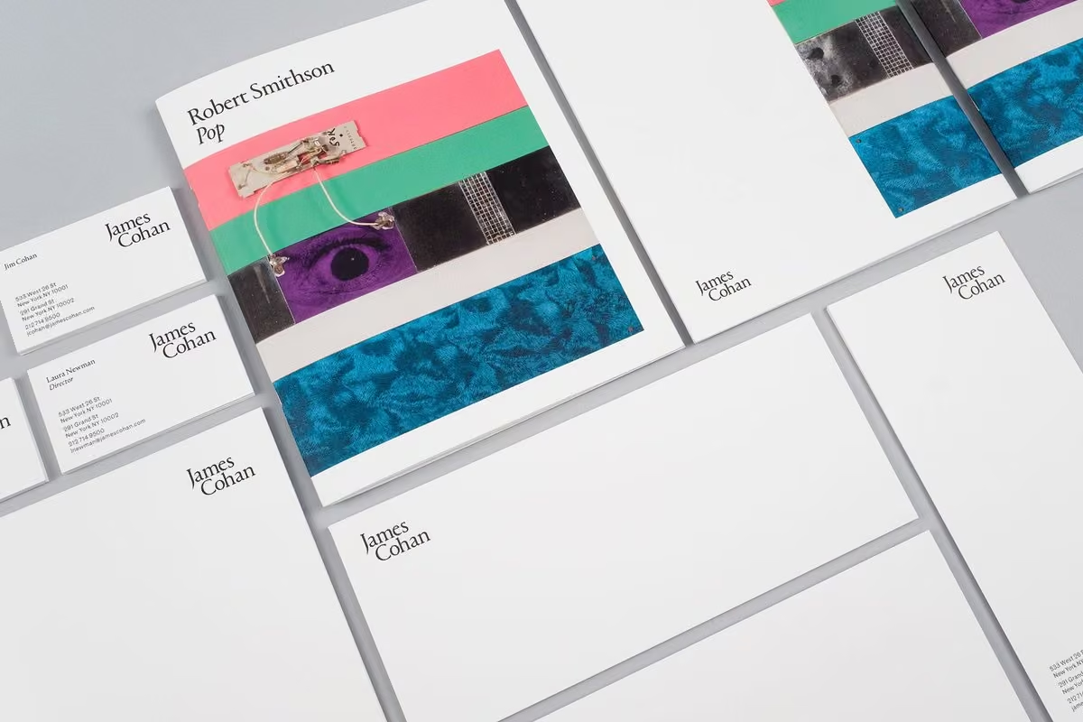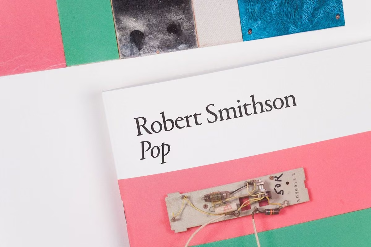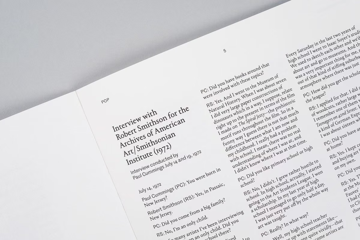

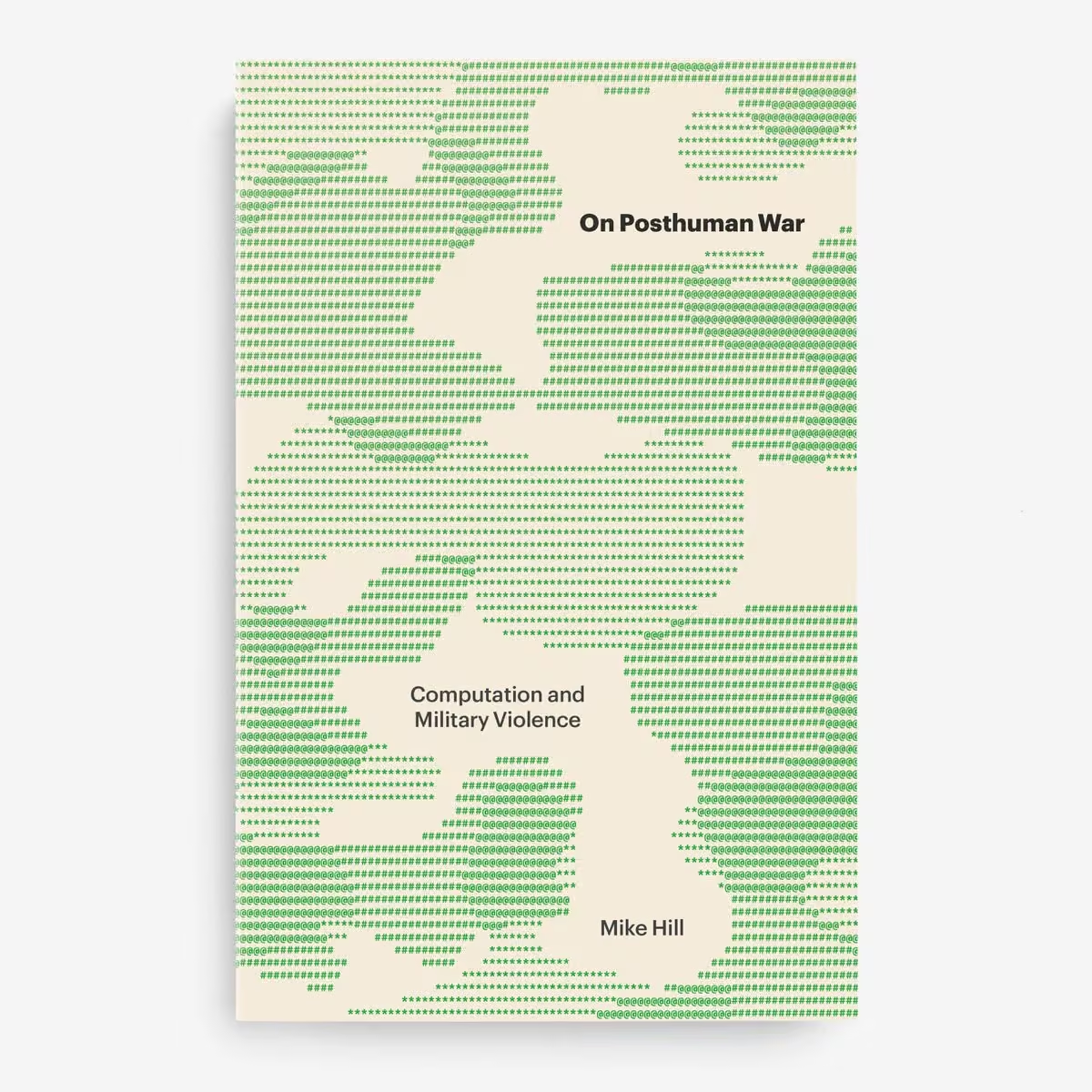
Delighted to share the cover for On Posthuman War was selected for @CommArts Typography Annual 13!
AD: Ana Bichanich
Editor: Douglas Armato
Editorial assistant: Zenyse Miller
Publisher: @UMinnPress
Atlas Typewriter from @carvalho_bernau (ASCII art)
Graphik from @commercialtype
Commercial Type
Commercial Type is a digital type foundry established in 2007 by type designers Paul Barnes and Christian Schwartz. Its work includes typefaces for The Guardian, such as the Guardian Egyptian series, and other retail and commissioned typefaces. It created the open-source Roboto Serif typeface for Google and several of its typefaces are bundled with macOS. More on Wikipedia
-
Commercial Type reposted
Monograph
@mngrph
-
Commercial Type
@commercialtype
Congratulations to @plain_form on opening today!
plain-form.com
There's a lot to love here but Ready is especially great.
plain-form.com/typefaces/ready -
Commercial Type reposted
Sandrine Nugue
@SNugue
A new specimen is out. What is your favorite article and what are your favorite type combinaisons?
Commercial Type
@commercialtype
NEW: The Food Issue, a type specimen for immersive reading. Edited by @litherland, designed by Nikhil Misra, built by Daniel Gamage
foodissue.commercialtype.com -
Commercial Type reposted
Matthew Marco
@matthewmarco
Incisive food writing as beautiful type specimen be still my heart. foodissue.commercialtype.com
-
Commercial Type reposted
derrick has started yet another project
@dvsch
Really excited to have contributed all of the illustrations for this one! And I got to collab with @diandrecaprice on the Beef Patty illo 😀
(I made these like 6 months ago so its Disco Diffusion not Stable Diffusion in most places)
Commercial Type
@commercialtype
NEW: The Food Issue, a type specimen for immersive reading. Edited by @litherland, designed by Nikhil Misra, built by Daniel Gamage
foodissue.commercialtype.com -
Commercial Type
@commercialtype
NEW: The Food Issue, a type specimen for immersive reading. Edited by @litherland, designed by Nikhil Misra, built by Daniel Gamage
foodissue.commercialtype.com
Commercial Type
@commercialtype
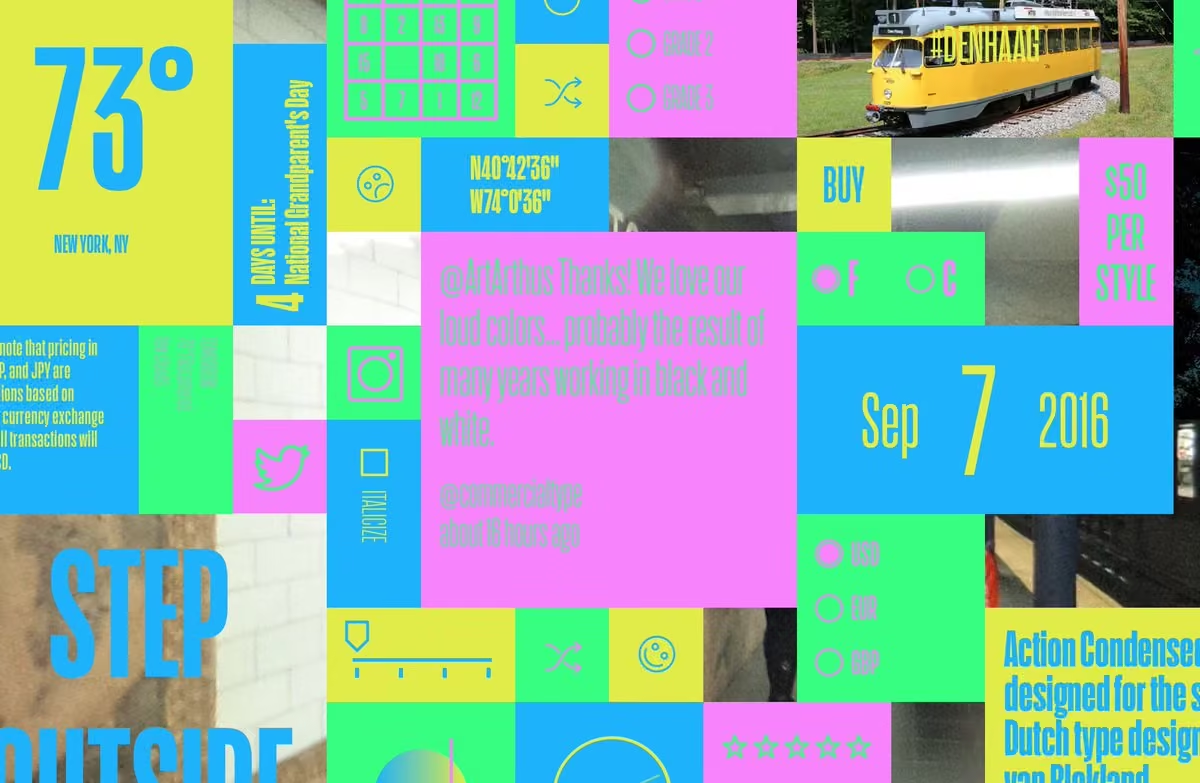
Explore the text faces from our library in six different kinds of articles, all centered around food and eating: an interview with @hels by @navalang, short fiction by @robinsloan, an essay by @helfitzgerald, a news story by Daniel Pravit Fathke, a recipe by Diane Chang…
Commercial Type
@commercialtype
...and an listicle written with help from the folks at Kuih Cafe, a Malaysian snack shop around the corner from our office in New York.
Illustrations by @dvsch, with help from @diandrecaprice.
We hope you enjoy it!
foodissue.commercialtype.com -
Commercial Type
@commercialtype
Check out this great new release from @letterror, LTR Principia: letterror.com/principia/
Berthold Wolpe influence, a lovely italic, a wide range of widths, fish… what more could you need? -
Commercial Type reposted
Commercial Classics
@commerclassics
Original Sans in its original form
St Bride Foundation
@stbridefdn
Rather than being struck with a punch, sanspareil mats, for very large types, were created as brass or copper ‘stencils’ riveted to a metal backing plate. The rivets are visible in these examples. Invented by Caslon in 1810.
-
Commercial Type
@commercialtype
The collection of type specimens from before 1831 that @stbridelibrary has digitized is incredible. See more here:
archive.org/details/early-type-specimens -
Commercial Type
@commercialtype
New in the Vault: Lovesong, an homage to Brush Script that can be used in all caps, drawn by Miguel Reyes @font_taste for @Mr_Turley.
vault.commercialtype.com/collection/lovesong -
Commercial Type
@commercialtype
Updated in the Vault: @SNugue's asymetrically flared Moulin has been expanded to a full range of weights, from Thin to Super.
vault.commercialtype.com/collection/moulin -
Commercial Type
@commercialtype
New in the Vault: Publico Headline Condensed by @andreepaat and Publico Banner Condensed and X Condensed by Thomas Bouillet.
vault.commercialtype.com/collection/publico_condensed
Commercial Type
@commercialtype
-
Commercial Type
@commercialtype
New in the Vault: Ergon by @hrvojezivcic, a display face in 6 weights.
vault.commercialtype.com/collection/ergon -
Commercial Type
@commercialtype
Miguel Reyes @font_taste also drew a display face to help tie the series together: Lovesong, inspired by Brush Script (designed in 1942 by Robert E. Smith) but usable in all caps.
www.itsnicethat.com/richard-turley-guest-edit-us-vs-them -
Commercial Type
@commercialtype
As part of @Mr_Turley's guest editorship of @itsnicethat, @greggazdowicz and CS used images generated by GLID-3 as a jumping off point for drawing a fizzy drink logotype. Read all about the process here:
www.itsnicethat.com/features/machine-learning-are-designe…
3D graphic by Jae Yeon Kim -
Commercial Type
@commercialtype
Congratulations to our friends at @xyz_type on their new site, designed and built by the brilliant GrayBits
XYZ Type
@xyz_type
🚨 🆕 xyztype.com!
After five years, it was time to upgrade our site with variable fonts, revamped licensing, case studies, fonts in progress, and more.
Our friends GrayBits (graybits.biz) did the design & development, and couldn't be happier.
1/X -
Commercial Type reposted
Commercial Classics
@commerclassics
Lots of Doric Condensed and Antique No. 6 for the Quentin Blake Centre for Illustration.
www.itsnicethat.com/news/fraser-muggeridge-studio-quentin…
@illustrationHQ @F_M_studio @itsnicethat -
Commercial Type reposted
Commercial Classics
@commerclassics
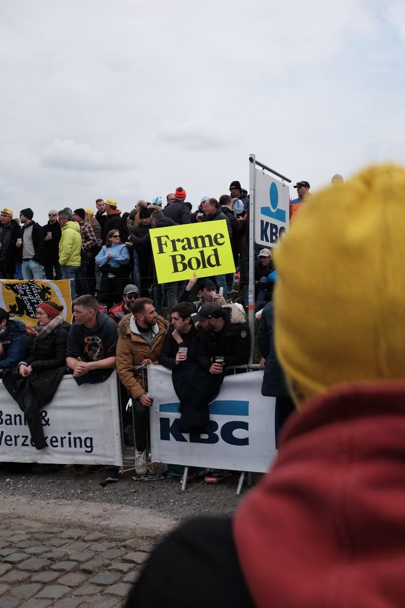
@rapha brand fonts Caslon Doric with @commercialtype new release, Frame at the spring cycling classics. Here @RondeVlaanderen
Concept @Matt__Tucker Graphics and realisation by Andy Edwards
commercialclassics.com/catalogue/caslon_doric/caslon_dori…
commercialtype.com/catalog/frame -
Commercial Type
@commercialtype
NEW RELEASE: Frame, a modern interpretation of Caslon originally designed to pair with Caslon Doric in the @rapha identity. Designed by Paul Barnes, assisted by Dan Milne and Thomas Bouillet.
commercialtype.com/catalog/frame
Commercial Type
@commercialtype
Frame comes in 4 weights and 2 optical sizes, plus a variable version with everything in between.
Read the story here:
commercialtype.com/news/new-release-frame-by-paul-barnes -
Commercial Type
@commercialtype
Frame by @PauloBarnesi will be out tomorrow.
Seen here in Roubaix.
Concept by Matt Tucker, realisation Andy Edwards
@rapha. -
Commercial Type
@commercialtype
Frame by @PauloBarnesi will be out on Friday.
Seen here in Flanders.
Concept by Matt Tucker, realisation Andy Edwards @rapha. Photo by Kristof Ramon. -
Commercial Type
@commercialtype
Frame by @PauloBarnesi is coming on Friday.
Seen here in Flanders.
Concept by Matt Tucker, realisation Andy Edwards
@rapha -
Commercial Type
@commercialtype
Frame by @PauloBarnesi will be out on Friday for the Grand Départ in Copenhagen.
Seen here at Paris-Roubaix.
Concept by Matt Tucker, realisation Andy Edwards
@rapha, Image ©FotoreporterSirotti -
Commercial Type
@commercialtype
New goods in the shop today: A poster for Lyon Arabic designed by @waelmorcos and @debakir, and extra copies of a zine for the Vault that are in the goody bags at this year's @TypographicsNYC
commercialtype.com/goods -
Commercial Type reposted
David Pearson
@typeasimage
A roving identity for Christie’s upcoming Art and Literature festival.
There are two firsts here: getting paid to use my secondary school lettering style and having a client agree to use @commercialtype’s Marian, a modern-day masterpiece whose thin limbs can put some people off. -
Commercial Type reposted
Commercial Classics
@commerclassics
Now available in wood @reppiRmiT fantastic version of Caslon Rounded Ornamented. I think Henry Caslon would be proud. 12 line or 144 point. Coming soon Thorowgood Grotesque Dimensional. Which may or may not be true.
-
Commercial Type reposted
Commercial Classics
@commerclassics
From Metal to Digital to Wood. Caslon Rounded, Caslon Italian Shaded and soon Caslon Rounded Ornamented. www.typehighdesign.com
-
Commercial Type
@commercialtype
New in the Vault: two contrast variations on Sanomat by @PauloBarnesi: Sanomat Banner and Sanomat Slab, each in 7 weights.
vault.commercialtype.com/collection/sanomat_banner
vault.commercialtype.com/collection/sanomat_slab -
Commercial Type
@commercialtype
See how Gabriello evolved from this early sketch:
commercialtype.com/news/custom_lettering_for_puma
vault.commercialtype.com/collection/gabriello -
Commercial Type
@commercialtype
Now available in the Vault: Houston, the oldest family in here by a wide margin, drawn by Christian Schwartz for Roger Black's 2003 redesign of the Houston Chronicle. 2 weights, 3 optical sizes, surprisingly effective on screen.
vault.commercialtype.com/collection/houston -
Commercial Type
@commercialtype
We were happy to be a part of this survey of foundries large and small that @abcdinamo published today:
abcdinamo.com/news/type-foundry-survey-1
Dinamo
@abcdinamo
We reached out to our 15 of our friends at big + small type foundries and asked them 6 questions we’ve been asking ourselves:
abcdinamo.com/news/type-foundry-survey-1 -
Commercial Type
@commercialtype
New in the Vault: Produkt Condensed, drawn by @kayessgordon to accompany the original width by @bertonhasebe and Christian Schwartz.
vault.commercialtype.com/collection/produkt_condensed -
Commercial Type
@commercialtype
We forgot to mention yesterday that you can download free trial fonts for Feature on the collection page or any of the family pages. All you need is a valid email address.
commercialtype.com/catalog/feature -
Commercial Type
@commercialtype
Read more about the process behind Feature in this essay by @litherland: commercialtype.com/news/new-release-feature-by-berton-has…
-
Commercial Type
@commercialtype
Feature Condensed is also coming soon, currently available as a prerelease in the Vault.
vault.commercialtype.com/collection/feature_condensed -
Commercial Type
@commercialtype
NEW RELEASE: Feature by @bertonhasebe and Christian Schwartz, assisted by @hrvojezivcic, originally commissioned by T, the New York Times Style magazine, now available in 3 optical sizes and a wide range of weights.
commercialtype.com/catalog/feature
Commercial Type
@commercialtype
Feature is designed for dense setting, and taps into a wildly inventive period in the 60s and 70s: Lubalin’s provocative covers for fact; Simoncini’s 1965 typeface Life; various versions of Times for photosetting; and low-budget zines hastily thrown together with Letraset.
Commercial Type
@commercialtype
For much more on fact, see fact.110west40th.com
Life image from www.flickr.com/photos/caffeitalic/3232872548 -
Commercial Type
@commercialtype
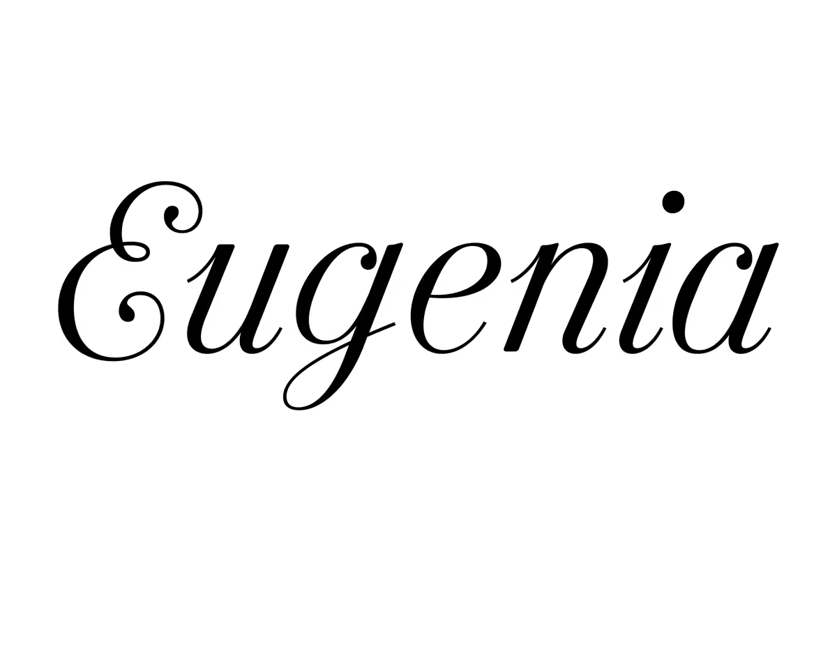
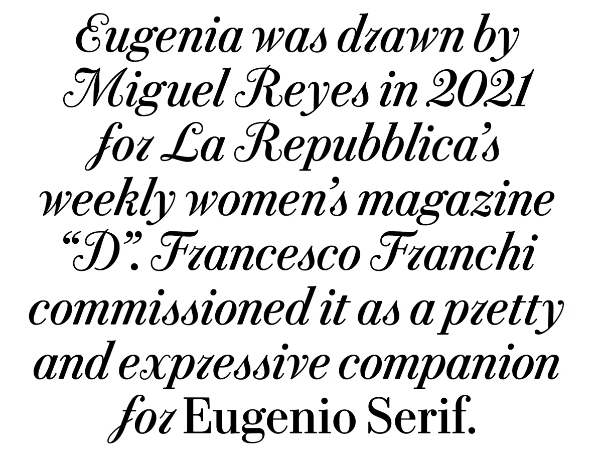
New in the Vault: Eugenia, drawn by Miguel Reyes @font_taste for @ffranchi in 2021 as a companion to Eugenio Serif for D, a weekly magazine from La Repubblica.
vault.commercialtype.com/collection/eugenia -
Commercial Type
@commercialtype
😂
Jacob Ford
@unitof
nvm the influencers love it
-
Commercial Type reposted
Jacob Ford
@unitof
on my block (!): @commercialtype wisely realizes only designers seriously read wheatpastes
-
Commercial Type reposted
Commercial Classics
@commerclassics
Trial fonts now available for the full Commercial Classics and Commercial Type libraries. Find them on any collection, family, or individual style page. We know this took too long, but it was a *lot* of trial fonts to prepare…
-
Commercial Type
@commercialtype
Trial fonts now available for the full Commercial Type and Commercial Classics libraries. Find them on any collection, family, or individual style page. We know this took too long, but it was a *lot* of trial fonts to prepare…
commercialtype.com
commercialclassics.com -
Commercial Type reposted
greggazdowicz
@greggazdowicz
🆕work!! So excited this project that’s been five years in the making is finally out! So excited to see it out in the world! 🙌💫🙏
Google Fonts
@googlefonts
It’s here! Say hi to Roboto Serif, a variable font family with 6 (yes, that's 6!) optical sizes.
material.io/blog/roboto-serif
Designed for Google by @greggazdowicz of @commercialtype, it's minimal, functional, and comfortable to read practically anywhere. #typography #variablefonts -
Commercial Type
@commercialtype
NEW WORK: Roboto Serif, designed for @googlefonts by @greggazdowicz, with help from @hrvojezivcic @font_taste @maria_doreuli @ingaploennigs @flaviazim @kayessgordon @RafalBuchner @MrMarkRecord. We're thrilled to finally see this out in the world!
Google Fonts
@googlefonts
It’s here! Say hi to Roboto Serif, a variable font family with 6 (yes, that's 6!) optical sizes.
material.io/blog/roboto-serif
Designed for Google by @greggazdowicz of @commercialtype, it's minimal, functional, and comfortable to read practically anywhere. #typography #variablefonts
Commercial Type
@commercialtype
Roboto Serif was designed to be ahistorical, using shapes that seemed to work well on screen rather than starting from an existing genre. It has been drawn to work well alongside Roboto without being built on the same skeleton.
Commercial Type
@commercialtype
With weight, width, optical size, and grade axes, Roboto Serif puts power to make both sweeping and extremely granular adjustments in the hands of designers. Micro and Display optical sizes are shown here, size-adjusted for comparison.
-
Commercial Type
@commercialtype
New in the Vault: Gingrich, by Christian Schwartz and @kayessgordon, an editorial headline typeface in four optical sizes of a single spiky weight.
vault.commercialtype.com/collection/gingrich -
Commercial Type
@commercialtype
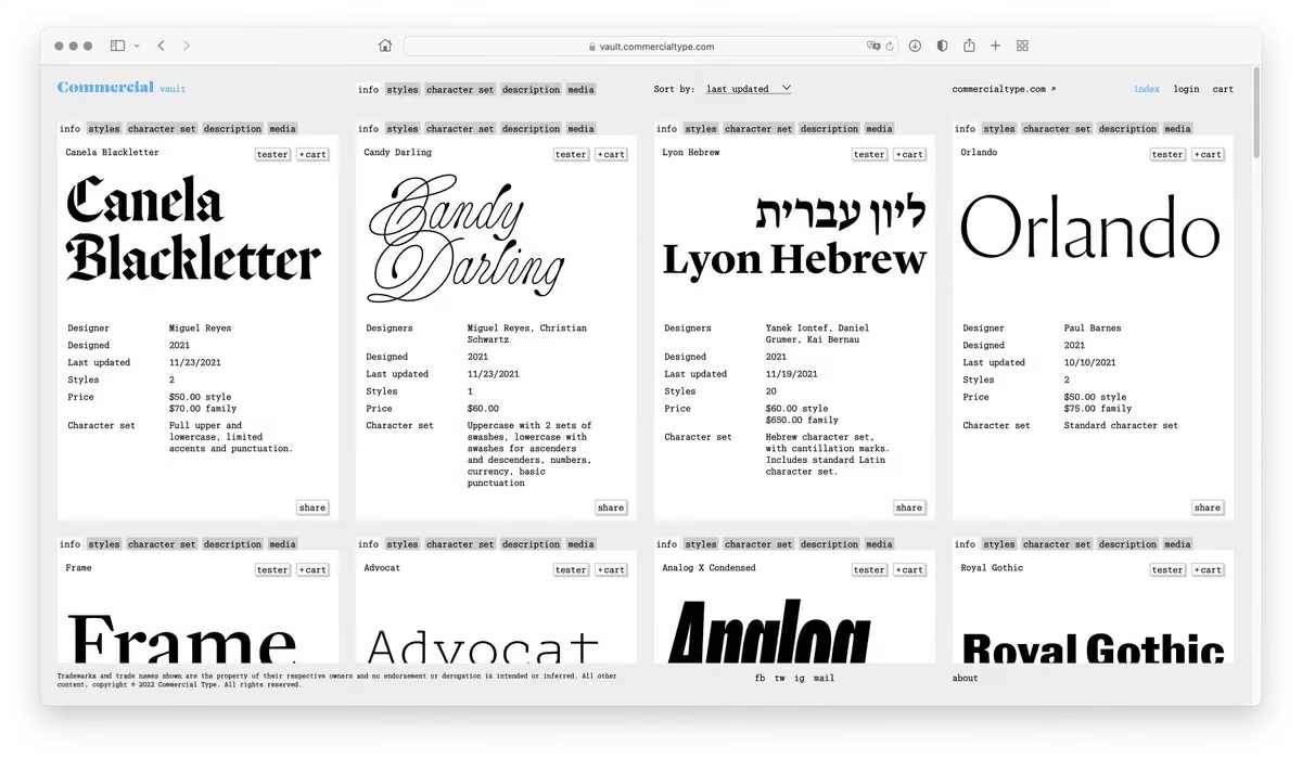
We've made a couple of updates to the Vault. First, you no longer need to log in or register to see what’s inside.
vault.commercialtype.com
Commercial Type
@commercialtype
It is also now possible to link directly to families in the Vault:
vault.commercialtype.com/collection/terza
vault.commercialtype.com/collection/seance
vault.commercialtype.com/collection/candy_darling
Commercial Type
@commercialtype
Thanks to everyone who suggested these changes, we appreciate that you care enough to ask!
-
Commercial Type
@commercialtype
New in the Vault: a condensed width of Duplicate Sans, drawn by @font_taste.
vault.commercialtype.com/collection/duplicate_sans_condensed -
Commercial Type
@commercialtype
A project we're still proud of, 15 years later:
-
Commercial Type reposted
Commercial Classics
@commerclassics
Caslon Rounded, Brunel, Original Sans and Caslon Shaded
Fenner Paper
@FennerPaper
The renowned Fenner Paper diary is being despatched now. Will you be receiving one? Our thanks to our collaborators @stbridelibrary @and__long and @ISTDworldwide @MrDaveCoates
Read more here... justinsamazingworldatfennerpaper.blogspot.com/2021/12/fen… -
Commercial Type
@commercialtype
We love seeing Lyon used for news:
Mario R. García
@DrMarioRGarcia
Read all about the process of change for Dubai's @khaleejtimes : showing how the print edition of a newspaper can be transformed in the mobile era. All my blog posts about this project here:
garciamedia.com/wp-admin/post.php?post=20002&action=edit -
Commercial Type reposted
Mario R. García
@DrMarioRGarcia
In Dubai today, transformation of the @khaleejtimes begins, to coincide with UAE 50th anniversary celebrations. In my blog today, all about this project:
garciamedia.com/blog/khaleej-times-in-dubai-a-print-desig… -
Commercial Type
@commercialtype
New in the Vault: the beautiful Canela Blackletter by @font_taste.
vault.commercialtype.com -
Commercial Type
@commercialtype
We're thrilled to see Marian and a few widths of Graphik working together in this lovely rebrand of @lunya_co by @DevaPardue and @chickfriedstike
Mark Davis
@MarkFonts
Marian in use by @commercialtype!
Provoking @lunya_co rebrand by @devapardue and @chickfriedstike
www.underconsideration.com/brandnew/archives/new_logo_and… -
Commercial Type
@commercialtype
New in the Vault: Candy Darling, a monoline script face designed by @font_taste earlier this year for Interview magazine.
vault.commercialtype.com -
Commercial Type
@commercialtype
New in the Vault: Graphik Decorated, a handful of mismatched display styles commissioned by two different magazines over the years.
vault.commercialtype.com
Commercial Type
@commercialtype
These have limited character sets, so they're $20 each or $50 for all 4.
-
Commercial Type
@commercialtype
More info on Corridor, Tim's typeface for @MIT_alumni and @pentagram: commercialtype.com/news/corridor_by_tim_ripper_for_the_mi…
-
Commercial Type
@commercialtype
NEW WORK: Corridor, designed by Tim Ripper @reppiRmiT for a new @MIT_alumni identity by @pentagram. This serif display face is based on brush lettering on campus by Glenn Silva, with a newly imagined lowercase. Read more here: alum.mit.edu/slice/new-mitaa-brand-identity-celebrates-pa…
-
Commercial Type
@commercialtype
Jacquard blankets designed with Lyon Arabic:
Wael Morcos
@waelmorcos
A selection of wild flowers:
اقحوان، سوسن، قرنفل، ياسمين، زعفران، بابونج، نرجس، خشخاش
Chrysanthemum, iris, carnation, jasmine, saffron, chamomile, narcissus, poppy
☞ morcos-key.myshopify.com
Jacquard Woven Blanket, 100% Cotton
54in x 72in — 137 cm x 182 cm
.
#arabictypography -
Commercial Type reposted
St Bride Foundation
@stbridefdn
Introducing our second speaker for the 50th Anniversary of the Beatrice Warde Memorial Lecture:
Paul Barnes at Commercial Type
Good Type/Bad Type
18 November, 7pm GMT
For more information and to book tickets visit:
www.sbf.org.uk/whats-on/view/beatrice-warde-memorial-lect…
#goodtypebadtype -
Commercial Type
@commercialtype
Newly available in the Vault: Azzurri, a chancery italic with no curves, drawn by @PauloBarnesi in 2009.
vault.commercialtype.com -
Commercial Type reposted
Commercial Classics
@commerclassics
Antique No. 6 is now available as a variable font when you buy the entire collection commercialclassics.com/catalogue/antique_no_6
-
Commercial Type
@commercialtype
New in the Vault: Orlando, a flared variant on Orleans Thin, which @PauloBarnesi drew for an art gallery in Florence earlier this year.
vault.commercialtype.com -
Commercial Type
@commercialtype
A lovely use of @processtype's Anchor together with our elusive Gabriello (which has moved to the Vault) in this identity for @charmcli command line tools.
Process Type Foundry
@processtype
Hypnotic use of Anchor for @charmcli, designed by @meowgorithm. Find more images of their website & identity on our blog prcss.co/7 or visit their website charm.sh where fashion and the CLI collide!
-
Commercial Type
@commercialtype
NEW RELEASE: Orleans, a crisply elegant sans serif headline face by Paul Barnes with calligraphic influence. Orleans was first drawn in 2016 for the German edition of frieze. The magazine folded before the redesign launched, but the typeface lives on.
commercialtype.com/catalog/orleans
Commercial Type
@commercialtype
Orleans first debuted in the Vault over the summer. We have since finished the PDF specimen, written about the design process, and finished the other marketing materials, so it's ready to move over to our main library.
commercialtype.com/news/new_release_orleans_by_paul_barnes
commercialtype.com/uploads/6800068/1634587174839/Orleans-… -
Commercial Type reposted
St Bride Foundation
@stbridefdn
Now booking:
Beatrice Warde Memorial Lecture – 50th Anniversary
Good Types/Bad Types
18 November 2021
In-person and online
Tickets: £3–£14
Speakers:
David Williams
Ellen Lupton
Erik van Blokland
Liron Lavi Turkenich
Martina Flor
Paul Barnes
Tré Seals
www.sbf.org.uk/whats-on/view/beatrice-warde-memorial-lect… -
Commercial Type reposted
Carvalho Bernau
@at_cb
NEW WORK/OPERA NOVA: @Internazionale has since been using it for some other special projects, and now you can, too!
@very_robin played a big role in refining and drawing Lyon Hed. She’s an amazingly good, inventive type designer and you should check out her work at @tinytypeco. -
Commercial Type reposted
Carvalho Bernau
@at_cb
NEW WORK/OPERA NOVA: Last month we published Lyon Hed, a new news-oriented headline family, at vault.commercialtype.com
@iammarkporter commissioned it in 2018 for an ambitious idea that @internazionale’s @gdemauro had: a pop-up daily newspaper that sadly never happened. -
Commercial Type
@commercialtype
New in the Vault: the first 2 styles of Analog, a new display sans with 90s vibes by @font_taste.
vault.commercialtype.com -
Commercial Type
@commercialtype
We really enjoyed working with @thejmonty and his team on Means!
Joe Montefusco
@thejmonty
One of the last things I worked on with the Mailchimp brand team was some specimen pieces for our lovely typeface Means. Doubtful that work will see the light of day so here are a few random bits I liked from that work. I very much wanted to make a throw blanket 4 snugglin'
-
Commercial Type
@commercialtype
Now available in the Vault: Frame, a crisp depiction of Caslon originally drawn for Rapha by @PauloBarnesi.
vault.commercialtype.com -
Commercial Type
@commercialtype
New in the Vault: Advocate, based on a quirky 'golf ball' typeface designed by Howard "Bud" Kettler (designer of Courier) for the IBM Selectric typewriter.
vault.commercialtype.com
Commercial Type
@commercialtype
Update: Now this family is called 'Advocat', the Catalan word for lawyer. Apologies to @mbutterick, who published a typeface called Advocate in 2015.
-
Commercial Type
@commercialtype
Check out @typesupply's new R&D Department. Smoosh Bits is REALLY good!
We're happy to see more of our friends and colleagues releasing type a little more informally, and like Tal we want to give thanks to @futurefonts for helping to lead the way.
Type Supply
@typesupply
I've decided to do something about it. I'm going to start rolling out my iffier ideas as works in progress through my "R&D Department." (Yeah, dumb name.) This will let me see what people are interested in and maybe feel less anxious. Details here:
typesupply.com/rnd -
Commercial Type reposted
Type Supply
@typesupply
Dai was special. This typeface is beautiful. Victoria is great. This essay is… there are no words in English for how deep and moving this is.
-
Commercial Type
@commercialtype
New in the Vault: Viktor, a barely-seriffed display face by Christian Schwartz, in a single style, at least for now.
Post not available here, view on X
Commercial Type
@commercialtype
I had a thought that sharpness = expensive. Flaring would turn up the sharpness, and I kept these stroke endings crisp and angular because subtle curves wouldn't come across on screen anyway. A big x-height would keep it legible.
Commercial Type
@commercialtype
We didn't have an opportunity to see how Viktor would work in an interface, but it ended up in @DocumentJournal for a couple of issues, and on a @WIRED cover, and now it's in the Vault.
vault.commercialtype.com -
Commercial Type reposted
Commercial Classics
@commerclassics
Caslon invented rounded typefaces. So it seem entirely correct to round Caslon Doric Condensed. Drawn by Thomas Bouillet in nine weights from hairline to black. Available from vault.commercialtype.com
-
Commercial Type
@commercialtype
New in the Vault: Caslon Doric Condensed Round, destined for @commerclassics, drawn by Thomas Bouillet with fully round "sausage" terminals.
vault.commercialtype.com -
Commercial Type
@commercialtype
New in the Vault: Duplex Sans and Serif, drawn for identical copyfit by @bertonhasebe for Ribergård + Munk's redesign of a Swedish newspaper group.
vault.commercialtype.com
Commercial Type
@commercialtype
The weights are offset between Serif and Sans because Sans was intended for more traditionally "tabloid" papers, so our client wanted it to be louder.
-
Commercial Type
@commercialtype
New in the Vault: Pialat, an elegant display typeface first drawn by @bertonhasebe for @tmagazine in 2010 and 2012.
vault.commercialtype.com -
Commercial Type
@commercialtype
Updated in the Vault: Royal Gothic now has an italic.
vault.commercialtype.com -
Commercial Type
@commercialtype
Also just added to the Vault: Eugenio Sans, a geometric drawn by @greggazdowicz for the same redesign of @repubblica by @ffranchi.
vault.commercialtype.com -
Commercial Type
@commercialtype
Now in the Vault: Eugenio Serif, a Bodoni for news drawn by @font_taste with help from @hrvojezivcic for @ffranchi at @repubblica.
vault.commercialtype.com -
Commercial Type reposted
type.today
@TypeTodayNews
Styrene B in use by Anna Gvirts ❥
type.today/en/journal/retro -
Commercial Type reposted
Type Supply
@typesupply
Hey! I have new font available for licensing: SMOOSH! It's a really condensed, extremely high contrast, barely legible typeface for when you want text to look important but not necessarily be read.
typesupply.com/fonts/smoosh -
Commercial Type reposted
Commercial Classics
@commerclassics
More at the vault.commercialtype.com Great Western, designed by @kayessgordon as a shaded modern companion to Brunel. Not from a single source, but as a compendium of one of the favourite display styles of the 19th C. Now layered for multi-coloured design work.
-
Commercial Type reposted
Sandrine Nugue
@SNugue
Moulin provençal and running text. Released by @commercialtype Vault.
-
Commercial Type
@commercialtype
Now in the Vault: Great Western, a shaded Modern drawn by @kayessgordon to accompany Brunel.
vault.commercialtype.com -
Commercial Type reposted
Sandrine Nugue
@SNugue
Moulin means Windmill and they are all over the world. Moulin is available with the @commercialtype Vault. vault.commercialtype.com
-
Commercial Type reposted
Commercial Classics
@commerclassics
Some new Commercial Classics are out on @commercialtype new venture; the Vault. Royal Gothic is a classic square sans from Figgins and it successors. County is another Figgins face, used for map labelling. vault.commercialtype.com It also features many other gems from CT.
-
Commercial Type
@commercialtype
And finally, huge thanks to Graybits for designing and building the Vault website!
graybits.biz -
Commercial Type
@commercialtype
We have 21 families available now, and will be adding more over the weeks and months to come. It's part staging area, part open storage, part sketchbook, and maybe even part dumping ground. We hope you find it useful or at least interesting!
vault.commercialtype.com -
Commercial Type
@commercialtype
The Vault is also a place for old custom projects. A lot of this stuff has been privately available to friends and acquaintances, or anyone who made the effort to reach out. This is a way to make it more accessible.
-
Commercial Type
@commercialtype
The Vault is also an outlet for interesting ideas that won't necessarily be finished with our usual character set, but still might be useful to someone, like @reppiRmiT's bizarre Seance.
-
Commercial Type
@commercialtype
The Vault is also a place for works in progress, like @SNugue's Moulin, which has one weight for now, and will grow as additional styles are finished…
-
Commercial Type
@commercialtype
The Vault is a mix of finished but unreleased typefaces that still need essays, specimens, and marketing materials, like @greggazdowicz's Terza, @bertonhasebe & Christian Schwartz's Feature, and @PauloBarnesi's Orleans…
-
Commercial Type
@commercialtype
This week we opened the Commercial Type Vault, a repository for 17 years of unreleased typefaces.
vault.commercialtype.com -
Commercial Type reposted
Oliver Schöndorfer 🇺🇦
@glyphe
Lights off, aaaaand action! My #fontfriday recommendation is Action Text by @LettError, available on @commercialtype. I love dark themes 🔦 and I love a well crafted font for it! It’s a rather narrow sans-serif that perfectly adjusts to its surrounding.
-
Commercial Type
@commercialtype
Nice to see the new Greek extension for Canela in action:
Typewolf
@typewolf
Site of the Day · Korkodilos
www.typewolf.com/site-of-the-day/korkodilos-athens
Featuring Monument Extended from @PangramPangram_, Monument Grotesk from @abcdinamo and Canela from @commercialtype -
Commercial Type reposted
Commercial Classics
@commerclassics
Caslon Doric in use for @rapha London store. We also did a poster remixing Dala Moa with @typeasimage celebrating 13 decades of the @LeTour
-
Commercial Type reposted
Fontstand
@Fontstand
🚀 Big news! 🚀
Today we are launching Fontstand News, a publishing platform to promote in-depth debate about type.
🙏 Read, share and contribute! 🙏
fontstand.com/news/ -
Commercial Type reposted
Wael Morcos
@waelmorcos
Overdue award announcement!
Lyon Arabic Text got awarded a silver cube at this year's #adcawards @TheOneClub
Lyon was designed by myself with @debakir
Available from @commercialtype
.
#arabictype #arabictypography #typography -
Commercial Type reposted
Commercial Classics
@commerclassics
Nice to read all about Studio Bergini’s work for @londonbookarts and the use of Original Sans and Caslon Ionic
It's Nice That
@itsnicethat
The identity for @londonbookarts by Studio Bergini represents the joy of materiality in graphic design > www.itsnicethat.com/articles/studio-bergini-london-centre…
-
Commercial Type
@commercialtype
Really nice use of Original Sans: commercialclassics.com/catalogue/original_sans
Dieline
@TheDieline
Michael Bierut and Pentagram brew up the packaging and identity for Brooklyn's Ebbs.
thedieline.com/michael-bierut-pentagram-brew-branding-wit…? -
Commercial Type
@commercialtype
There's a nice writeup on @letterror's Action Text on @AIGAeyeondesign today:
AIGA Eye on Design
@AIGAeyeondesign
Action Text brings personality and bite to the smooth world of screen type—@AngelaRiechers > aigaeod.co/action @commercialtype
-
Commercial Type
@commercialtype
Next Thursday, @greggazdowicz and @font_taste will be speaking at the @TypographicsNYC Typelab, Miguel at 11am NYC time and Greg at 1pm NYC time.
-
Commercial Type reposted
magCulture
@magculture
Two days until magCulture Live We love New York! Check the full lineup + ticket details here: www.eventbrite.co.uk/e/magculture-live-we-love-new-york-t… @NYMag @NewYorker @racqetmagazine @EBONYMag @civilizationnyc @racqetmagazine +more
-
Commercial Type
@commercialtype
Next week! Join @magculture in celebrating New York
magCulture
@magculture
Join us for our next magCulture Live on Wednesday 9 June • Celebrate New York with @NewYorker @EBONYMag @civilizationnyc @racqetmagazine and The New Now • Full details on the Journal: magculture.com/blogs/journal/magculture-live-1
-
Commercial Type reposted
Francesco Franchi
@ffranchi
Domani D in edicola con @repubblica
-
Commercial Type
@commercialtype
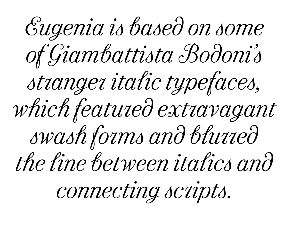
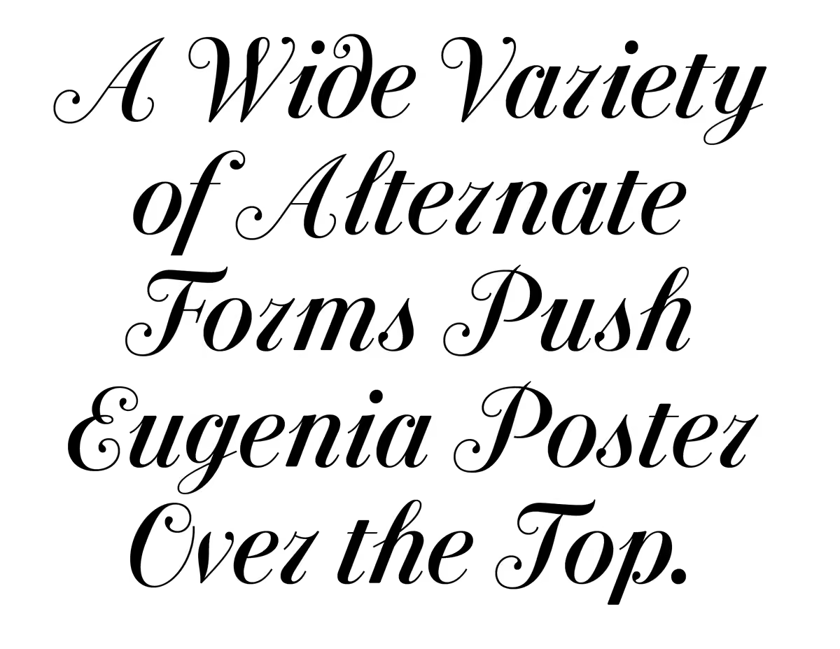
Eugenia by @font_taste has two weights, each in two optical sizes, with alternates drawing on all sorts of bizarre italic and script letterforms that Bodoni cut. It is drawn to accompany Eugenio Serif, which Miguel drew for La Repubblica in 2018.
Commercial Type
@commercialtype
Bodoni came up with some truly weird shapes. We couldn't keep them all, but tried to do justice to the overall vibe...
-
Commercial Type
@commercialtype
NEW WORK: Eugenia, a display italic, and cover lettering for the 25th anniversary issue of @repubblica's women's magazine D. Thrilled to have been a part of this!
Francesco Franchi
@ffranchi
Out today with @repubblica the redesign project of our female supplement D. This special 25th anniversary edition marks the debut of the new typeface Eugenia, based on several of Bodoni’s strangest italics and designed by @commercialtype and @font_taste
-
Commercial Type
@commercialtype
This was a really fun thing to work on, apologies to Ed Benguiat and thanks to Tom Alberty.
magCulture
@magculture
On the Journal: how New York magazine became New Yawk magazine for one issue: magculture.com/blogs/journal/new-yawk-magazine @NYMag #welovemagazines
-
Commercial Type reposted
Type@Cooper
@CooperType
Happy to welcome Sébastien Morlighem to present about the origin of bold and fat faces #lubalinlectureseries on February 22 at 12:30 pm EST. RSVP for this free webinar @cooperunion coopertype.org/event/dusting_latin_type_history_1_on_the_…
-
Commercial Type reposted
St Bride Foundation
@stbridefdn
Just a reminder that there is still time to book your ticket for tonight’s lecture with @agyeidesign
St Bride Foundation
@stbridefdn
We’re delighted to announce that Agyei Archer will be delivering our second lecture of 2021 (online via Zoom) on
10 February. He’ll be exploring the value of vernacular design in the English-speaking Caribbean and it’s impact on his type design practice.
www.sbf.org.uk/whats-on/view/do-it-like-you-do-it-with-ag… -
Commercial Type reposted
type.today
@TypeTodayNews
+ we are very grateful to everyone who helped us on the way:
• Alexander Sukiasov
• Akaki Razmadze @razmadzekoko
• Giga Khatiashvili
• Lasha Giorgadze
🖤
type.today/en/journal/ge -
Commercial Type reposted
type.today
@TypeTodayNews
🇬🇪 Next chapter in our Journal dedicated to Graphik Georgain (@commercialtype & @ostromentsky)
Read more about historical and modern Georgian Typography:
type.today/en/journal/ge -
Commercial Type reposted
type.today
@TypeTodayNews
🇦🇲 How Armenian type design was born? What’s happening in Armenian type today? How Armenian type reflects culture at large? Here’s what Armenian type designers have to say...
type.today/en/journal/am
Related to our co-release of Graphik Armenian by @commercialtype & @debakir -
Commercial Type
@commercialtype
In short, after an impossible year we couldn't figure out a way to keep @commerstudio going as a standalone company, so we're folding it into Commercial Type, and @dino_sanchez will stay on to manage clients.
Commercial Type
@commercialtype
Depending on how we look at it, we're tightening the focus of Commercial Studio on logotypes and type-driven identities, or expanding on what Commercial Type does best.
-
Commercial Type
@commercialtype
Happy 2021! We've updated our homepage with some news:
commercialtype.com -
Commercial Type reposted
Commercial Classics
@commerclassics
“From the Ridiculous to the Sublime” Peter Saville on Commercial Classics.
Caslon Italian Shaded by @reppiRmiT
Regents Canal
Design @F_M_studio
Photos Derek Man -
Commercial Type reposted
Commercial Classics
@commerclassics
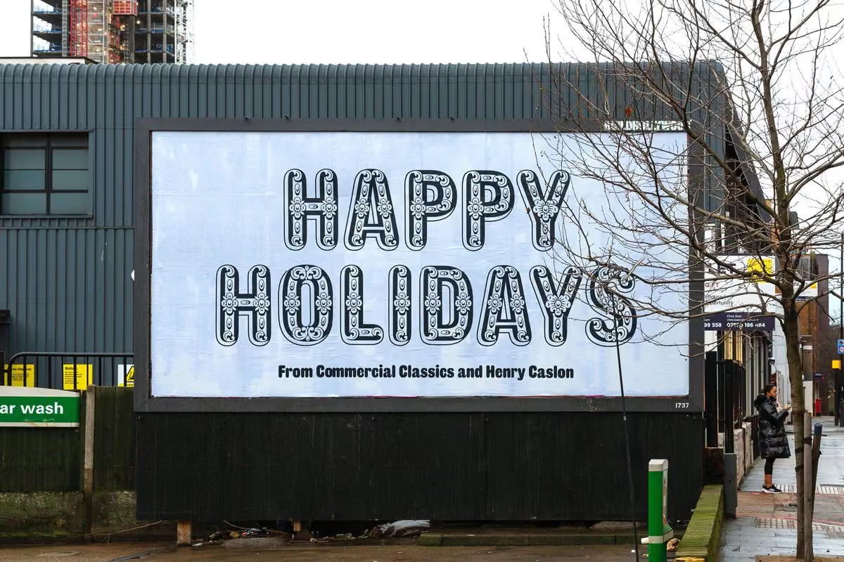
All over London posters are going up celebrating the Commercial Classics library and wishing everyone a very happy Holiday Season. Here is Caslon Rounded Ornamented on the Highway, Tower Hamlets.
Posters designed by @F_M_studio Photography by @derekman_ -
Commercial Type
@commercialtype
More info on Means, a new serif typeface drawn by @greggazdowicz for @mailchimp, referencing the work of Oz Cooper.
commercialtype.com/news/means_for_mailchimp
Commercial Type
@commercialtype
While the main identity primarily uses Means Light, their annual report does a great job of putting the whole family through its paces:
mailchimp.com/annual-report/mailchimp-hq/ -
Commercial Type
@commercialtype
NEW WORK: A new logotype for @DocumentJournal, debuting with their Fall/Winter 2020 issue
-
Commercial Type
@commercialtype
New release! Paul has expanded Antique No 6 with lighter weights and our friends at @pentagram have added the family to the @commerclassics minisite launched earlier this year, along with a new colorway.
showcase.commercialclassics.com
commercialclassics.com/catalogue/antique_no_6
Commercial Type
@commercialtype
-
Commercial Type
@commercialtype
Antique No. 6 Bold revived one of the standalone heavy weights cut by Figgins, proportioned to match with Caslon Ionic. Four lighter weights make Antique No. 6 a useful and versatile family in its own right.
commercialclassics.com/catalogue/antique_no_6 -
Commercial Type
@commercialtype
One of our all-time favorite uses of Lyon and Atlas:
-
Commercial Type
@commercialtype
We've got an essay on Review in our news section now: commercialtype.com/news/new_release_review_by_berton_hasebe
Thanks to @litherland for her work on this! -
Commercial Type
@commercialtype
Very excited for these two new type-related books recently added on Kickstarter: The underappreciated Jaroslav Benda, and the incomparable Ed Fella
www.kickstarter.com/projects/783759658/jaroslav-benda-188…
www.kickstarter.com/projects/uniteditions/ed-fella-a-life… -
Commercial Type
@commercialtype
Our designer @kayessgordon has a nice interview out today in @outofprintph: outofprint.ph/Kara-Gordon
-
Commercial Type
@commercialtype
We just put up an archive page showing all of our newsletters from over the years, from this year's wild @commerclassics series by @theoriginalecs and @litherland, back to the very beginning.
commercialtype.com/newsletters/archive/ -
Commercial Type
@commercialtype
A more detailed article on Review will be coming soon. In the mean time, you can read more in the email we sent out this morning: commercialtype.com/newsletters/81
Text by @litherland, sample images by @kayessgordon -
Commercial Type
@commercialtype
NEW RELEASE! Review, designed by @bertonhasebe for the 2018 redesign of @tmagazine has been expanded to a full set of 7 weights in 3 widths. commercialtype.com/catalog/review
Post not available here, view on X
Commercial Type
@commercialtype
Review offers a flexible palette for demanding editorial contexts, but can also move beyond page or screen to the built environment: walls, building facades, signage, projections, etc.. Berton was assisted by @reppiRmiT in adding the lighter weights and italics.
Commercial Type
@commercialtype
The more versatile Review and Review Condensed are meant to be used both small and large, while Review Poster is exclusively meant for large sizes. Set tight, these walls
of letters form a dramatic text image while remaining pleasantly legible and readable. -
Commercial Type
@commercialtype
Very happy to see @bertonhasebe's Styrene used on the cover of @BarackObama's new memoir. Curious whether the fact that Berton also grew up in Hawaii factored into the choice.
-
Commercial Type reposted
Eye magazine
@eyemagazine
‘Size eats content.’ Interview magazine’s Art Director Kurt Woerpel (@LepreowTruk) talks about type, tracing, lettering, archives and pizza at magCulture Live. #typography #proxy #richardturley #jackvhay #melottenberg
-
Commercial Type
@commercialtype
This absolutely stunning typeface by My-Lan Thuong is out today from @SharpTypeCo: sharptype.co/typefaces/carta/
-
Commercial Type reposted
Commercial Classics
@commerclassics
Lovely use of Original Sans and Caslon Ionic. @londonbookarts are literally round the corner from Rothbury Road, the last home of the Caslon Foundry.
LCBA
@londonbookarts
🧡💖💚
-
Commercial Type reposted
St Bride Foundation
@stbridefdn
Thank you so much to everyone who has been donating to our campaign. This funding will go to developing new print workshops, curating exhibitions, talks and digitising our collections, giving greater access to our unique treasures #wearetype #stbride125
www.crowdfunder.co.uk/st-bride-library-125th-anniversary -
Commercial Type
@commercialtype
St Bride Library in London is celebrating 125 years, and needs help to make sure they're around for the next 125. Our body of work – especially @commerclassics – wouldn't have been possible without the library's collection.
Please contribute if you can:
www.crowdfunder.co.uk/st-bride-library-125th-anniversary -
Commercial Type
@commercialtype
A few weeks after release, we have finally put up some more detailed info on Graphik International: commercialtype.com/news/new_release_graphik_international…
-
Commercial Type
@commercialtype
Small writeup for German readers on Lyon Arabic Text in @PAGEmag:
-
Commercial Type reposted
The Society of Publication Designers (SPD)
@SPDtweets
Join us on Thursday, November 5th for TypeCraft 2020 - A ‘What’s Next’ View of What’s Happening in the Type World with @davelab6, @fridaemg, @commercialtype, and @notbornin_june! Learn more here: www.spd.org/events/typecraft-2020
-
Commercial Type reposted
House Industries
@houseindustries
-
Commercial Type
@commercialtype
NEW RELEASE: Graphik International adds Hebrew, Armenian, Georgian, and Thai to the existing Latin, Cyrillic, Greek, and Arabic.
commercialtype.com/catalog/graphik_international
Commercial Type
@commercialtype
The main goal for each was to translate the idea of a ‘vanilla’ typeface in 9 weights, useful at a wide range of sizes in both expressive and plain design, in whatever way makes sense for the script. We wanted to express the same intentions rather than simply adapting the shapes.
Commercial Type
@commercialtype
It was a lot of fun and a fantastic learning experience to work with this staggeringly talented international team of designers on this project. We hope people find these new additions useful!
-
Commercial Type
@commercialtype
Graphik Thai is comprised of two separate families. The Thai script needed variants with and without loop terminals to function as a ‘plain’ typeface for text and display, so rather than compromising with just one the other, the designers at @CadsonDemak kept both options.
-
Commercial Type
@commercialtype
Graphik Georgian was designed by Yury @ostromentsky, a Russian designer who became fascinated with the script through spending time in Georgia. The Georgian script is unusual in that it has both upper and lowercase, but they are only ever used separately.
-
Commercial Type
@commercialtype
In Graphik Armenian, Khajag Apelian @debakir has balanced tradition with fresh ideas. While the contrast and many of the shapes are quite similar to the Latin, the vertical proportions had to deviate quite a bit to look convincing.
-
Commercial Type
@commercialtype
Graphik Hebrew was drawn by Yanek Iontef & Daniel Grumer. There is no established equivalent to the grotesk genre, so the designers used Graphik's plain approach to construction to generate many options for character shapes, which we mixed & matched to find the right overall tone
-
Commercial Type
@commercialtype
Miguel @font_taste is featured in this series from @HuffPost for Latinx Heritage Month: www.huffpost.com/entry/miguel-reyes-ayer-canela-type-desi…
-
Commercial Type
@commercialtype
You can play with the variable versions of Action Text and Action Condensed at v-fonts.com:
-
Commercial Type
@commercialtype
Great use of Orientation by @SNugue in this new project by @jo_bailey
-
Commercial Type reposted
Commercial Classics
@commerclassics
Original Sans and Caslon Ionic
LCBA
@londonbookarts
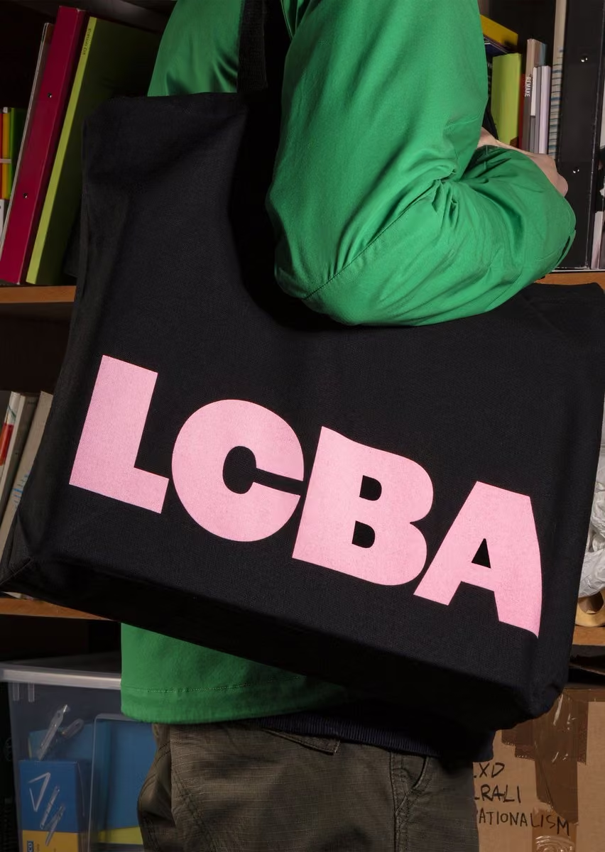
New but familiar design for LCBA by our friends Studio Bergini uses Caslon Ionic and Original Sans from @commercialtype in a nod to our letterpress wood type collection. Expect to see more in print and online s👀n!
-
Commercial Type
@commercialtype
Here are some notes on the design process behind Action Text in the designer's own words, well worth a look:
-
Commercial Type
@commercialtype
NEW RELEASE! Action Text by Erik van Blokland. Action Text builds on the explorations that led to Action Condensed. Its inventive letterforms stem directly from function: any details that couldn’t be removed have been simplified and exaggerated.
See more: commercialtype.com/catalog/action_text
Commercial Type
@commercialtype
Action Text is our first variable font release, with weight & grade axes, in addition to "flat" fonts in 4 weights + 2 grades. Grades subtly vary overall weight, and are useful for creating rollovers on screen or adjusting weight in print w/o affecting copyfit.
Commercial Type
@commercialtype
Action Text is a contemporary addition to the pantheon of great sans serifs designed for legibility at tiny point sizes and in difficult reproduction conditions. Read more here: commercialtype.com/news/new_release_action_text_by_erik_v…
-
Commercial Type
@commercialtype
NEW WORK: @greggazdowicz designed Means, a new serif typeface for @Mailchimp. The light weight debuts today on their site and app, more to come soon.
-
Commercial Type
@commercialtype
Lyon Arabic by @waelmorcos & @debakir featured in @AIGAeyeondesign today:
AIGA Eye on Design
@AIGAeyeondesign
“One design, two flavors” ✌ Lyon Arabic brings a new slant to traditional characters > aigaeod.co/2FFY12h
-
Commercial Type
@commercialtype
Please read and spread this horrifying story from one of the key people responsible for how text is rendered on screen.
Behdad Esfahbod
@behdadesfahbod
If you read one thing from me, please be this
medium.com/@behdadesfahbod/if-you-read-one-thing-from-me-… -
Commercial Type
@commercialtype
Really nice writeup on Lyon Arabic by @waelmorcos and @debakir at @itsnicethat: www.itsnicethat.com/articles/wael-morcos-khajag-apelian-l…
-
Commercial Type
@commercialtype
NEW RELEASE! Lyon Arabic Text and Lyon Arabic Slanted Text, designed by @waelmorcos and @debakir as a companion to @kaibernau's original design.
commercialtype.com/catalog/lyon_arabicPost not available here, view on X
Commercial Type
@commercialtype
Lyon Arabic Slanted Text conveys a different texture, using the Nastaliq script as a model to bring fluidity and angle. The two, each with their own distinct flavor, can be used on their own, for content differentiation within one layout, or even mixed for in-line emphasis.
Commercial Type
@commercialtype
Huge thanks to @bahmantype for his invaluable work on engineering these fonts.
-
Commercial Type
@commercialtype
Now open: showcase.commercialclassics.com, a minisite showing a different side of Brunel, Caslon Doric, and Caslon Ionic, three cornerstone families from the @commerclassics library, designed by Jonny Sikov and Britt Cobb at @pentagram
Commercial Type
@commercialtype
Development by Tom Conroy, informational text by @litherland
Commercial Type
@commercialtype
Also in white if the red is too much…
showcase.commercialclassics.com -
Commercial Type reposted
Poem
@poem_editions
History reconsidered: ‘Robert Thorne and the origin of the ‘modern’ fat face’ by Sébastien Morlighem. Co-edited with @alicesavoie in the Poem Pamphlet series.
8€ free EU shipping
poem-editions.com/products/thorne -
Commercial Type reposted
Open
@notclosed
Restaurants and stores starting to open again: We want you to be successful. People starting to go out more: We want you to be safe. These signs might help (a little) with both. Download a PDF on our ideas page: www.notclosed.com/ideas #covid19 #stayhome #washyourhands #wearamask
-
Commercial Type
@commercialtype
Today @CommArts published a nice interview with our designer @greggazdowicz: www.commarts.com/columns/gazdowicz
-
Commercial Type
@commercialtype
NEW RELEASE at @commerclassics today: Original Sans, based on the second sans serif ever cut, released by Vincent Figgins between 1828 and 1834. This was the first typeface to carry the name "sans serif". @PauloBarnesi & CS have revived it in 2 weights.
commercialclassics.com/catalogue/original_sans
Commercial Type
@commercialtype
Animated images by @theoriginalecs for our weekly email series on Commercial Classics. This is what we sent this morning:
commercialtype.com/newsletters/62
Subscribe here for more: commercialtype.com/news/subscribe -
Commercial Type reposted
Actual Source
@actual_source
Salt Lake City welcomes @paulbarnesi of @commercialtype and @commercialclassics on April 6 2020 *FREE AND OPEN TO THE PUBLIC*
the lecture will take place at the Utah Museum of Contemporary Art @utahmoca
Sponsored by Actual Source and @aigaslc -
Commercial Type reposted
Commercial Classics
@commerclassics
Fabulous identity @TownerGallery identity Original Sans and Caslon Ionic. Photos by Rob Harris
-
Commercial Type reposted
Commercial Classics
@commerclassics
All about us on @itsnicethat
www.itsnicethat.com/articles/commercial-classics-caslon-r… -
Commercial Type reposted
I Love Typography
@ilovetypography
A few words about one of my favorite stencil typefaces. Designed by @SNugue & published by @commercialtype, meet Orientation: ilovetypography.com/2020/02/15/fonts-in-focus-two/
-
Commercial Type reposted
Luke T☺︎nge
@luketonge
Some lovely Druk by @commercialtype on display...
@custardfactory @weareboom @seven9signs
#fontsunday #windows @DesignMuseum -
Commercial Type
@commercialtype
Great use of Orientation in this exhibition designed by @jo_bailey and @AnnaEBrown
-
Commercial Type
@commercialtype
We launched our website 10 years ago today. We have some thanks and reminiscences on our homepage: commercialtype.com
-
Commercial Type reposted
Type Directors Club
@typedirectors
Foundries, #type designers, and students! @greggazdowicz @commercialtype will be considering which new typefaces will be the World's Best #typography Get in on the competition before Jan 10 to show Greg your best work: tdc.org/enter
-
Commercial Type reposted
Commercial Classics
@commerclassics
Just before the holidays we released Caslon Rounded Ornamented. Designed by
@reppiRmiT
it completes the Caslon Rounded family, going from the Solid, to the Open to this incredibly detailed Ornamented. With up to four layers, possibilities are huge
commercialclassics.com/catalogue/caslon_rounded_ornamente… -
Commercial Type
@commercialtype
Very sad to hear that Vaughan Oliver passed away yesterday. He was truly one of a kind. This is a lovely tribute:
4AD
@4AD_Official
Vaughan Oliver remembered by 4AD founder Ivo Watts-Russell - "Vaughan Oliver taught me to appreciate quality. He taught me how to look at the physical world. He was a force of nature and I’m having such a hard time processing this." Continued: 4ad.com/news/29/12/2019/vaughanoliverrememberedbyivowatts…
-
Commercial Type
@commercialtype
-
Commercial Type
@commercialtype
One final release from @commerclassics for the holiday season: Caslon Rounded Ornamented, first seen around 1844, now revived by @reppiRmiT with 4 layers for lots of flexibility with color, from tasteful to… commercialclassics.com/catalogue/caslon_rounded
-
Commercial Type
@commercialtype
It has been wonderful to see our typeface for @MuseumModernArt come to life this year, and this design system has been a big part of it.
order
@order
New work 🎨 Design system and guidelines for @MuseumModernArt. The comprehensive design system, developed closely with @momastudio, reinforces MoMA’s iconic brand with more forward-looking strategies for building awareness via motion, digital, and print. order.design/project/moma
-
Commercial Type reposted
Commercial Classics
@commerclassics
New Release: Caslon Doric Condensed Text. Wider than Caslon Doric Condensed, it was originally designed for @Rapha and works well at text, but is also an excellent headline face. Its has no historical model, yet feels a homogenous part of the Caslon Doric family
-
Commercial Type
@commercialtype
NEW RELEASE! Darby Serif by @PauloBarnesi with Dan Milne @typelab_ is a contemporary serif in two optical sizes: Darby Serif Display, for headlines and large sizes; and Darby Serif Text, designed for continuous reading matter. commercialtype.com/catalog/darby_serif
Post not available here, view on X
Commercial Type
@commercialtype
Darby Serif first appeared as the text face in the redesign of Italian daily newspaper La Repubblica by Francesco Franchi and Angelo Rinaldi in 2017.
Commercial Type
@commercialtype
Read more about the origins of Darby Serif and its relationship to Darby Sans here:
commercialtype.com/news/new_release_darby_serif -
Commercial Type
@commercialtype
Another new @commerclassics release today: Thorowgood Grotesque Open, also drawn by @greggazdowicz after a mid-1830s display face by Thorowgood.
-
Commercial Type
@commercialtype
New from @commerclassics today: Blake & Stephenson’s Sans-Surryphs Ornamented cut before 1839. @greggazdowicz has applied the technique to Thorowgood Grotesque, with the help of a tool developed by @typemytype
commercialclassics.com/catalogue/thorowgood_dimensional/r… -
Commercial Type reposted
Commercial Classics
@commerclassics
Its finally here: @greggazdowicz Thorowgood Grotesque Dimensional, a multi layered three dimensional engraved face. commercialclassics.com/catalogue/thorowgood_dimensional
None of this would be possible without the amazing help of @typemytype and of course @stbridelibrary -
Commercial Type
@commercialtype
Maybe it's time to start feeling nervous about our jobs…
Janelle Shane
@JanelleCShane
A neural net trained on 2674 fonts generates glyphs of its own. Some letters it got easily; b was particularly tricky for some reason
-
Commercial Type
@commercialtype
It took a little longer than expected, but we have posted an article about the design of Ayer by Miguel Reyes @font_taste, released earlier this year:
commercialtype.com/news/new_release_ayer_by_miguel_reyes
Commercial Type
@commercialtype
Thanks to @kayessgordon for putting the specimen images together for this one!
-
Commercial Type reposted
Diego Areso
@quintatinta
Van unas páginas. El principio de la revista está dominado por la tipografía Platform, de @commercialtype. Todos los textos van en Majrit, de @FelicianoType.
-
Commercial Type reposted
Type Directors Club
@typedirectors
Foundries, #type designers, and students! @greggazdowicz @commercialtype will be considering which new typefaces will be the World's Best #typography Enter before the December deadline. Read about Greg, his work, and the bios of our other amazing judges: www.tdc.org/news/meet-the-tdc66-judges/
-
Commercial Type
@commercialtype
Nice use of Caslon Doric from @commerclassics on this book cover:
David Pearson
@typeasimage
French edition of ‘The Book of Human Emotions’ by Tiffany Watt Smith. Part of @EditionsZulma’s new non-fiction series, Zulma Essais.
-
Commercial Type reposted
OH no Type Co
@OHnoTypeCo
I love this series of book cover illustrations from @letterror. But I love more that after all his contributions to type and design, Erik is still pushing it with obvious enthusiasm and a freakish work ethic. letterror.com/misc/covers.html
-
Commercial Type
@commercialtype
We love this use of @bertonhasebe's unreleased Pialat (originally drawn for T) for Prince's new memoir "The Beautiful Ones", designed by Triboro Design
-
Commercial Type reposted
Commercial Classics
@commerclassics
Paul will be in Boston on Tuesday talking to the AIGA about Commercial Classics
-
Commercial Type reposted
Commercial Classics
@commerclassics
Paul is in Providence tonight.
-
Commercial Type
@commercialtype
I really, really love the interactive specimen celebrating the first year of @futurefonts:
hypertext.futurefonts.xyz -
Commercial Type reposted
kelly krause
@kellybkrause
8 / Graphics style guide: Nature’s @Jasiek_Kr lead the design team’s update to our style guide for graphics, with a more concise colour system and other tweaks that improve display of data.
-
Commercial Type reposted
kelly krause
@kellybkrause
7 / New colour palette: Nature-branded journals now have a new accent colour palette based on the Ostwald colour system, developed by nobel prize-winning chemist Friedrich Wilhelm Ostwald (1853 – 1932). His work influenced major artists such as Paul Klee and Piet Mondrian.
-
Commercial Type reposted
kelly krause
@kellybkrause
6 / Colour: We removed the red bar from the top of our web page so that content stands out cleanly. Research shows elimination of unnecessary colour elements eases cognitive load. Now all type, including logos, will be in either black or white, with colour used as accent only.
-
Commercial Type reposted
kelly krause
@kellybkrause
5 / Branding for digital: We have prioritized digital performance by simplifying all Nature-branded journal logos. And because social media has grown in importance, we have created a system of abbreviated forms for the tiny avatars on those platforms.
-
Commercial Type reposted
kelly krause
@kellybkrause
4 / Logo: Nature has had at least ten logos since 1869; all up to now were designed for print, a medium that allows for fine detail in a way mobile devices do not. Using Harding as a basis, we have updated the logo for the digital age. More details: go.nature.com/31BY3xG
-
Commercial Type reposted
kelly krause
@kellybkrause
3 / Typography: A custom typeface, Harding, has been created for @nature by @commercialtype for Nature’s new logo, print/web and much else. Named after the late neurologist Anita Harding, it was designed specifically for science. More details: go.nature.com/31BY3xG
-
Commercial Type reposted
kelly krause
@kellybkrause
2 / Overall design philosophy: Nature’s redesign is influenced by the mid-century Swiss school of rational graphic design, with strong use of grids/typography, prioritizing information design/function over decoration. In the new research article layout, key info is shown clearly.
-
Commercial Type
@commercialtype
Read more about the redesign as a whole in this thread from @kellybkrause and at www.nature.com/articles/d41586-019-03083-5, and read more about the typeface at commercialtype.com/news/harding_a_new_typeface_for_nature
kelly krause
@kellybkrause
1 / After well over a year of working with renowned designer @IamMarkPorter, @nature is pleased to unveil our new design and logo. We’ve published an in depth analysis go.nature.com/31BY3xG, but here are the highlights.
-
Commercial Type
@commercialtype
NEW WORK: Harding, a new text and display typeface for a print and online redesign of Nature, one of the world's most prestigious scientific journals, carried out by consultant @IamMarkPorter and creative director @kellybkrause
Commercial Type
@commercialtype
Because Nature covers such a vast range of topics, from physics, to molecular biology, to astronomy, to linguistics, Harding has one of most extensive character sets we've ever worked on.
-
Commercial Type reposted
Jerry Saltz
@jerrysaltz
Hey Art-Lovers‼️ Let me be the 1st to tip you off to a FREE secret: @MuseumModernArt is opening A DAY EARLIER THAN ANNOUNCED. It’ll be FREE admission. Oct. 20 10:00 a.m. - 5:30 p.m. Be 1st to behold the new Museum. Post selfies. Tell ‘em @NYMag & Jerry sent me” @oneVoxdotcom
-
Commercial Type
@commercialtype
The next book from @Lett_Arc has just been announced: "Only on Saturday", celebrating the woodtype experiments the brilliant SF printer Jack Stauffacher made on weekends. See much more and back the project here:
www.kickstarter.com/projects/letterformarchive/only-on-sa… -
Commercial Type
@commercialtype
Just incredible... check out Rekall by @shiva__n
Bold Monday @boldmonday@mastodon.online
@boldmonday
NEW RELEASE – Rekall by Shiva Nallaperumal, a forceful display family that is putting decipherability to a test.
www.boldmonday.com/typefaces/rekall/ -
Commercial Type reposted
Type Directors Club
@typedirectors
NYC Get uptown Wednesday Oct 16 -- Reserve your free ticket to the talk by National Design Awardee Tobias @frerejones @cooperhewitt as part of the 20th anniversary of the USA's National Design Awards #nda20yrs Tickets here: www.cooperhewitt.org/event/winners-salons-20-x-20-10-16-2…
-
Commercial Type
@commercialtype
This new project by @IlyaRuderman, @ostromentsky, and Nikita Kanarev is brilliant: 18 loosely related styles for a totally distinct typographic voice
type.today
@TypeTodayNews
Custom typeface for the youtube channel of Yury Dud (@yurydud)— one of the most popular Russian video-bloggers.
18 styles. 18 voices. 18 shades of the journalism:)
Read more: type.today/en/journal/vdud
#вдудь #vdud -
Commercial Type reposted
PPL Spec Collection
@TheSpecialest
We're very excited to share details about this year's Updike Award ceremony, which will feature a panel on typeface revivals. Join us at 7pm on October 25th at the Pavilion at Grace Church. (Poster by Gene Hua, 2018 Updike Prize winner.)
www.provlib.org/calendar/?id=5643530&d=2019-10-25 -
Commercial Type reposted
Sandrine Nugue
@SNugue
Happy to be part of the second round. I will talk about Orientation: From Roubaix to Commercial.
-
Commercial Type reposted
Commercial Classics
@commerclassics
Thorowgood Egyptian as used by @jeremydeller for a pull-out souvenir for @TheArtNewspaper today @FriezeArtFair. From @F_M_studio
-
Commercial Type
@commercialtype
Congratulations to @shiva__n on this fantastic new sans!
Typotheque
@typotheque
🚀 Please welcome Oli Grotesk, a high-performance typeface family informed by the industrial aesthetics of mechanical writing tools. Designed by the multi talented Shiva Nallaperumal. tptq.com/oli
-
Commercial Type reposted
Commercial Classics
@commerclassics
Blake & Stephenson Open Sans-Surryphs now available as Blake & Stephenson Shaded commercialclassics.com/catalogue/blake_stephenson_shaded
-
Commercial Type reposted
Commercial Classics
@commerclassics
Brevier Caslon Doric Outline cut by Boileau @stbridelibrary now available digitally commercialclassics.com/catalogue/caslon_doric_outline
-
Commercial Type
@commercialtype
New goods in the shop today: We have collaborated with New York clothing label Dahsar on a small collection of 9 pieces, recontextualizing some of what we've made over the last 9 years. See more at commercialtype.com/goods
-
Commercial Type
@commercialtype
NEW WORK: @reppiRmiT has drawn a new serif family called REI Stuart for @REI, referencing Plantin and classic US National Park Service routed wood signs. Read more: commercialtype.com/news/custom_typeface_by_tim_ripper_for…
-
Commercial Type
@commercialtype
The @commerclassics range of shaded display faces has also grown with the addition of Caslon Doric Outline and Blake & Stephenson Shaded, both by @PauloBarnesi and @reppiRmiT, which join Caslon Antique Shaded, Caslon Italian Shaded, & Caslon Sans Shaded
commercialclassics.com/catalogue/category/shaded -
Commercial Type
@commercialtype
Caslon Rounded, by @PauloBarnesi with @reppiRmiT, revives the first rounded typeface cut by the Caslon & Catherwood foundry in 1836, including a highlighted version that had previously found popularity in the 1960s and 70s.
commercialclassics.com/catalogue/caslon_rounded -
Commercial Type
@commercialtype
Thorowgood Grotesque, also revived by @PauloBarnesi with @greggazdowicz, comes from Thorowgood's condensed sans lowercase of 1834, now expanded with additional widths, an urgent italic, and a companion Egyptian in one weight.
commercialclassics.com/catalogue/thorowgood_grotesque -
Commercial Type
@commercialtype
Caslon Ionic, revived by @greggazdowicz with @PauloBarnesi, looks back to a text face that had a huge influence on newspaper types through the 20th century to today. It also features an alternate bold, Antique No 6, with unbracketed slab serifs.
commercialclassics.com/catalogue/caslon_ionic -
Commercial Type
@commercialtype
After launching @commerclassics with 6 collections over the summer, we have expanded the library with a new batch of releases.
commercialclassics.com -
Commercial Type
@commercialtype
Caslon Doric in use by @F_M_studio for "Making Space" by Jessie Brennan at Royal Docks, London.
Commissioned by UP Projects, installation by OmniColour, photos by Thierry Bal.
commercialclassics.com/catalogue/caslon_doric -
Commercial Type reposted
Sandrine Nugue
@SNugue
The new Tate Etc. is out and Orientation is the guest typeface, slightly customised for the occasion. A section of this issue is commissioned by Mark Leckey taking inspiration from the visionary artist and writer William Blake. Design graphic by Studio Ard.
-
Commercial Type
@commercialtype
NEW WORK! Proxy, an all caps titling face for the @BarneysNY fall windows. It was great to be reunited with @Mr_Turley, who collaborated with Thom Bettridge on the windows.
-
Commercial Type
@commercialtype
NEW WORK: Rapha Sans & Rapha Serif by @PauloBarnesi with Dan Milne @typelab_ for an evolution of @rapha's identity. Rapha Sans is a modification of @commerclassics Caslon Doric. Rapha Serif is a new interpretation of Caslon I's Great Primer. Read more: commercialtype.com/news/custom_typefaces_for_rapha
-
Commercial Type
@commercialtype
NEW WORK! We drew a titling typeface for @pentagram's identity system for OMNY, the MTA's new contactless payment system. Read more about the project here: www.pentagram.com/work/omny/story
-
Commercial Type
@commercialtype
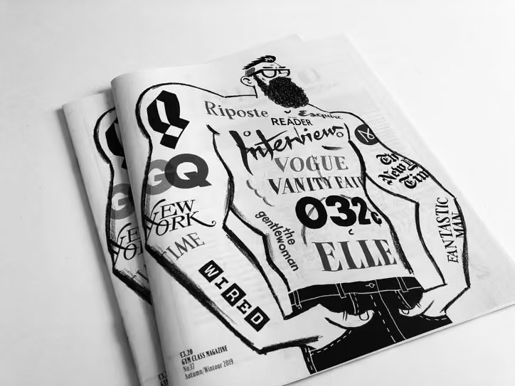
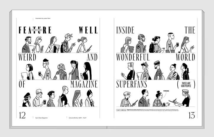
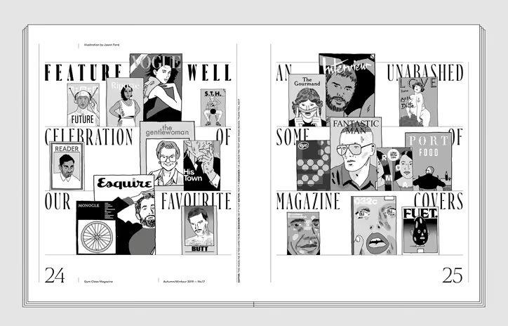
We’re always happy to be a part of @gymclassmag. The new issue puts our latest release Ayer to great use.
Eye magazine
@eyemagazine
Gym Class returns with a magazine zine, www.itsnicethat.com/news/gym-class-issue-17-steven-gregor… #indiemags #magazines #illustration #eye94 #eye96 @gymclassmag via @itsnicethat ht @hollycatford
-
Commercial Type
@commercialtype
New in our Goods shop today: a more affordable remix of our Commercial Classics specimen and a few copies of a poster printed by @thecounterpress with newly manufactured Caslon Rounded woodtype.
commercialtype.com/goods -
Commercial Type
@commercialtype
This project has been @PauloBarnesi's dream since even before we started Commercial Type, and would not have been possible without the hard work of our colleagues & outside collaborators: @bertonhasebe @reppiRmiT @greggazdowicz @font_taste @hannes_famira @fostertype Jesse Vega…
Commercial Type
@commercialtype
Web designers @wkshpsnyc, developer GrayBits, PDF specimen designer @thejackamo
Commercial Type
@commercialtype
Above all we need to acknowledge the @stbridelibrary, home to much of the historical material we used in the creation of these new typefaces. A portion of all @commerclassics license sales will be donated to support the library, and we encourage you to support @sbf1891 if you can
-
Commercial Type
@commercialtype
Paul has written an extensive and profusely illustrated essay on the origin of each family, showing much of the historical material that informed the design. commercialclassics.com/catalogue/brunel Thanks to @ThinkingType for editing and @kayessgordon for copy editing
-
Commercial Type
@commercialtype
Our new venture @commerclassics is finally live! Visit commercialclassics.com to see more. We're starting out with 6 releases, including the serif and sans workhorses Brunel and Caslon Doric, along with a selection of display faces.
-
Commercial Type
@commercialtype
Paul's lecture on @commerclassics from last Monday is online now:
Type@Cooper
@CooperType
So grateful to @HoeflerCo for their continued support to make the Lubalin Lecture series available online. Here's last week's talk by @PauloBarnesi. What an amazing labor of love to revive these 19th c typefaces! vimeo.com/347407965
-
Commercial Type reposted
Commercial Classics
@commerclassics
Last night was a success. Thank you all for coming and the kind words. And a great collection from @dahsar
-
Commercial Type reposted
Frere-Jones Type
@frerejones
Looking forward to speaking in tonight’s panel “Historical Type in Contemporary Design” with @paulobarnesi, @theoriginalecs, and @shira_no_filter, moderated by @angelariechers !
-
Commercial Type
@commercialtype
See Paul discuss historical typefaces in contemporary graphic design with @frerejones, @theoriginalecs, and @shira_no_filter in New York next week, moderated by @AngelaRiechers:
www.eventbrite.com/e/historical-type-in-contemporary-desi…
Admission is free! -
Commercial Type
@commercialtype
See Paul speak about @commerclassics for @CooperType's Lubalin Lecture Series next week:
coopertype.org/event/the_past_is_the_present -
Commercial Type
@commercialtype
We're putting on a series of events around Commercial Classics in New York next week.
Commercial Classics
@commerclassics
A week of @commerclassics in New York
-
Commercial Type reposted
Type Directors Club
@typedirectors
Announcing another new video -- Miguel Reyes Miguel Reyes @font_taste @commercialtype explains the ideas and process behind a new condensed display family originally drawn for @wmag fashion magazine in "Variations on a Theme." Watch here: youtu.be/G4tTasgLd50
-
Commercial Type
@commercialtype
Congratulations to @frerejones on this extremely well-deserved honor!
Frere-Jones Type
@frerejones
We are beyond thrilled and excited to announce that Tobias has received Cooper Hewitt’s 2019 National Design Award for Communication Design.
@cooperhewitt #nda20yrs
See all the winners and their galleries here: www.cooperhewitt.org/national-design-awards/2019-national… -
Commercial Type
@commercialtype
Some news! Christian is partnering with designers Matt Tragesser and Dino Sanchez in Commercial Studio, a new branding agency that will be a sister company to Commercial Type. Follow @commerstudio here and _commercialstudio on Instagram to find out more.
-
Commercial Type
@commercialtype
NEW RELEASE! Ayer, designed by @font_taste, is an elegant condensed display typeface with flared endings, in three optical sizes. The family was originally commissioned by Cian Browne and Jeff Burch for their redesign of @wmag
Commercial Type
@commercialtype
Ayer Poster, the largest optical size, features four italics with distinctly different personalities. See more at commercialtype.com/catalog/ayer
Commercial Type
@commercialtype
Ayer Deck, the smallest optical size, is designed for subheads, pull quotes, and small headlines, but also works as a low-contrast display face when tracked in.
-
Commercial Type
@commercialtype
July 8 at Cooper Union, @PauloBarnesi will tell the story of Commercial Classics:
Commercial Classics
@commerclassics
Commercial Classics in New York.
The Past is the Present
Monday, July 8, 2019, 6:30 PM – 8:30 PM
coopertype.org/event/the_past_is_the_present
The image is Thorowgood Egyptian on Fann Street, the site of the Fann Street Foundry -
Commercial Type reposted
type.today
@TypeTodayNews
Alfa-Bank used Styrene by Commercial Type in branding and communications
@alfabank @commercialtype @bertonhasebe
Read our short article about the project: type.today/en/journal/styrene-alfa Thanks to Irina Voloshina for talking to us. -
Commercial Type reposted
Fraser Muggeridge
@F_M_studio
commercialclassics specimen second edition on press 👀 Exact reprint but bound in a different way to make 96 page book 📚 www.instagram.com/p/Bx2X9Y6Bvi9/
-
Commercial Type
@commercialtype
The @CandidDotOrg identity by @notclosed is one of the nicest uses we've seen of Algebra.
Candid
@CandidDotOrg
Get the answers to your most burning questions about Candid. Visit candid.org/faq/
-
Commercial Type
@commercialtype
Fantastic use of @commerclassics (and Marian) here:
David Pearson
@typeasimage
Drunken drop caps: www.instagram.com/p/Bxhy3zzhDBT/
-
Commercial Type
@commercialtype
Congratulations to Corina Cotorobai and @FredSmeijers on launching TYPE BY! We're huge admirers of Fred's work and are delighted to see it available again.
TYPE BY
@TypeBy_com
One year in the making, TYPE BY is now live with a collection of exclusive typefaces signed by Fred Smeijers, Thomas Thiemich, Hendrik Weber, Merel Wagner, Maurice Göldner, Pierre Pané-Farré and Corina Cotorobai. We design type with character. Enjoy! typeby.com
-
Commercial Type reposted
Francesco Franchi
@ffranchi
La nuova @repubblica appena stampata
-
Commercial Type
@commercialtype
New in the shop: Commercial Classics specimen designed by @F_M_studio : commercialtype.com/goods/commercial_classics_specimen
Commercial Type
@commercialtype
We were delighted to work with @JanelleCShane on the text for this specimen. She trained a neural network on novels by 19th century British authors like Austen and Thackeray, and also on Adam Smith's Wealth of Nations, for suitably bizarre results.
-
Commercial Type reposted
Type Directors Club
@typedirectors
A few seats left! May 8 at Parsons - Join AIGA and TDC for a conversation between graphic and type designers with @chasnix @monotype , Christian Schwartz @commercialtype , Jennifer Kinon @ocdagency , @samarskaya , and Naomi Abel @pentagram. Be there! Tix: www.tdc.org/event/type-x-graphic-design-craft-and-origina…
-
Commercial Type
@commercialtype
The Past is the Present: launch event for @commerclassics tonight at @stbridelibrary
-
Commercial Type
@commercialtype
I‘m a big fan of Plaak, so I’m very excited to see Plaax out in the world.
205TF
@205tf
We are proud to announce Plaax! Designed by Damien Gautier, this typeface takes its inspiration from the characters of the nameplates of French streets.
Now available www.205.tf/Font/41/plaax/ -
Commercial Type reposted
Commercial Classics
@commerclassics
-
Commercial Type reposted
St Bride Foundation
@stbridefdn
If you have a spare ticket to the @commerclassics event this week, please do let us know as it has sold out and lots of people would love to go who missed out! @PauloBarnesi @commercialtype @sbf1891
-
Commercial Type reposted
Type Directors Club
@typedirectors
Tonight in NYC! Come over to hear Miguel Reyes @font_taste @commercialtype speak about his new condensed display family originally drawn for @wmag. Here, a recent spread. Info here: www.tdc.org/event/miguel-reyes-variation-on-a-theme/
-
Commercial Type
@commercialtype
Very excited for the relaunch of this brilliant project!
The Pyte Foundry
@thepytefoundry
It is the 101st day of the year 2019 CE, … and The Pyte Foundry is resurrecting.
thepytefoundry.net -
Commercial Type
@commercialtype
Thursday night!
Type Directors Club
@typedirectors
This week! Don't miss Miguel Reyes @font_taste @commercialtype in NYC April 11. He'll be speaking about process behind a new condensed display family originally drawn for @wmag. Here, a recent spread. Info here: www.tdc.org/event/miguel-reyes-variation-on-a-theme/
-
Commercial Type
@commercialtype
Our friends at Triboro have posted some much better photos of the new specimen they designed for us, along with several other recent projects: triborodesign.com/work/commercial-type
Pick one up here: commercialtype.com/goods/go_to_commercial -
Commercial Type
@commercialtype
We’re delighted to have backed this comprehensive book on Otl Aicher’s identity program for the 1972 Olympics in Munich. They’re close to their goal but not quite there yet...
Mark Holt
@MarkHoltDesign
Pledge now please. ‘Munich ‘72. The Visual Output of Otl Aicher’s Dept. XI’. 225 x 170, hardback, 536 pages, in your hand in November. Kickstarter link kck.st/2TiQFHZ
-
Commercial Type
@commercialtype
Today we are also releasing a new limited edition silkscreen poster and folder celebrating Schnyder, designed by Li, Inc. commercialtype.com/goods
-
Commercial Type
@commercialtype
We have a new specimen booklet conceived and designed by Triboro Design in our Goods shop today: commercialtype.com/goods $5.00 including shipping worldwide.
-
Commercial Type
@commercialtype
April 11! Miguel will be speaking at the @typedirectors about an upcoming display family originally drawn for W. Info below
Type Directors Club
@typedirectors
Don't miss Miguel Reyes @font_taste @commercialtype in NYC April 11. He'll be speaking about process behind a new condensed display family originally drawn for @wmag. Here, a recent spread. Info here: www.tdc.org/event/miguel-reyes-variation-on-a-theme/
-
Commercial Type
@commercialtype
Miguel is in Munich today, where he spoke at the @qved_conference
tgm
@typographische
MIGUEL REYES @font_taste, Commercial Type @commercialtype about “Canela, Defying classifications” at @qved_conference #edch19
-
Commercial Type
@commercialtype
As we get closer to launching Commercial Classics, Paul will be previewing some of the initial releases. Follow @commerclassics here and commercialclassics on instagram for more.
Commercial Classics
@commerclassics
We will begin @commerclassics with a first set of releases that will give a good idea of what the venture is about. Based upon the first modern cut for the Caslon foundry in the late 18th C, Brunel is the British equivalent the Italian Bodoni or the French Didot @commercialtype
-
Commercial Type reposted
St Bride Foundation
@stbridefdn
New talk alert!
Collections and Collaborations
A visual celebration of the St Bride Library
14 May, 6–9pm
Tickets: £3–5
www.sbf.org.uk/whats-on/view/collections-and-collaboratio… -
Commercial Type reposted
St Bride Foundation
@stbridefdn
We asked some of our Friends why they #lovestbride or what their favourite item in our collection is? We had some wonderful responses that highlight how important our collections and community are and why we need your support.
Become a Friend today!
www.sbf.org.uk/friends -
Commercial Type reposted
Commercial Classics
@commerclassics
@commercialtype are delighted to announce the launch of a new venture, Commercial Classics on 18 April 2019. We will be giving a talk @stbridelibrary. Details sbf.org.uk/whats-on/view/commercial-type-are-proud-to-pre…
-
Commercial Type reposted
Fontstand
@Fontstand
We have 10 tickets for #fontstandcon2019 in Porto reserved for the local students, available for €10 only (+ VAT). Drop us an email with a scan of your Portuguese student ID to use this opportunity. RT please.
🔟✖️🎟️👩🎓👨🎓
fontstand.com/conference-2019/ -
Commercial Type reposted
Tim Ball
@tball
And here are a few more pages from this morning...
This one features one of @brettaffrunti's wonderful frequent spot illustrations (two more in this week's paper alone) and @AliWalker24's smart use of the typeface I've fallen in love with: @commercialtype's Portrait Condensed. -
Commercial Type reposted
Tim Ball
@tball
A print refresh debuts tomorrow morning for us, with a deep dive into the EU's Operation Sophia by @notzachcampbell and killer artwork by @mcqtweet.
-
Commercial Type
@commercialtype
Orientation by @SNugue was featured on @AIGAeyeondesign this week: eyeondesign.aiga.org/this-brutalist-inspired-stencil-font…
-
Commercial Type
@commercialtype
Congratulations to @waelmorcos and @debakir on their Graphik Arabic specimen booklet being selected for this year’s TDC exhibition! Copies still available here:
commercialtype.com/goods
Wael Morcos
@waelmorcos
Graphik Arabic Booklet was awarded a Certificate of Typographic Excellence from the TDC @typedirectorsclub 🏆
Designed with @debakir
Font available from @commercialtype
.
#الخط_العربي #arabictypography #arabicfont #arabicdesign #arabictypedesign -
Commercial Type
@commercialtype
Congratulations to @SNugue on Orientation being selected for TDC2! Have a closer look at the typeface here: commercialtype.com/catalog/orientation
Sandrine Nugue
@SNugue
Orientation has been selected by the judges to receive the “Certificate of Typographic Excellence” in the 22nd @typedirectors Typeface Design Competition. 💫🥂💫 Champagne!
-
Commercial Type reposted
Type@Cooper
@CooperType
Animation for Typographers is a 10-week Wednesday evening class and there are only 3 places left. @DrawingRoomNYC's Nol Honig is teaching this year. Starts February 6.
-
Commercial Type
@commercialtype
New okaytype.com is 👍🏼👍🏼👍🏼
-
Commercial Type
@commercialtype
Congratulations to @contrastfoundry on launching today! Chimera is one of my favorite typefaces of the last few years, or maybe ever... check it out here: contrastfoundry.com
-
Commercial Type reposted
Fontstand
@Fontstand
Great to see seven new type families from @CommercialType now on Fontstand. Those are the fonts you already love: Lyon Text, Lyon Display, Atlas Grotesk, Atlas Typewriter, Algebra, Algebra Display and Robinson. fontstand.com/foundries/commercial-type
-
Commercial Type
@commercialtype
Read more about Orientation here: commercialtype.com/news/new_release_orientation_by_sandri…
-
Commercial Type
@commercialtype
NEW RELEASE: Orientation by French type & graphic designer @SNugue, a stencil typeface characterized by an unusually playful and creative kind of minimalism, full of surprising shapes. commercialtype.com/catalog/orientation
Commercial Type
@commercialtype
The initial weight of Orientation was commissioned in 2015 by Paris-based designer Thanh Phong Lê, who had been hired to create a wayfinding typeface for a new student apartment building in Roubaix, France.
Commercial Type
@commercialtype
.@SNugue has also used Orientation in her own work, including posters for a conference in Amiens organized by her alma mater @esadtype and a dance performance she helped to organize at the Centre Pompidou in Paris
-
Commercial Type reposted
David Pearson
@typeasimage
Some new work: www.instagram.com/p/BrA1TM1B3GS/
-
Commercial Type
@commercialtype
One of our favorite designers on one of our favorite designers:
Type@Cooper
@CooperType
Also, just posted this recording of Barbara Glauber's tribute to the amazing Sr. Corita Kent on the eve of what would be her 100th birthday. Thanks to @HoeflerCo for their on-going support of the Herb Lubalin Lecture Series @cooperunion vimeo.com/304460720
-
Commercial Type
@commercialtype
What a fantastic piece of work…
Frere-Jones Type
@frerejones
New release! Empirica, designed by Tobias Frere-Jones and @ninastoessinger, revisits the grand style of ancient Roman inscriptions, projecting their dignity and authority into a modern type family. frerejones.com/families/empirica
-
Commercial Type
@commercialtype
A brilliant designer with a singular vision, always generous with his knowledge, and a kind soul. Gerard was a true original and will be missed.
Gerry Leonidas
@gerryleonidas
Designer, educator, author, friend. Gerard Unger, 1942–2018
-
Commercial Type reposted
Readymag
@readymag
"For me, typefaces are building blocks in the truest sense of the word. I am prepared to build something even if the material is very poor." — #willyfleckhaus #typeface #graphicdesign stories.readymag.com/fleckhaus/
-
Commercial Type
@commercialtype
This is a really clever idea, executed well:
-
Commercial Type
@commercialtype
Congratulations to @connordavenpo on an impressive first release! It's nice to see a young designer as excited by typefaces from the 19th century - and bringing their shapes and ideas into the 21st - as we are.
C. Davenport
@connordavenpo
🚨NEW RELEASE🚨 Garnett is finally out in the world! sharptype.co/typefaces/Garnett/
-
Commercial Type reposted
TPTQ Arabic
@TPTQArabic
NEW RELEASE! Please welcome Mizan, a typeface for smooth uninterrupted reading. Have a look! ☞ tptq-arabic.com/blog/mizan_a_typeface_for_smooth_uninterr…
-
Commercial Type
@commercialtype
New goods in the shop: The backdrop from our National Stationery Show booth has been recycled into 15 one of a kind tote bags. commercialtype.com/goods
-
Commercial Type
@commercialtype
NEW RELEASE! Superette by @sincerelyross, a script face with deliberately broken connections, in 4 weights plus a dramatic Shaded variant. commercialtype.com/catalog/superette
Post not available here, view on X
Commercial Type
@commercialtype
Read more about Superette and @sincerelyross's inspiration points and process in this news article by @realdougwilson: commercialtype.com/news/new_release_superette_by_ross_milne
Commercial Type
@commercialtype
😳😎
-
Commercial Type
@commercialtype
New work by Miguel @font_taste debuting in the latest issue of @wmag, italics for the display family he designed for them in 2017, used to incredible effect by Cian Browne and his team.
-
Commercial Type
@commercialtype
Another fantastic use of Paul's Brunel by the brilliant @typeasimage!
Simon Prosser
@HamishH1931
Penguin Essential AUSTERLITZ in fine new design by @typeasimage
-
Commercial Type
@commercialtype
NEW RELEASE! Canela Condensed by @font_taste The difference in width between the new and original widths is not subtle: Miguel established clear differentiation between the families, inspired in part by American book covers of the 1960s and 70s. commercialtype.com/catalog/canela
Commercial Type
@commercialtype
Read more about the development of Canela Condensed here: commercialtype.com/news/new_release_canela_condensed
Commercial Type
@commercialtype
News article by @realdougwilson. Text in the sample images borrowed from @DocumentJournal, who first used Canela when it was in development. PDF specimen by @thejackamo commercialtype.com/uploads/3700037/1537203375784/Canela_C…
-
Commercial Type
@commercialtype
Huge congrats to @djrrb on receiving the Prix Charles Peignot this year!
ATypI: Association Typographique Internationale
@ATypI
Congratulations @djrrb for receiving the very well deserved 10th Prix Charles Peignot at #atypi2018 in Antwerp!
-
Commercial Type
@commercialtype
NEW WORK! The relaunched @InterviewMag is using our revival of the text sizes of Caslon Ionic No. 2 by @greggazdowicz and @PauloBarnesi throughout. First cut in the 1860s, it still has some life in it. Always great to be working with @Mr_Turley…
Commercial Type
@commercialtype
And a few more spreads…
Commercial Type
@commercialtype
A couple more, to show how the brush lettering by AD Kurt Woerpel, hearkening back to when the magazine was Andy Warhol's Interview, plays against the Caslon Ionic.
-
Commercial Type
@commercialtype
Another smart, interesting typeface from @grillitype with a smart, interesting minisite. Nice work by @tobirechsteiner and everyone involved!
Grilli Type
@grillitype
⟡ ⟡ ⟡ ⟡ ⟡ ⟡⟡ ⟡ ⟡ ⟡ ⟡ ⟡
GT Zirkon — OUT NOW
⟡ ⟡ ⟡ ⟡ ⟡ ⟡⟡ ⟡ ⟡ ⟡ ⟡ ⟡
gt-zirkon.com
⟡ ⟡ ⟡ ⟡ ⟡ ⟡⟡ ⟡ ⟡ ⟡ ⟡ ⟡ -
Commercial Type reposted
David Pearson
@typeasimage
Three recent covers for @PlutoPress
Art direction by @melaniespatrick
Hand illustration by @AdamsBusby
Type by @commercialtype -
Commercial Type reposted
Robert Newman
@Newmanology
To mark the final shutdown of @villagevoice, a nostalgic look at my experience working at the legendary weekly newspaper www.robertnewman.com/working-at-the-village-voice/
-
Commercial Type
@commercialtype
Also, late congratulations are due to @stephaneelbaz on the launch of his new foundry @general_type! Have a look: www.generaltypestudio.com
-
Commercial Type
@commercialtype
Late to the party but no less impressed by the incredible new @OHnoTypeCo website, which is everything a type foundry site should be AND MORE. ohnotype.co
-
Commercial Type
@commercialtype
Read more about Graphik Wide here: commercialtype.com/news/new_release_graphik_wide
Commercial Type
@commercialtype
...and find the family here: commercialtype.com/catalog/graphik/graphik_wide
Graphik Wide looks particularly good for very long words. -
Commercial Type
@commercialtype
NEW RELEASE: Graphik Wide further broadens the utility of the Graphik collection with new options for posters, book covers, editorial opening spreads, and even text. The original plan for 8 widths in 9 weights is finally complete.
-
Commercial Type
@commercialtype
Super nice work by @kioskfonts on the whole Source Serif family!
-
Commercial Type
@commercialtype
Dala Floda and Druk are in excellent company on this list!
Schrift Publishers
@schriftpblshrs
Just published our Top 10 Cyrillic Typefaces of 2017. Enjoy: 2017.typejournal.ru.
-
Commercial Type
@commercialtype
See Paul at SND Amsterdam in November!
Mapcreator
@mapcreator_io
Here we go again! We are proud to announce that Madeleine Jarling (@Mad_J_), the Layout Chief for Bild am Sonntag (@BILDamSONNTAG) and Paul Barnes (@PauloBarnesi) from Commercial Type (@commercialtype) will talk on stage at #sndams! Register now: www.eventbrite.com/e/snd-amsterdam-tickets-46456082393
-
Commercial Type reposted
Nicola Ryan
@Nicola_Ryan
I’m going to be taking on the mantle of Creative Director @Telegraph, and am looking for a deputy come and join the fun. Job ad here: isw.changeworknow.co.uk/telegraph/vms/e/careers/positions… Retweets appreciated
-
Commercial Type
@commercialtype
Another great talk in the Lubalin Lecture Series coming up on Monday: @waelmorcos will be talking about recent Arabic-language projects at @MorcosKey including the process behind Graphik Arabic. coopertype.org/event/right_to_left
-
Commercial Type
@commercialtype
Sanomat and the upcoming Cyrillic for Publico Headline in use by @hsfi
Steve Rosenberg
@BBCSteveR
Ahead of the Trump-Putin meeting here, Finland’s largest newspaper has put up ads around Helsinki which are less than complimentary about the visiting leaders. The sign in Russian says: “Putin is trying again to bring the media to heel.”
-
Commercial Type
@commercialtype
Monday night @bertonhasebe and I will be speaking together with Patrick Li on the work we've done for his team at @tmagazine. The talk is part of @CooperType's Lubalin Lecture Series and will be free and open to the public. coopertype.org/event/type_as_context_in_t_magazine
-
Commercial Type reposted
Type@Cooper
@CooperType
2 upcoming talks @cooperunion w/ @commercialtype's Christian Schwartz type designer Berton Hasebe & @tmagazine's creative director Patrick Li on 7/9 followed on 7/23 by @waelmorcos who will talk about the challenges of Arabic-Latin bilingual typefaces. coopertype.org/lectures/nyc
-
Commercial Type
@commercialtype
SOOOOO GOOOOOOD! Congrats to @Typozon on getting this incredible typeface out into the world.
Coppers and Brasses
@CoppersBrasses
The day finally arrived. Salvaje Display, the stunning typeface designed by Cristian Vargas (@Typozon ), is now available.
Go check it out!
----
www.coppersandbrasses.com/retail-fonts/salvajedisplay/ -
Commercial Type
@commercialtype
Read more about the new Canela families in this article by @realdougwilson: commercialtype.com/news/new_release_canela_text_and_deck Thanks to @documentjournal, the first publication to use Canela, for the text in the sample images.
-
Commercial Type
@commercialtype
Optimized for use below 20 point, Canela Text brings the grace and distinction of Canela to longer text and small navigational elements. Unlike the more limited weight range found in many text faces, the Canela Text family includes the full range of weights from the original.
-
Commercial Type
@commercialtype
Canela Deck is optimized for the “middle sizes”: subheads and pull quotes in editorial layouts, and all but the largest display sizes on the web.
-
Commercial Type
@commercialtype
NEW RELEASE! Once a typeface is released into the world, it takes on a life of its own. Miguel Reyes @font_taste has added Deck and Text optical sizes to his Canela family after seeing it at much smaller sizes than he ever intended. commercialtype.com/catalog/canela
-
Commercial Type
@commercialtype
Congratulations to everyone involved with @FoSh_Foundry. The typefaces, essays, and site are all fantastic!
-
Commercial Type
@commercialtype
Check out this super nice and very interesting new condensed sans by our good friend @hrvojezivcic!
Typotheque
@typotheque
Hey! Our new font Halte is just out. A signage typeface that should be used for anything but signage. 👉 tptq.com/halte
-
Commercial Type
@commercialtype
New specimen in the shop today: 'répondez s'il vous plait', conceived and designed by @theoriginalecs and printed in 6 lush spot colors. commercialtype.com/goods
-
Commercial Type
@commercialtype
Schnyder is yet another typeface in our library with a hard-to-pronounce name. With the help of @thejackamo, we have put together a short pronunciation guide to help with some common mistakes and pronounce even our most obscure typefaces with confidence: vimeo.com/267469438
-
Commercial Type
@commercialtype
Commissioned by Patrick Li and his team at @tmagazine, Schnyder was inspired in part by a handlettered invitation by Swiss artist Jean-Frédéric Schnyder. Read more about the development of Schnyder here: commercialtype.com/news/new_release_schnyder_an_idiosyncr…
-
Commercial Type
@commercialtype
NEW RELEASE! Schnyder, an elegant display typeface with an idiosyncratic personality in 4 widths and 3 weights, originally designed by @bertonhasebe and Christian Schwartz for @tmagazine. commercialtype.com/catalog/schnyder
-
Commercial Type reposted
Mark Porter
@IamMarkPorter
Thrilled with our latest @Internazionale extra. Couldn’t miss the chance to channel the spirit of 1960s underground press. More images here: www.instagram.com/p/BhtzfGgDsTB/?hl=en&taken-by=iammarkpo…
-
Commercial Type
@commercialtype
Can't wait to see this issue on Sunday…
T Magazine
@tmagazine
Seven icons of New York in the early ’80s are on the cover of T's Culture Issue www.nytimes.com/2018/04/17/t-magazine/carolina-herrera-je…
-
Commercial Type reposted
type.today
@TypeTodayNews
Great use of Druk Cyrillic(@commercialtype) by Charmer studio
masterbrus.com
besides commercialtype.com Druk Cyrillic available at type.today -
Commercial Type
@commercialtype
Incredible work by @typesupply for the newly launched redesign of @NatGeo. Two display typefaces and a logo refresh - read all about his process here:
Type Supply
@typesupply
New work! I made some new typefaces for @natgeo under the direction of @godfreydadich and @emmetsmith. Earle is a slab serif loosely inspired by Egizio Condensed. Marden is a sans serif that kind of popped out of my head. There's a lot more info here: typesupply.com/portfolio/earle-and-marden
-
Commercial Type
@commercialtype
New newsprint specimen available now! 8 pages, all headlines, $1.00 including shipping, designed by @thejackamo. commercialtype.com/goods
-
Commercial Type reposted
Type Supply
@typesupply
Another amazing typeface designed to meet the very particular needs of one client. The italics are shockingly beautiful!
Production Type
@ProductionType
NEW WORK! LVMH Air for the @LVMH group. An exclusive typeface family for both in-house and public communications. www.productiontype.com/news/lvmh
-
Commercial Type
@commercialtype
Unfortunately @ffranchi and Angelo Ronaldi weren’t able to make it, due to the storm, but their talk has been rescheduled to Saturday.
-
Commercial Type
@commercialtype
THANK YOU to everyone who came out for #typetypetype at the SND workshop yesterday, and especially to @frerejones, @yarakhoury, Peter Rentz, and Derrick Schultz for a excellent series of talks. Thanks also to @SND for making it happen.
-
Commercial Type reposted
Frere-Jones Type
@frerejones
This Thursday I’ll join @commercialtype @yarakhoury @ffranchi and more at this years’s Society for News Design conference, in a series of talks about type in news design. snd2018.sched.com/event/E1lH/type-type-type
-
Commercial Type reposted
Tyson Evans
@tysone
There will be a ton of hands-on training workshops from people like @veltman, @sisiwei and @ffranchi. We’re teaming up with Adobe and Facebook for specialized training on @FacebookOrigami and @AdobeXD — plus more:
Society for News Design
@SND
Ever-growing list of training at #sndnyc:
✔️ D3.js with @veltman or @kemper
✔️ HTML/CSS with @gianordoli
✔️ mapping basics with @schwanksta
✔️ prototyping with @demianborba
✔️ data-viz with @sisiwei
✔️ typography with @ffranchi
… and more: nyc.snd.org -
Commercial Type reposted
Tyson Evans
@tysone
It’s the only conference focused on the intersection of journalism, design and technology. More than 60 speakers are on the schedule, including some heros like @scottstowell, @jenniferdaniel, @johnmaeda, @katdowns and these two jokers:
Society for News Design
@SND
Don’t miss @ftrain and @aaronlammer on stage for a live episode of @longformpodcast at #sndnyc. They’ll discuss “What is Code?” and other easy-to-answer questions. Registered? Register! nyc.snd.org
-
Commercial Type reposted
Tyson Evans
@tysone
A few quick notes about @SND’s creative conference, which is only a week away at The New School (nyc.snd.org). I’ve spent the last few months organizing this contraption and think it’s going to be fun and unique for news nerds of all stripes.
-
Commercial Type
@commercialtype
March 22: The @SND conference is in New York this year, and I helped to organize an afternoon of talks on type in news design, featuring @frerejones on Exchange, @yarakhoury on Arabic language news design… snd2018.sched.com/event/E1lH/type-type-type
Commercial Type
@commercialtype
…@ffranchi & Angelo Rinaldi on their redesign of la @repubblica, Peter Rentz & Derrick Schultz on how type unifies print & digital editions of the @nytimes, and I'll speak on our work for T over the years. Registration is limited! Sign up at nyc.snd.org
-
Commercial Type reposted
Morcos Key
@MorcosKey
. @waelmorcos spoke to @PAGEmag about his process for designing Arabic typefaces, specifically @commercialtype’s Graphik Arabic.
Designed with @khajag
.
#typography #arabictypography
#design
#graphicdesign
#typeface
#interview -
Commercial Type
@commercialtype
Looking forward to talking about custom type together with @mikeabbink, Boyoung Lee, @mrmucca, and @leemaschmeyer, with moderator @theoriginalecs, at the TDC's one-day conference "Type Drives Culture" on March 23 in NYC. Info & tickets at typedrivesculture.org
-
Commercial Type reposted
greggazdowicz
@greggazdowicz
Love seeing Robinson being used to talk about food! 100jewishfoods.tabletmag.com
-
Commercial Type
@commercialtype
We're honored to have made a small contribution to this project... Paul's unreleased Caslon Doric Condensed was a great fit.
Champions Design
@heartgutsgrit
Honored to have designed the commemorative issue of @TheAtlantic celebrating the life and words of Martin Luther King Jr. with contributions by @BerniceKing @repjohnlewis @RevDrBarber @BreeNewsome; art by @hankwthomas, Kara Walker @adehogue; type by @commercialtype @jfporchez
-
Commercial Type reposted
The Cooper Union
@cooperunion
.@tmagazine creative director Patrick Li explains to @itsnicethat how our @lubalincenter played a role in the magazine's redesign www.itsnicethat.com/news/t-the-new-york-times-style-magaz…
-
Commercial Type
@commercialtype
NEW WORK: The first redesigned issue of @tmagazine is out now using Kippenberger by @bertonhasebe & Fact by Christian Schwartz & Berton Hasebe. More info here:
commercialtype.com/news/kippenberger_and_fact_for_t
Commercial Type
@commercialtype
We’re very happy to have had the chance to work with Patrick Li and his design team again, and I’d like to second Berton’s thanks to @harrygassel for bringing us in
-
Commercial Type
@commercialtype
Fact, by Christian Schwartz and @bertonhasebe, is a serif family in three optical sizes and two widths. Its clearest inspiration is Times New Roman and its many imitators, but it has a looser and more organic tone.
-
Commercial Type
@commercialtype
Kippenberger by @bertonhasebe is a sans serif family in three widths. Round bowls are blunted off to facilitate tightly stacked tracking and leading, and its squarish, inflated curves feel like phototype and DIY dry transfer headlines without referencing any particular typeface.
-
Commercial Type
@commercialtype
Here's a short article on Schnyder, the display face Berton and I drew for T 6 years ago: www.nytimes.com/2018/02/07/t-magazine/font-typography.html We're sorry to see it retire, but it had a good run! It debuted on this cover in February 2013.
-
Commercial Type
@commercialtype
New work for @tmagazine: Kippenberger, a sans family by @bertonhasebe, and Fact, a serif family by Christian Schwartz & Berton, each in an extensive range of weights and widths. It was fantastic to work with the brilliant Patrick Li and his team again!
-
Commercial Type reposted
Type Directors Club
@typedirectors
Join us for a major type event in NYC on March 23 at "Type Drives Culture" -- an all-day discussion on type's influence on business, music, fashion, and politics with @emilyoberman @leemaschmeyer @mrmucca @mikeabbink. Info and tix on sale now: www.typedrivesculture.org
-
Commercial Type reposted
Wkshps
@wkshpsnyc
Fresh off the press and designed by Chris Wu, the poster for #mingromantic—a brand new Chinese typeface by @SynopticOffice, with Le Jenue roman characters by @commercialtype. Release reception today, 6 pm, 2 Rivington St, NYC. Come one, come all!
-
Commercial Type
@commercialtype
Having grown up in the 80s, Cardinal Short and Fruit appeal to me on a deep, primal level... The new site looks great too.
Production Type
@ProductionType
Cardinal, a new serif face that explores the idea of artificiality in an organic environment.
See more: www.productiontype.com/news/new_fonts_from_production_typ… -
Commercial Type
@commercialtype
This Thursday, our friends @SynopticOffice are hosting a reception in New York for their new Chinese typeface Ming Romantic. We contributed Le Jeune as the Latin companion, and are very excited to see Ming Romantic out in the world! www.eventbrite.com/e/point-line-shape-an-opening-receptio…
-
Commercial Type
@commercialtype
We just posted some information and more samples of the typeface we drew for @chobani in collaboration with @bertonhasebe: commercialtype.com/news/chobani_serif_for_chobani
-
Commercial Type
@commercialtype
This looks like it will be a great event…
Fontstand
@Fontstand
BIG NEWS💥: Fontstand organizes an international type design conference in Zagreb Croatia. Reserve the date, meet your favourite type designer & people behind Fontstand. fontstand.com/conference-2018/
-
Commercial Type reposted
Readymag
@readymag
Our new editorial pays tribute to US artist and thinker #aprilgreiman. She is recognized for introducing the ‘New Wave’ design in the US. Her pioneering experiments with grid and typography have been influential worldwide over the last 30 years!
amp.gs/GAbU -
Commercial Type
@commercialtype
Nice use of the heaviest weight of Guardian Headline:
Guardian Design
@GuardianDesign
The new @maggie_b_murphy design for guardian weekend #design #magazine #typography #fashion #photography
-
Commercial Type
@commercialtype
See Miguel's new NFL Network typeface in motion here:
Trollbäck+Company
@trollback
New work: CD @rosegarsch and team just developed a bold new typeface + digital identity for the @nflnetwork 🏈 🏆
Learn more about the project here: trollback.com/projects/nfl-network-refresh/This media couldn't be displayed. See it on the original post. -
Commercial Type
@commercialtype
NEW WORK: Miguel @font_taste drew the all caps NFL Tackle Black for a refresh of the NFL Network by our friends at @trollback. More info here: trollback.com/projects/nfl-network-refresh/
-
Commercial Type
@commercialtype
NEW WORK: Miguel, Tim and I brought some of our unused typeface sketches to life for the Free Speech issue of @wired. I love how they treated one of mine on the cover.
Commercial Type
@commercialtype
...But don't click the weird spammy link @wired posted in their tweet, go here instead: www.wired.com/2018/01/free-speech-issue/
-
Commercial Type reposted
Guardian Design
@GuardianDesign
Day 2. #design #guardian #newspsper with @chrisclarkecc @SarahJHabershon
-
Commercial Type reposted
Carvalho Bernau
@at_cb
Delighted to find that Scotch Malt Whisky Society redesigned its iconic bottles with… Lyon Display! A dream come true. Anyone know who did this? Please send samples 😬
-
Commercial Type reposted
Chetham's Library
@chethamslibrary
On a day @Guardian goes tabloid it’s a nice excuse to get out one of our copies of the very first issue, 5 May 1821
-
Commercial Type
@commercialtype
NEW WORK: Today the @guardian relaunches as a tabloid and unveils a redesigned website & apps. @reppiRmiT reworked Guardian Egyptian Headline for the redesign: higher contrast, more compact proportions, some rethought details, and a softer italic.
Commercial Type
@commercialtype
The redesign was carried out by The Guardian's internal @GuardianDesign team, headed by @ajbreuer and @chrisclarkecc. Tim was directed by Paul and Christian, and @MrMarkRecord worked tirelessly on the technical side.
-
Commercial Type
@commercialtype
New year, new goods in our shop: commercialtype.com/goods
-
Commercial Type reposted
St Bride Foundation
@stbridefdn
Would you like to support us by becoming a Friend of St Bride Library for £5 a month?
All donations will go to the Library to help fund its general up keep, expand its collections, contribute to ongoing conservation projects and more.
Visit www.sbf.org.uk/friends to join now! -
Commercial Type reposted
type.today
@TypeTodayNews
💥💥💥 Dala Floda Cyrillic 💥💥💥
Beautiful design by @PauloBarnesi with Cyrillic by @IlyaRuderman
Released both at @commercialtype and @TypeTodayNews
type.today/en/journal/dala_floda -
Commercial Type
@commercialtype
We just updated our homepage with a recap of the year's releases and more: commercialtype.com
-
Commercial Type
@commercialtype
NEW RELEASE! Dala Floda Cyrillic is out today, drawn by @IlyaRuderman based on @PauloBarnesi's original.
Read more here: commercialtype.com/news/new_release_dala_floda_cyrillic
Or have a look at the PDF specimen: commercialtype.com/uploads/3300033/1513659086564/Dala_Flo… -
Commercial Type
@commercialtype
Here's a small taste of what's shown in the article… commercialtype.com/news/eugenio_three_new_families_for_la…
-
Commercial Type
@commercialtype
We have finally posted more info and samples of Eugenio, designed by @font_taste, @greggazdowicz, and @PauloBarnesi for La Repubblica: commercialtype.com/news/eugenio_three_new_families_for_la…
Thanks to @ffranchi for sending layouts! -
Commercial Type
@commercialtype
Please read this beautiful and deeply moving remembrance of Rich Roat:
Type Supply
@typesupply
Some (very inadequate) thoughts on my boss, colleague and friend, Rich Roat.
-
Commercial Type
@commercialtype
Goodbye, Rich. I'm going to miss you terribly.
House Industries
@houseindustries
-
Commercial Type
@commercialtype
New work! @Chobani has rebranded with a new logotype by @bertonhasebe and a new typeface by Berton + Christian (plus GT America). The rebranding was carried out by Chobani's internal design team. Thanks to Berton for pulling me in to help out!
-
Commercial Type
@commercialtype
While Bodoni revivals tend to be sharp (ITC Bodoni aside), Miguel brought warmth and softness to his interpretation, basing it on middle sizes rather than the biggest display types shown in Bodoni’s 1788 Manuale Typographico, one Testo (about 16pt) in particular.
Commercial Type
@commercialtype
Correction from @PauloBarnesi: these pages are from the 1818 Manuale, not the 1788; and we would be remiss to not mention Berthold Bodoni Oldface, which also had a soft, organic finish.
-
Commercial Type
@commercialtype
One final touch for La Repubblica was the logotype, which hadn’t changed since the newspaper was founded in 1976. The refresh brings in higher contrast and some Bodoni details.
-
Commercial Type
@commercialtype
Eugenio Text, designed by Paul Barnes with assistance from Dan Milne, is related to his Darby Sans, though it does not hew so closely to the transitional model; its forms are defined by function rather than genre.
-
Commercial Type
@commercialtype
Eugenio Sans, designed by @greggazdowicz, is the crisp and clean counterpoint to Eugenio Serif. Though the geometric sans genre is *painfully* crowded, Greg focused on the technical constraints of newsprint and complementing the Serif to find a fresh look.
-
Commercial Type
@commercialtype
Eugenio Serif is the main display face in the new La Repubblica, drawn by Miguel Reyes @font_taste with assistance from @hrvojezivcic and me. With an eye to the heritage of the newspaper, managing editor and mastermind of the redesign @ffranchi knew it needed to be a Bodoni.
-
Commercial Type
@commercialtype
NEW WORK! Three new families and a nameplate for a top-to-bottom redesign of La Repubblica in Rome.
-
Commercial Type
@commercialtype
These prisma initials, based on @greggazdowicz's Eugenio Sans, were a late addition and a whole lot of fun to draw…
Stefania Aloia
@stealoia
Pagine speciali per la #nuovarepubblica
-
Commercial Type
@commercialtype
There's nothing like seeing months of hard work come to life… Congratulations to everyone involved! #nuovarepubblica
Stefania Aloia
@stealoia
Emozione #nuovarepubblica
-
Commercial Type
@commercialtype
A small preview of Eugenio Serif, debuting Wednesday in the redesign of La Repubblica
-
Commercial Type
@commercialtype
This is bound to be great… Go if you can!
Frere-Jones Type
@frerejones
Friends & colleagues in London! I’ll be speaking at St Bride Foundation on 20 February: www.sbf.org.uk/whats-on/view/decompiling-history-tobias-f…
-
Commercial Type
@commercialtype
At this weekend's #yadesign event, @IlyaRuderman gave a preview of Yandex Serif, a companion for Yandex Sans that he and I are working on together.
Yandex4Developers
@YaDevelopers
.@ilyaruderman только что рассказал о нашем новом (ещё развивающемся) шрифте в дополнение к Yandex Sans. Он называется Yandex Serif
youtu.be/rKH-UHjbzR4
Задавайте Илье вопросы с хэштегом #yadesign -
Commercial Type reposted
Type@Cooper West
@coopertypewest
Take the sign painting workshop with @font_taste in the beginning of December and improve your Christmas gift game! coopertype.org/event/introduction_to_sign_painting_casual…
-
Commercial Type
@commercialtype
We’ve been busy! 3 new families for La Repubblica will debut in their redesign next week: A Bodoni by @font_taste, a sans by @greggazdowicz, and a text face by @PauloBarnesi. It was a joy to work with the brilliant @ffranchi and his team.
Repubblica
@repubblica
Leggere meglio per capire meglio: ecco #eugenio, il nuovo carattere tipografico disegnato appositamente per il nuovo giornale che sarà in edicola dal 22 novembre, la #nuovarepubblica larep.it/2z96ibd
-
Commercial Type
@commercialtype
So much nice new work here!
Carvalho Bernau
@at_cb
↕️ Scroll scroll ↕️
↔️ Swipe swipe ↔️
carvalho-bernau.com
New work on our website.
Thank you for your patience. -
Commercial Type
@commercialtype
Super cool use of Graphik Arabic!
Tashkeel
@tashkeel
Very happy to announce #weltformatdxb, in collab with @weltformat, Engy Aly, @whatthemobius, @ProHelvetiaCai | tashkeel.org/exhibitions/weltformat-dxb
-
Commercial Type
@commercialtype
Read more about Druk Cyrillic here: commercialtype.com/news/new_release_druk_cyrillic
or have a look at the extensive PDF specimen: commercialtype.com/uploads/3200032/150760047042/Druk_Cyr-… -
Commercial Type
@commercialtype
NEW RELEASE! @IlyaRuderman and @ostromentsky have added Cyrillic support to all 5 families of Druk. commercialtype.com/catalog/druk
-
Commercial Type
@commercialtype
Huge congrats to @debakir & @waelmorcos: Graphik Arabic won 1st prize in its category at @GranshanConf competition! www.granshan.com/competition-2017-–-winners
Commercial Type
@commercialtype
I also want to thank @besmin for his work on the engineering, without which Graphik Arabic never would have been released.
-
Commercial Type reposted
Project Projects
@projectprojects
Sneak peek—Our identity/invitations for the AFA 2017 Gala! To craft a contemporary look w/a classic twist, we use Canela f/ @commercialtype
-
Commercial Type
@commercialtype
Check out @typesupply's great new site!!!
Type Supply
@typesupply
Hey everybody! I have an all new website!
typesupply.com
Over there you can learn about, try and £i¢€n$€ my fonts! -
Commercial Type reposted
Project Projects
@projectprojects
'Pursuing the Unpredictable' opens today @newmuseum! Design by Chris Wu & Chris Rypkema of PP. Secret MTA receipt typeface by Berton Hasebe
-
Commercial Type reposted
David Pearson
@typeasimage
Mr @PauloBarnesi and I will be discussing fonts, football and Fad Gadget at @stbridelibrary next Wednesday. Tickets: www.sbf.org.uk/events/collaborate-design-to-the-power-of-two
-
Commercial Type
@commercialtype
For a *really* comprehensive look at Graphik, see the 123 page PDF specimen by @thejackamo: commercialtype.com/uploads/3100031/15057887693/Graphik-co…
-
Commercial Type
@commercialtype
To read more about the new additions to Graphik, see this comprehensive article by @realdougwilson: commercialtype.com/news/new_release_graphik_expansion
-
Commercial Type
@commercialtype
Graphik Compact is useful for efficient copyfit, while Graphik XXX & XXXX Condensed test the limits of readability.
-
Commercial Type
@commercialtype
The new widths have popped up in various publications over the last 7 or 8 years. Thanks to @hrvojezivcic, they all finally have italics.
-
Commercial Type
@commercialtype
I had originally envisioned Graphik as a big family based on a rational grid of weights and widths... then it took 10 years to finish.
-
Commercial Type
@commercialtype
NEW RELEASE! 6 additional widths of Graphik, from Compact to XXXX Condensed. commercialtype.com/catalog/graphik
-
Commercial Type
@commercialtype
Read more about the development of Graphik Arabic, by the brilliant @waelmorcos and @debakir, here: commercialtype.com/news/new_release_graphik_arabic
-
Commercial Type
@commercialtype
Graphik Arabic aims to be a meaningful departure from calligraphic detailing and presents a utilitarian workhorse with a plain style.
-
Commercial Type
@commercialtype
Rather than adapting the forms, Graphik Arabic adapts the idea of Graphik: a plain sans suited to expressive display and extended reading.
-
Commercial Type
@commercialtype
NEW RELEASE! Graphik Arabic by @waelmorcos and @debakir. commercialtype.com/catalog/graphik_arabic
-
Commercial Type reposted
Typewolf
@typewolf
Site of the Day · Jony Guedj
www.typewolf.com/site-of-the-day/jony-guedj
Featuring Graphik from @commercialtype
@BenGuedj @jcsuzanne -
Commercial Type reposted
Wael Morcos
@waelmorcos
Last year I drew the Arabic logotype of @commercialtype
High contrast + stencil = 😆 -
Commercial Type reposted
Carvalho Bernau
@at_cb
We care a lot about words and style, so our fonts being used by our favorite style manual @ChicagoManual makes us feel really… understood.
-
Commercial Type
@commercialtype
New specimen going to press today: Graphik Arabic, 48pp, double cover. Typeface & specimen designed by the brilliant @debakir & @waelmorcos
-
Commercial Type
@commercialtype
An interesting new site dedicated to in-depth reviews of typefaces launched over the weekend, with Styrene in the first batch. Have a look:
FontReviewJournal
@fontreviewjourn
The Font Review Journal site is live! Please give it a look, and I hope you find it informative and fun! fontreviewjournal.com
-
Commercial Type
@commercialtype
A wonderful use and abuse of Austin by @typeasimage:
David Pearson
@typeasimage
Some of the lettering experiments that make up the new @Monotype Recorder cover (artfully combined by @luketonge). Type by @commercialtype.
-
Commercial Type reposted
type.today
@TypeTodayNews
Short interview with @commercialtype about MoMA Sans — the new custom typeface for the @MuseumModernArt
type.today/en/journal/moma_sans -
Commercial Type reposted
St Bride Foundation
@stbridefdn
Save the date: 4 October, 7pm
Collaborate: Design to the power of two
Paul Barnes, Sinem Erkas, David Pearson, Kelvyn Smith, Jim Sutherland -
Commercial Type reposted
St Bride Foundation
@stbridefdn
Save the date: 13 September, 7pm
A celebration of rejection with 14 book cover designers who will share their own killed cover stories... -
Commercial Type
@commercialtype
We're proud to sponsor the Bonde conference on Brazilian design in Brooklyn today. They've put Marr Sans to excellent use.
-
Commercial Type
@commercialtype
Search and replace has given birth to a new legend of magazine design.
-
Commercial Type
@commercialtype
"This Plain Stone…"
-
Commercial Type
@commercialtype
We're delighted that the incredible @Lett_Arc chose Duplicate Sans + Ionic for their new identity, designed by @ainat_
Letterform Archive
@Lett_Arc
You’ve seen our new logo on Twitter, but we finally have a chance to reveal the full identity by @ainat_. Read more: letterformarchive.org/news/the-new-face-of-letterform-arc…
-
Commercial Type
@commercialtype
Canela is looking GREAT here…
Project Projects
@projectprojects
Check out westreichwagner.com's new look, designed by Prem Krishnamurthy and Adriana Ramić of Project Projects!
-
Commercial Type
@commercialtype
We have a few of the specimens we printed for Typographics left over. $1.00 postage paid, shipped anywhere: commercialtype.com/goods/a_concise_synopsis_of_the_commer…
-
Commercial Type
@commercialtype
The biggest Action Condensed we've ever seen, at the @NBASummerLeague. Foreshortening adds contrast! (Photos from Las Vegas Review Journal)
-
Commercial Type
@commercialtype
We worked with @letterror to customize his Action Condensed for the NBA. Very exciting to see it out in the world!
Champions Design
@heartgutsgrit
The NBA is refreshing its logo. Marking the first such update in 48 years. Typeface by @commercialtype / @letterror.
www.nba.com/article/2017/07/06/first-look-nbas-refreshed-… -
Commercial Type
@commercialtype
We're flattered to have 5 of last year's releases in @typographica's annual list of favorite typefaces: typographica.org/features/our-favorite-typefaces-of-2016/
Commercial Type
@commercialtype
Action Condensed by @letterror, reviewed by @_Lettermin typographica.org/typeface-reviews/action-condensed/
Commercial Type
@commercialtype
Algebra by @at_cb, reviewed by @marsidesino typographica.org/typeface-reviews/algebra/
Commercial Type
@commercialtype
Canela by @font_taste, reviewed by @benkiel typographica.org/typeface-reviews/canela/
Commercial Type
@commercialtype
Robinson by @greggazdowicz, reviewed by @jamestedmondson typographica.org/typeface-reviews/robinson/ #chill
Commercial Type
@commercialtype
...and Styrene by @bertonhasebe, reviewed by @grahamwbradley typographica.org/typeface-reviews/styrene/
Commercial Type
@commercialtype
I wrote about Cobalte by @ProductionType typographica.org/typeface-reviews/cobalte/, but also loved Grifo, Hobeaux Rococo, Totentantz, Prismaset, Pyte Foundry…
Commercial Type
@commercialtype
...Stratos, and Chap. 2016 was an unusually good year for interesting new typefaces.
-
Commercial Type
@commercialtype
Calcula is an amazing piece of work. Congratulations to @shiva__n and @typotheque on getting this out!
Typotheque
@typotheque
Please welcome Calcula, a typeface that works like lettering. Crazy collaboration of @shiva__n and @typesupply
www.typotheque.com/blog/calcula_a_geometrical_layering_di… -
Commercial Type
@commercialtype
This is just the beginning of @momastudio making great things with MoMA Sans...
MoMA The Museum of Modern Art
@MuseumModernArt
All ages are welcome to explore design in the People's Studio. Follow #momamakers to see what we're creating. mo.ma/peoplesstudio
-
Commercial Type
@commercialtype
NEW WORK: MoMA Sans for @MuseumModernArt. commercialtype.com/news/moma_sans_for_the_museum_of_moder…
-
Commercial Type reposted
David Pearson
@typeasimage
My exhibit for ‘Orchestra of Letters’ (open now @snapemaltings): a 4-colour screen print produced by @BaddeleyBros. Type by @commercialtype
-
Commercial Type
@commercialtype
Nice use of the most condensed style of Druk here
BP&O
@bpandopinion
New • New Packaging & Art Direction for O/O Brewing's Long Boil Barley Wine by @LndgrnLndqvst • bpando.org/2017/05/26/oo-brewing-barley-wine/ •
-
Commercial Type
@commercialtype
If you haven't gotten your ticket for @TypographicsNYC yet, save $50 with our discount code: COMMERCIAL_50
-
Commercial Type
@commercialtype
Our new specimen for next month's @TypographicsNYC festival has arrived! Extras will be on our goods page after, if you can't make it...
-
Commercial Type reposted
SODA
@sodalondon
We're looking forward to seeing Simon Esterson talk at tonight's @typocircle!
Also loving the poster 🙌🏼 #typography #design #graphicdesign -
Commercial Type
@commercialtype
Another cool release from yesterday… @rui_abreu is really on a roll these days. Grifo/Grifito/Grifinito is also a recent favorite.
R-Typography
@R_Typography
New Release Today: Sul Mono
r-typography.com/17_sul-mono/ -
Commercial Type
@commercialtype
Duplicate Soft & Round were drawn by @font_taste and feature two kinds of terminals: plain and extra rounded
-
Commercial Type
@commercialtype
...including the release of Duplicate Round and Soft, because why shouldn't our unpopular typefaces be expanded too? commercialtype.com/catalog/duplicate
-
Commercial Type
@commercialtype
More news on our homepage: commercialtype.com
-
Commercial Type
@commercialtype
Sanomat's gentle curves and humanist sentiment are designed to echo Finnish 20th c architecture & design. Read more: commercialtype.com/news/new_release_sanomat_by_paul_barnes
-
Commercial Type
@commercialtype
Sanomat is an unusual hybrid: a serif face with flared sans terminals, influenced by ‘serifless romans’ like Optima & Albertus.
-
Commercial Type
@commercialtype
NEW RELEASE! Sanomat by @PauloBarnesi, serious & elegant with an inviting warmth, originally commissioned for @hsfi commercialtype.com/catalog/sanomat
-
Commercial Type
@commercialtype
Congratulations to @aleksamul and @boldmonday on the release of Pilot!
@AleksandraSamulenkova@typo.social
@aleksamul
Clear prop, folks! Pilot is released. Started at @typemedia in 2012 Pilot is now available at @boldmonday. www.boldmonday.com/typefaces/pilot/
-
Commercial Type
@commercialtype
It's a real honor to see Marr Sans in use for the new wayfinding system at the Royal Academy of Art (KABK) in the Hague!
-
Commercial Type reposted
Frere-Jones Type
@frerejones
.@benschott asked me and @commercialtype @espiekermann @okaytype @jesseragan (and more!) about test words: www.wired.com/2017/05/weird-words-phrases-designers-use-t…
-
Commercial Type
@commercialtype
Congratulations to our friends @benkiel and @jesseragan on launching @xyz_type today! Great site and interesting library!
XYZ Type
@xyz_type
We’re proud to unveil XYZ Type, a new independent type foundry offering fonts by @benkiel and @jesseragan. xyztype.com
Commercial Type
@commercialtype
.@benkiel @jesseragan @xyz_type "Interesting" isn't a euphemism for anything btw, it's the highest praise i can give
-
Commercial Type
@commercialtype
...and if the actual shipping cost is less than what you paid, we'll refund the difference.
-
Commercial Type
@commercialtype
We have extra copies of our new news specimen available here: commercialtype.com/goods Specimens are free, you just pay shipping
-
Commercial Type
@commercialtype
Congrats to type.today on their first anniversary! Here's to many more...
type.today
@TypeTodayNews
type.today is having a birthday today!
From one hand, only a year passed. From the other, we managed to do so much. Hooray! -
Commercial Type
@commercialtype
When a typeface family is planned around usage rather than a logical grid, it can lead to a very interesting result: type.today/en/journal/about_ria_typeface
-
Commercial Type reposted
Carvalho Bernau
@at_cb
Couldn’t have done it without the help of @bbigosinska and @ste_catherine, two excellent type designers who kept pushing us ❤️💛🖤💙💜💚
-
Post not available here, view on X
Commercial Type
@commercialtype
I'm afraid not. Our automatic family & collection discounts for everyone are quite deep, so we can't go further for students.
Commercial Type
@commercialtype
You can find much of our library at @Fontstand, though, and all of our fonts can be licensed as individual weights.
-
Commercial Type
@commercialtype
See Algebra & Algebra Display here: commercialtype.com/catalog/algebra and read more about Algebra Display here: commercialtype.com/news/new_release_algebra_display
-
Commercial Type
@commercialtype
Algebra Display covers many tones across its 7 weights: Thin is icily pretty, Black is bracingly strange, and sophisticated in between.
-
Commercial Type
@commercialtype
Algebra Display has an unusual approach to weight in the accents, using them to add texture and visual interest.
-
Commercial Type
@commercialtype
NEW RELEASE! Algebra Display by @at_cb, inspired by the construction and proportions of Grotesks, with strong slabs and brutal detailing.
-
Commercial Type
@commercialtype
We're proud to be sponsoring #sndclt, and attendees will be getting our brand new 2-part news specimen designed by @thejackamo
-
Commercial Type
@commercialtype
Paul is speaking at #sndclt this week as part of an impressive lineup of type designers: @frerejones @dberlow & more www.snd.org/clt2017/
-
Commercial Type
@commercialtype
Paul is in Cornwall this week, posting wonderful things like this... well worth having a look
-
Commercial Type
@commercialtype
We've finally posted our profusely illustrated article on the origins and process behind @PauloBarnesi's Chiswick: commercialtype.com/news/new_release_chiswick_by_paul_barnes
-
Commercial Type
@commercialtype
The new weights of Austin Hairline were drawn by @hrvojezivcic, expanding on the original by @bertonhasebe and @PauloBarnesi
-
Commercial Type
@commercialtype
UPDATED: Austin Hairline now has a full set of weights, from a delicate Light to a Lubalinesque Ultra. commercialtype.com/catalog/austin
-
Commercial Type
@commercialtype
New widths of Graphik have been in the works a long time. Seeing them used so nicely is 👍🏼 motivation for the final push to get them out...
-
Commercial Type
@commercialtype
Paul's talk on Chiswick for @CooperType from a few weeks ago is online now. If you have a spare hour: vimeo.com/211337005
-
Commercial Type
@commercialtype
Paul drew these section heads, based on Publico Banner
-
Commercial Type reposted
Mark Porter
@IamMarkPorter
Congratulations and thanks to Sunday Times team @Russel_Herneman @jameshuntereu @heather3elliott . It's been emotional!
-
Commercial Type reposted
Mark Porter
@IamMarkPorter
Possibly my favourite section of the new Sunday Times. Thanks Martin, Harry and the big man Alex
-
Commercial Type reposted
Mark Porter
@IamMarkPorter
New Sunday Times out today. A collaboration with our friends at @EstersonAssoc. Fonts by @commercialtype
-
Commercial Type
@commercialtype
I got an early peek at this book on WA Dwiggins, and it's going to be incredible (and exhaustive!)
Letterform Archive
@Lett_Arc
Our first publication, written and designed by Bruce Kennett (of @WADwiggins), is now live on Kickstarter: www.kickstarter.com/projects/letterformarchive/w-a-dwiggi…
-
Commercial Type reposted
David Pearson
@typeasimage
‘England Your England’, published this month by @PenguinUKBooks. Art direction by Jim Stoddart (@penguinpressart), type by @commercialtype.
-
Commercial Type
@commercialtype
Paul's lecture on Chiswick for @CooperType in NYC is coming up soon. Free registration here: www.eventbrite.com/e/chiswick-a-vernacular-typeface-with-…
Commercial Type
@commercialtype
No live stream, but I believe a video will be posted very soon after the talk.
-
Commercial Type
@commercialtype
Paul was on BBC Radio 2 last week, talking Os and 0s with Jeremy Vine: www.bbc.co.uk/programmes/b08gmhr3
Paul comes on around 1:42:00 -
Commercial Type reposted
Anton & Irene
@antonandirene
KOMMISSAR @commercialtype for @shantell_martin complements & contrasts with her work, and is black & white & bold & strong, just like her 🖤
-
Commercial Type
@commercialtype
If you're in NYC & interested in hearing about Chiswick, @PauloBarnesi will be giving a talk on 21 March for @CooperType — and it's free!
-
Commercial Type
@commercialtype
Chiswick Sans was first seen in @documentjournal No 4 in 2014. We had been lukewarm on finishing it but @nickvogelson was very enthusiastic
Commercial Type
@commercialtype
No, this was 2013. The point is, @PauloBarnesi makes amazing things but it can take a very very long time…
-
Commercial Type
@commercialtype
Chiswick Grotesque first appeared in 'SUP, designed by a small team headed up by @Mr_Turley in 2014. They added nice homebrewed ligatures.
-
Commercial Type
@commercialtype
Chiswick first debuted in @priestandgrace's lovely 2010 redesign of O, the Oprah magazine. Grace told us "Oprah loves the italic"... !?
-
Commercial Type
@commercialtype
Thanks to @greggazdowicz for his work on Sans & Grotesque, @thejackamo for specimens, and Alan Bartram and James Mosely for help w research
-
Commercial Type
@commercialtype
As fitting a typeface based on lettering, Chiswick (serif) has a huge number of alternates, which you can easily play with on our site.
-
Commercial Type
@commercialtype
Chiswick Grotesque is the same skeleton in crude, industrial clothing, as seen on lettering in urban environments commercialtype.com/catalog/chiswick_grotesque/
-
Commercial Type
@commercialtype
Chiswick Sans was inspired by serifless letters found on gravestones long before sans forms appeared in typefounding commercialtype.com/catalog/chiswick/chiswick_sans/chiswic…
-
Commercial Type
@commercialtype
Chiswick takes inspiration from many sources, from the pen of the writing master to the chisel of the letter cutter: commercialtype.com/catalog/chiswick/chiswick_serif
-
Commercial Type
@commercialtype
Chiswick has 3 main styles: an elegant serif (in 4 optical sizes), a high-contrast sans (in 3 optical sizes), and a workmanlike grotesque.
-
Commercial Type
@commercialtype
NEW RELEASE: The long-gestating Chiswick by @PauloBarnesi, inspired by 18-19th c British Vernacular lettering: commercialtype.com/catalog/chiswick
-
Commercial Type reposted
Fontstand
@Fontstand
New foundry profile article about the work of @commercialtype written by Indra Kupferschmid. fontstand.com/articles/commercial-type
-
Commercial Type reposted
Type@Cooper
@CooperType
NYC: on 3/21@PauloBarnesi of @commercialtype is speaking & on 4/11 Kelly Doe of @nytimes coopertype.org/lectures/nyc
-
Commercial Type
@commercialtype
Meet our very own @greggazdowicz and our friends @theoriginalecs and @zzdesign at the @typedirectors anniversary next Friday!
Type Directors Club
@typedirectors
NYC TDC 70th Anniversary in 8 days: Meet @greggazdowicz @theoriginalecs @jessicasvendsen @zzdesign Info: tdc.org/event/type-over-time/
-
Commercial Type
@commercialtype
This has been on my mind a lot over the last few days. The US is still that country. We have to be. NO BAN. NO WALL.
-
Commercial Type
@commercialtype
A few generations back, my father's family escaped the pogroms against Jews in Russia and arrived as refugees in New Bedford, MA.
-
Commercial Type
@commercialtype
The 7 of us come from 4 different countries: US, UK, Mexico, & Russia; Adding the people we've collaborated with, it's over a dozen.
-
Commercial Type
@commercialtype
I avoid going off-topic with the company twitter account because I don't think people are interested in our opinions about anything but type
-
Commercial Type
@commercialtype
We really enjoyed this synopsis of 2016 from our good friends at @at_cb
Carvalho Bernau
@at_cb
Our Year in Review
cb.io/2016 -
Post not available here, view on X
Commercial Type
@commercialtype
Thanks for getting in touch. You should have already received a reply - maybe it's caught in your spam filter?
-
Commercial Type
@commercialtype
Out now! 2nd edition of Don't Call It That, a manual on naming featuring nice lettering by @font_taste: extracurricularpress.com/products/dont-call-it-that-secon…
-
Post not available here, view on X
Commercial Type
@commercialtype
My favorite is Local Gothic. We were going to leave it off the site but the sentences were too funny. @katjklee is brilliant.
-
Commercial Type
@commercialtype
I love the work that @HilaryGreenbaum & her @whitneymuseum design team have been doing, now complied here: design.whitney.org.
-
Commercial Type reposted
Francesco Franchi
@ffranchi
Seconda domenica con #robinson. In edicola con @repubblicait
-
Commercial Type
@commercialtype
It's great to see Robinson on such a nice book cover, since Greg's original idea was to make a typeface for book covers:
This post is unavailable. See it on X. -
Commercial Type
@commercialtype
Styrene has been used in projects by @eroonkang and @othermeans. See more here: commercialtype.com/news/new_release_styrene_by_berton_hasebe
-
Commercial Type
@commercialtype
A small number of alternates have a big effect on Styrene's personality. commercialtype.com/catalog/styrene
-
Commercial Type
@commercialtype
Styrene’s widths offer different textures. A is strictly geometric, with a stronger flavor, while B is narrower for more efficient copyfit.
-
Commercial Type
@commercialtype
NEW RELEASE: Styrene, @bertonhasebe's latest exploration of proportion and simplicity in type design. commercialtype.com/catalog/styrene
-
Commercial Type
@commercialtype
Out today! ROBINSON, a new weekly cultural supplement to La Repubblica using Le Jeune & Austin News Text. Design team headed up by @ffranchi
-
Commercial Type
@commercialtype
Tonight, Miguel is speaking in Chile at @TiposLatinosCL. Next week: Argentina
Tipos Latinos Chile
@TiposLatinosCL
Es Miguel Reyes @font_taste de @commercialtype en su conferencia Tipografías Retail y a la Medida"
instagram.com/p/BM7evXegK0Y/ -
Commercial Type reposted
Catherine Dixon
@ThinkingType
my talk for @C20Society resplendent in beautiful typefaces thanks to generosity of @PauloBarnesi : NG would have loved that Caslon Egyptian!
-
Post not available here, view on X
Commercial Type
@commercialtype
Trump's website uses a Soviet typeface called Old Standard for headlines. Interesting choice! fonts.google.com/specimen/Old+Standard+TT
-
Commercial Type
@commercialtype
Meanwhile in SOUTH America, Miguel's tour is underway. Lecture in Bogota tomorrow, and date added in Buenos Aires. commercialtype.com/news/miguel_reyes_on_tour_in_south_ame…
-
Commercial Type
@commercialtype
We're always delighted to see Publico Text Mono in use…
BP&O
@bpandopinion
Fonts In Use • Natasha Alphonse by @madebyshore feat. Publico Text Mono by @commercialtype • bpando.org/2016/10/28/natasha-alphonse-ceramics/ •
-
Commercial Type
@commercialtype
MONDAY: Lecture & roundtable in Seoul with Noël Leu & Yongje Lee. Tickets seem to still be available: www.markethiut.com/product/detail.html?product_no=240&cat…
-
Commercial Type
@commercialtype
Our upcoming release Chiswick Sans Poster makes an appearance in the @BaddeleyBros book
Commercial Type
@commercialtype
It's just about done and you could license it now. We're just finishing up webfonts & PDF specimens. Email info@... for details
-
Commercial Type reposted
St Bride Foundation
@stbridefdn
Now booking:
#typetuesday hosted by @eyemagazine with @PauloBarnesi @Wallagram @ThinkingType on all things train
www.eventbrite.co.uk/e/trains-and-fonts-and-double-arrows… -
Commercial Type reposted
Donald Soutar
@donald_soutar
New Trust magazine back from the printers, with a cover featuring @commercialtype’s Dala Floda
-
Commercial Type
@commercialtype
We're glad to have sponsored #modmag16 (3rd year in a row!), but sorry we weren't able to be there. Sounds like a great event as always.
-
Commercial Type
@commercialtype
I'm speaking in Seoul on 7 Nov together w/ Noël Leu from @grillitype & Yonge Lee from Hiut Type School. More info: commercialtype.com/news
-
Commercial Type
@commercialtype
Grab, a popular ride-sharing app in SE Asia, is using Sanomat Sans. Our friends at @CadsonDemak drew Sanomat Sans Thai, now in use:
-
Commercial Type
@commercialtype
Thanks again to @paperlesspost for hosting us last night, and to everyone who came out!
-
Commercial Type
@commercialtype
NOVEMBER: Miguel @font_taste is doing a small tour of South America
-
Commercial Type reposted
Wael Morcos
@waelmorcos
I will be giving a talk at @CACollegeofArts in San Francisco tomorrow! Come through if you're around :)
-
Commercial Type
@commercialtype
TOMORROW! Miguel, Greg and I are giving a talk at @paperlesspost in New York. RSVP here: www.paperlesspost.com/events/20340770-82d4f0e4/replies/
-
Commercial Type reposted
David Moretti
@davoelmoro
#wired 24.11 The POTUS Issue. Canela in use. @font_taste commercialtype #editorialdesign… www.instagram.com/p/BLv_igVBZyW/
-
Commercial Type
@commercialtype
Here's a nice writeup on the wonderful Kazimir by @IlyaRuderman / Yury Ostromensky / CSTM Fonts: eyeondesign.aiga.org/dont-call-it-a-revival-kazimir-font-…
-
Commercial Type reposted
Friends of Type
@friendsoftype
NYC! Psyched for @CommercialType doing a @PaperlessPost design talk next Tuesday (Oct 25 @ 6pm) RSVP here www.paperlesspost.com/events/20340770-82d4f0e4/replies/!
-
Commercial Type
@commercialtype
A Druk cameo in Vanity Fair thanks to our friend Simon Esterson!
Chris Dixon
@dixonanddixon
A big thanks to our friend, the legend Simon Esterson, for designing the type to open our NE list this year. @bodoni20 with @tonyadouraghy
-
Commercial Type
@commercialtype
Congratulations to @frerejones on today's extraordinary release!
Frere-Jones Type
@frerejones
We’re happy to announce the release of our second family, Retina! frerej.co/2drKcqw
-
Commercial Type reposted
David Pearson
@typeasimage
A new one for the @PushkinPress/@TheLondonLib ‘Found on the Shelves’ series. Type by @thepytefoundry:
-
Commercial Type reposted
David Pearson
@typeasimage
The latest release by @thegentleauthor, written by @HistoryLondon. Cover features the work of @commercialtype, @thepytefoundry + @JoeMcLaren
-
Commercial Type
@commercialtype
This year @bertonhasebe & I taught the @CooperType Extended Program. @nairobiabel's project was one of our favorites www.alphabettes.org/the-chosen-contrast/
-
Commercial Type reposted
Communication Arts
@CommArts
WEBPick: @projectprojects’ site proves how @commercialtype’s Action Condensed cleans up even complex UI. www.commarts.com/webpicks/action-condensed?platform=hoots…
-
Commercial Type
@commercialtype
An amazing, life-changing program (I have heard) — and possibly the only time I've ever seen Dignitas in the wild. commercialtype.com/catalog/dignitas
American Academy in Rome
@AmAcademyRome
The @AmAcademyRome 2017 Rome Prize competition is now open!
aarome.org/apply -
Commercial Type
@commercialtype
Miguel @font_taste and @greggazdowicz are at #bnconf this week, and would appreciate Hot Chicken recommendations from any Nashville locals
-
Commercial Type
@commercialtype
Big thanks to @thejackamo, who builds our painfully comprehensive PDF specimens. 2 latest: commercialtype.com/uploads/2400024/1473343120413/Robinson… commercialtype.com/uploads/2400024/1473814369592/Austin_N…
-
Commercial Type
@commercialtype
A day late, but really liking @typotheque's November. Shades of Steile Futura (an old favorite), but useful: www.typotheque.com/blog/november_utilitarian_street_signa…
-
Commercial Type
@commercialtype
Read more about the development of Robinson here: commercialtype.com/news/new_release_robinson
-
Commercial Type
@commercialtype
Robinson has the hallmarks of broad nib construction without being overtly calligraphic commercialtype.com/catalog/robinson/
-
Commercial Type
@commercialtype
NEW RELEASE! Robinson, a sans serif with a lively texture and personality, our first release by @greggazdowicz
-
Commercial Type
@commercialtype
Really great! @ProductionType did you see this?
Other Means
@other_means
New website for @ICAPhiladelphia's upcoming performance project: endlessshout.icaphila.org
-
Commercial Type
@commercialtype
In case you missed it, check out our new minisite for Action Condensed! action.commercialtype.com
-
Commercial Type
@commercialtype
Sanomat, Sanomat Sans & Giorgio Sans are used for display, plus this shaded B on culture section by @greggazdowicz
-
Commercial Type
@commercialtype
Always an honor to be part of a redesign by @IamMarkPorter: new look @Berlingske launched yesterday in Copenhagen.
-
Commercial Type
@commercialtype
My favorite part is the puzzle, a little homage to Mac OS 1.0. action.commercialtype.com
-
Commercial Type
@commercialtype
New minisite for Action Condensed, designed by @projectprojects, built by @GrayBits. CLICK FOR INTERFACE OVERLOAD: action.commercialtype.com
-
Commercial Type reposted
The Scofield
@TheScofieldMag
Text collages by J. G. Ballard, created in the late 1950s and later titled “Project for a New Novel.”
-
Commercial Type reposted
Type Supply
@typesupply
Hey Baton Rouge! I'll be in town next week talking about fonts, time sheets and stuff. Come out if you can!
AAF-Baton Rouge
@aafbr
Start the Fall right - register for the September 9th luncheon with LSU alumni Tal Leming (aka @typesupply)! - us1.campaign-archive.com?u=e82d2f66ce7d3cabac75304d4&id=9…
-
Commercial Type
@commercialtype
Find Marian Text 1812 (and the rest of Marian) here: commercialtype.com/catalog/marian
-
Commercial Type
@commercialtype
Marian Text 1812, based on work of Richard Austin, has all the lovely excess of Marian: small caps, 19th c. swashes…
-
Commercial Type
@commercialtype
NEW RELEASE! Because there wasn't already too much Marian, @PauloBarnesi has added a Text version of 1812.
-
Commercial Type
@commercialtype
CS on contemporaneity in type & more in an extensive interview w/ @IlyaRuderman
EN: type.today/en/journal/christian_schwartz_interview
RU: type.today/ru/journal/christian_schwartz_interview -
Commercial Type
@commercialtype
INCREDIBLE!
OH no Type Co
@OHnoTypeCo
My dreams are coming true, thanks to the brave designers at @NYMag.
-
Commercial Type
@commercialtype
Portrait & Marr Sans look great on @CreativeReview's new website, along with the condensed by @robertholmkvist: www.creativereview.co.uk
-
Post not available here, view on X
Commercial Type
@commercialtype
Thanks for letting us know - we had no idea!
-
Commercial Type
@commercialtype
Putting the full range of weights in Austin News to use!
-
Commercial Type reposted
David Pearson
@typeasimage
A new one for @PushkinPress and @TheLondonLib using @commercialtype:
-
Commercial Type
@commercialtype
Really nice work!
Frere-Jones Type
@frerejones
Our new family for @Tableau’s data visualizations! Thanks @reppiRmiT for many contributions tabsoft.co/2bkfSNh
-
Commercial Type
@commercialtype
Our New York tour date from last fall was recorded, and is online now thanks to @AIGANY! aigany.org/video/not-just-money-not-just-art/
-
Commercial Type
@commercialtype
Berton and I are delighted to have @szkolny and @jesseragan as guest critics for tonight's final crit at the @CooperType Extended Program
-
Commercial Type reposted
Typewolf
@typewolf
Site of the Day · PEN Català
www.typewolf.com/site-of-the-day/pen-catala
Featuring Dala Floda from @commercialtype and Pona from @Tipografies
cc @PENCatala -
Commercial Type reposted
Identita
@projektidentita
An Interview with Miguel Reyes @font_taste of @commercialtype by TypeThursday www.typographher.com/blog/2016/7/26/an-interview-with-mig…
-
Commercial Type reposted
Type Supply
@typesupply
And Rudy's constant prodding to work for *now* was (and, ahem, still is!) a powerful motivator. Emigre should get all the 🏆🏆🏆🏆🏆.
-
Commercial Type
@commercialtype
I wouldn't be a type designer if not for Zuzana Licko's example and inspiration. She & Rudy followed their interests and changed the world.
-
Commercial Type
@commercialtype
Very sorry to be out of town and missing this tonight... Huge congratulations to Emigre on receiving the 29th @typedirectors medal.
-
Commercial Type reposted
Guggenheim New York
@Guggenheim
Designers from @commercialtype create a typographic homage to #moholynagy—FREE to download on our website. gu.gg/pGlI301YZHu
-
Commercial Type reposted
Typewolf
@typewolf
Site of the Day → Geordie Wood
www.typewolf.com/site-of-the-day/geordie-wood
Featuring Canela by @commercialtype and Maison Neue by @MilieuGrotesque
@hassanrahim -
Commercial Type reposted
Miguel Reyes
@font_taste
This a cool spread using the newest @wmag display typeface.
-
Commercial Type reposted
Catherine Dixon
@ThinkingType
exceptional signwriting in today’s @thegentleauthor post featuring Jeffrey Johnson photos: spitalfieldslife.com/2016/07/01/jeffrey-johnsons-favourit…
-
Commercial Type
@commercialtype
NEW WORK: Miguel Reyes @font_taste has drawn a new display typeface for @wmag, debuting in the August issue
W Magazine
@wmag
It's here! French actress Eva Green stars on the cover of W's August 2016 issue: wmag.cm/ZITbiit
-
Commercial Type
@commercialtype
Bill Cunningham on Bill Cunningham. A wonderful article from 2002: www.nytimes.com/2016/06/26/fashion/bill-cunningham-on-his…
-
Commercial Type reposted
Vogue Magazine
@voguemagazine
As Anna Wintour once said, “We all dress for Bill.” Remembering the legendary @nytimes photographer: vogue.cm/1V4vYxb
-
Commercial Type
@commercialtype
And finally, here's more info about Le Jeune, where the ideas come from, and why it looks the way it does: commercialtype.com/news/new_release_le_jeune
-
Commercial Type
@commercialtype
We're so excited about Le Jeune Stencil that we forgot to mention the other 6 weights… commercialtype.com/catalog/lejeune
-
Commercial Type
@commercialtype
Huge thanks to @dixonanddixon for commissioning Le Jeune in the first place, and as always to @thejackamo for making excellent PDF specimens
-
Commercial Type
@commercialtype
For a more faithful depiction of French Modern types, see Trianon from @EliasZi and @ProductionType
-
Commercial Type
@commercialtype
Le Jeune uses the work of Joseph Molé Le Jeune as a starting point, but has a glossy Anglo-American finish
-
Commercial Type
@commercialtype
Le Jeune's italic is dramatic and beautiful. commercialtype.com/catalog/lejeune
-
Commercial Type
@commercialtype
Le Jeune has a stencil drawn by @greggazdowicz for each optical size, with terminal options commercialtype.com/catalog/lejeune
-
Commercial Type
@commercialtype
Le Jeune is available in four optical sizes, from Text up to Hairine, for 150pt and above. commercialtype.com/catalog/lejeune
-
Commercial Type
@commercialtype
NEW RELEASE! Le Jeune, a contemporary interpretation of French Modern types, first drawn by CS + PB for Vanity Fair
-
Commercial Type
@commercialtype
This article on the process behind Hobeau Rococeaux is a good read: medium.com/@ohno/the-process-of-hobeaux-rococeaux-100c4f7… Congratulations again @OHnoTypeCo!
-
Commercial Type
@commercialtype
Hobeaux Rococeaux is astonishing. @OHnoTypeCo has really outdone himself: www.ohnotype.co/product/hobeaux-rococeaux
-
Commercial Type reposted
Lubalin Center
@lubalincenter
.@commercialtype spotted on my morning commute. Nicely done!
-
Commercial Type
@commercialtype
More photos of our subway ads, and a little bit of background: commercialtype.com/news/advertising_in_the_new_york_city_…
-
Commercial Type
@commercialtype
Our subway ads were designed by @projectprojects, and we still can't believe they're real.
-
Commercial Type
@commercialtype
We have ads in 3 NYC subway stations this month. First few up now at Lorimer St on the L, Grand & Graham coming soon
-
Commercial Type
@commercialtype
More on the story of Yandex Sans, from @yandex creative director @k00 medium.com/@k00/yandex-sans-a-new-typeface-for-yandex-aad…
-
Commercial Type reposted
David Pearson
@typeasimage
Book covers – real and imagined – for @commercialtype’s latest type specimen (copies available at @TypographicsNYC):
-
Commercial Type
@commercialtype
Excellent use of Portrait:
Typewolf
@typewolf
Site of the Day → Upstatement
www.typewolf.com/site-of-the-day/upstatement
Featuring Portrait from @commercialtype and Plain from @optimofoundry
cc @upstatement
Commercial Type
@commercialtype
That is a great cover!
-
Commercial Type reposted
Project Projects
@projectprojects
On June 16th, a studio tour of Project Projects and @commercialtype — register for the waitlist here: 2016.typographics.com/workshops/studio-tour-commercial-ty…
-
Commercial Type
@commercialtype
On press today with a new specimen booklet designed by @typeasimage. Get a copy at @TypographicsNYC!
-
Commercial Type reposted
David Pearson
@typeasimage
I’m giving a talk at @prattgradcomd on 9 June (Manhattan campus). It’s open to the public and free. 6pm for drinks reception. Talk at 6:45pm
-
Commercial Type
@commercialtype
More info on Austin News: commercialtype.com/news/new_release_austin_news
-
Commercial Type
@commercialtype
Austin News also features a Headline Condensed. commercialtype.com/catalog/austin_news
This media couldn't be displayed. See it on the original post. -
Commercial Type
@commercialtype
Austin News has 3 optical sizes: Headline, Deck, and Text commercialtype.com/catalog/austin_news
-
Commercial Type
@commercialtype
NEW RELEASE: Austin News is an adaptation of @PauloBarnesi's Austin to news proportions. commercialtype.com/catalog/austin_news
-
Commercial Type reposted
Chris Dixon
@dixonanddixon
Latest cover, it's the Queen, an exclusive Annie Leibovitz portrait
-
Commercial Type
@commercialtype
Last day to apply! @KombinatType will be taking over for @stephaneelbaz, @bertonhasebe and me in the fall.
Type@Cooper
@CooperType
We're very encouraged to see the many wonderful applications coming in for the 7th year! coopertype.org/extended/
-
Commercial Type
@commercialtype
Today @ADCGlobal ran a nice interview with Miguel @font_taste: adcglobal.org/miguel-reyes/
-
Commercial Type
@commercialtype
Great as always to work with @darhilcrooks.
-
Commercial Type
@commercialtype
NEW WORK! A display sans for @TheAtlantic, proportionally spaced but inspired by typewriters commercialtype.com/news/a_new_sans_for_the_atlantic
-
Commercial Type
@commercialtype
This is a great use of Dala Moa:
BP&O
@bpandopinion
New • Brand Identity for Ragnar Hartvig by @commandogroup • bpando.org/2016/05/23/branding-ragnar-hartvig/ •
-
Commercial Type
@commercialtype
Our good friend and close collaborator @IlyaRuderman is finally on twitter! If you're at all interested in Cyrillic type, follow him.
-
Commercial Type reposted
Typographics
@TypographicsNYC
We’ve added a new studio tour with @commercialtype & @projectprojects: www.eventbrite.com/e/studio-tour-commercial-type-project-…
Also happy to add new sponsor @CadsonDemak. 👍 -
Commercial Type
@commercialtype
NEW WORK! Yandex Sans for @yandex, designed by Miguel Reyes (@font_taste) and Ilya Ruderman commercialtype.com/news/yandex_sans_by_miguel_reyes_and_i…
-
Commercial Type
@commercialtype
This is a fantastic use of Druk and Atlas by @rumors_studio: www.newcitiesfutureruins.com
-
Commercial Type reposted
Jon Hill
@jonhilldesign
I'm on the hunt for great graphic / data / information designers. 3x roles to fill. Search: jobs.telegraph.co.uk #designjobs pls RT
-
Commercial Type
@commercialtype
Thanks as always to Ilya Ruderman and Panos Haratzopoulos for their excellent work!
-
Commercial Type
@commercialtype
Also, we have been meaning to mention that Giorgio Sans now supports Cyrillic and Greek. commercialtype.com/catalog/giorgio
-
Commercial Type
@commercialtype
Dignitas and Kommissar are finally available for the web: commercialtype.com/catalog/dignitas commercialtype.com/catalog/kommissar
-
Commercial Type
@commercialtype
If I hadn't been too slow to respond, I would have wanted to write about Trianon, Kazimir, Infini, ATF Brush, or Hobeaux.
-
Commercial Type
@commercialtype
We're flattered to have Druk Text & Sanomat Sans in @typographica's exhaustive list of favorite typefaces of 2015: typographica.org/features/our-favorite-typefaces-of-2015/
-
Commercial Type reposted
Type@Cooper
@CooperType
San Francisco type lovers, mark your calendar and rsvp for @szkolny 's talk May 17 coopertype.org/events/grotesque-birth-modern-sans-serif
-
Commercial Type
@commercialtype
Here's the fastest use of Canela: jon-kyle.com The Thin weight looks great with a chunky serif like Titling Gothic.
-
Commercial Type
@commercialtype
For a closer look at Canela, see the PDF specimen by @thejackamo: commercialtype.com/uploads/2100021/1462417904541/Canela-f…
-
Commercial Type
@commercialtype
Canela is characterized by elegance and grace. Read more about the process and ideas here: commercialtype.com/news/new_release_canela
-
Commercial Type
@commercialtype
NEW RELEASE! Canela, designed by @font_taste, a typeface that defies easy categorization. commercialtype.com/catalog/canela
-
Commercial Type reposted
Rumors
@rumors_studio
AIGA has a nice profile of our editorial work, courtesy @MadeleineMorley — thanks for the write up!
AIGA
@AIGAdesign
How @rumors_studio uses writing to crack its most complex design problems: eyeondesign.aiga.org/how-rumors-studio-uses-writing-to-cr…
-
Commercial Type
@commercialtype
In New York? There are also a few copies for sale at @mastbooks on Avenue A in the East Village.
-
Commercial Type
@commercialtype
In London? Paul just dropped off copies of our most recent specimen book at the @magculture shop.
-
Commercial Type reposted
Type Directors Club
@typedirectors
Watch Matthew Carter's tribute to the great Adrian Frutiger here: livestream.com/typedirectorsclub/events/5134342
Juan Villanueva
@Juan_Kafka
Frutiger's letter to all young Type Designers @typedirectors @ Parsons School of Design www.instagram.com/p/BEtOWEgHdFR/
-
Commercial Type reposted
Steve Dorsey
@dorsey
Found a good home for @commercialtype’s “Austin News” specimen from #sndsf in my @statesman news rack #atx #design
-
Commercial Type
@commercialtype
Giorgio Moroder and his namesake Giorgio Sans
ExpandTheRoom, a part of Infinum
Happy Birthday electronic music pioneer @giorgiomoroder!
-
Commercial Type reposted
De La Warr Pavilion
@dlwp
Sneak peek #willemsandberg @Stedelijk exhibition opens this Sat #bexhill
-
Commercial Type reposted
Fontstand
@Fontstand
Fontstand is proud to introduce font rentals to your iOS device. Sync your rentals and trials to iPhones and iPads. fontstand.com/iosapp
-
Commercial Type
@commercialtype
We've posted a little more info on the exciting debut of type.today: commercialtype.com/news/typetoday
-
Commercial Type
@commercialtype
RIP Prince. I have no words.
-
Commercial Type
@commercialtype
Welcome type.today, a new typefoundry & distributor in Russia! You can find Graphik and Giorgio Sans there, & more to come soon
-
Commercial Type reposted
Eye magazine
@eyemagazine
Nigel Ball (@nigel_dubdog) on design of Guardian’s #panamapapers pages, dubdog.co.uk/2016/04/09/press-release/ via @gilburtandpaul
-
Commercial Type
@commercialtype
Ilya Ruderman just pointed us to this nice use of Graphik Cyrillic, together with @maria_doreuli's William Text: zona.media
-
Post not available here, view on X
Commercial Type
@commercialtype
Hi @davidprati, all of our licensing is a one-time payment, no matter if it’s for web, app, or desktop use.
-
Commercial Type
@commercialtype
We're very happy to see Graphik on this list of 10 notable Cyrillic typefaces of 2015 from @typejournalru: typejournal.ru/articles/The-Ten-Cyrillic-Typefaces-2015
-
Commercial Type
@commercialtype
Congrats to @stephaneelbaz on his new Fournier revival! Lovely work: typofonderie.com/fonts/ps-fournier-family/
-
Commercial Type
@commercialtype
And here's another thing I really like today:
Type Supply
@typesupply
Quick look at a display face for @CNTraveler I recently collaborated on with @_calebbennett: www.instagram.com/p/BDjohoGlfXK/ www.instagram.com/p/BDjJrmbFfY7/
-
Commercial Type
@commercialtype
Nice new site and really nice new typeface. Have a look!
Schick Toikka
@schicktoikka
Say hi to Chap, our new retail typeface! www.schick-toikka.com/chap
-
Post not available here, view on X
Commercial Type
@commercialtype
@herroherren We updated our site recently and a few things may still be out of place. Try adding to cart from here: commercialtype.com/catalog/druk/druk
Commercial Type
@commercialtype
@herroherren You'll see the Display package as an option, in addition to the full collection. Thanks for the heads up—we'll fix this soon
Commercial Type
@commercialtype
@herroherren And if you're still having trouble, here's a saved cart you can use: commercialtype.com/saved_carts/druk_display_1459394805267
-
Commercial Type
@commercialtype
The historically minded and intellectual side of the company… x.com/PauloBarnesi/status/714864715487449090
-
Commercial Type
@commercialtype
More and better photos of Tanja on our news page: commercialtype.com/news/post_no_bills_tanja_in_use
-
Commercial Type
@commercialtype
Still excited about our Tanja stencils. Maybe still feeling the lingering effects of the fumes.
-
Commercial Type
@commercialtype
We learned that if you can't beat them, join them. #postnobills
-
Commercial Type
@commercialtype
Back story: When we released Dala Prisma, we put up posters, which were torn down/painted over almost immediately.
-
Commercial Type
@commercialtype
Our neighborhood is full of construction sites, so we're doing our small part to beautify it with Tanja.
-
Commercial Type
@commercialtype
In case you missed it, here's a nice writeup on Tanja:
AIGA
@AIGAdesign
Meet Tanja, a (literally) dotty new display #font: eyeondesign.aiga.org/tanja-a-literally-dotty-display-font… #typetuesday #graphicdesign
-
Commercial Type
@commercialtype
Tanja is part of a long tradition of dotted typefaces. Two recent favorites: www.jblt.co/v2/en/jbl/page/projects/arts-music-cinema/reu… font.cadsondemak.com/foundry/sukhumvit-dot-สุขุมวิท-ดอท/
-
Commercial Type
@commercialtype
Tanja is our 4th release so far this year, and we're going to try to keep this momentum up…
-
Commercial Type
@commercialtype
Until we finish our OT feature tester (coming very soon!), you can try features out with the CSS editor:
-
Commercial Type
@commercialtype
We talked to @thedailyheller about Tanja: www.printmag.com/interviews/519959/
-
Commercial Type
@commercialtype
Tanja is unusual in that its dots vary in size, giving subtle gradation to stroke weights. commercialtype.com/catalog/tanja
-
Commercial Type
@commercialtype
Tanja was designed by Christian + Paul, and made possible by a special tool developed by @typemytype. Read more: commercialtype.com/news/new_release_tanja
-
Commercial Type
@commercialtype
NEW RELEASE! Tanja, a Renaissance typeface made of dots, based on Marian 1554. commercialtype.com/catalog/tanja
-
Commercial Type
@commercialtype
Possibly the first sighting of Action Condensed in the wild!
patch 🇵🇸
@PatchHofweber
@letterror @commercialtype @PauloBarnesi seen this? rodeo.net/wave/naken-utan/
-
Commercial Type
@commercialtype
The North American Tour (sort of) continues: I'm speaking in Montréal this Friday! www.eventbrite.ca/e/christian-schwartz-commercial-type-ti…
-
Commercial Type
@commercialtype
TONIGHT! Paul will MC @eyemagazine's Type Tuesday at St Bride Library. If you're in London, don't miss it. commercialtype.com/news/type_tuesday_at_st_bride_library
-
Commercial Type reposted
David Pearson
@typeasimage
Tngt I’ll be discussing my working relationship w @PauloBarnesi and his peculiar typefaces: www.eyemagazine.com/blog/post/type-tuesday-archive-night-…
-
Commercial Type
@commercialtype
The hits keep coming on @lubalincenter's Flat File. Karl Gerstner's wonderful Capital magazine: readymag.com/flatfile/03-capital/
-
Commercial Type reposted
Eye magazine
@eyemagazine
Archive Night with Paul Barnes.
Come to St Bride Library 8 Mar for 1st #typetuesday of 2016, www.eyemagazine.com/blog/post/type-tuesday-archive-night-… -
Commercial Type
@commercialtype
These are so beautiful! I would love to see typographic ornaments come back into style.
Typotheque
@typotheque
We had hours of fun with the incredible borders and ornaments that Masha painstakingly designed. Check out the PDF.
-
Commercial Type
@commercialtype
Between Algebra, William from @typotheque/@maria_doreuli, and 90 Minutes from @typesupply, this has been a very exciting Leap Day.
-
Commercial Type
@commercialtype
Congratulations to @typesupply—dream projects like this don't come along very often!
Type Supply
@typesupply
I'm proud to announce that I designed a new typeface for @ussoccer. ➔ ➔ ➔ typesupply.com/portfolio/90-minutes #onenationoneteam
-
Commercial Type
@commercialtype
Also, huge thanks to Hugo Marucco for production assistance on Algebra!
-
Commercial Type
@commercialtype
Algebra's PDF specimen is the best way to get a closer look (made as always by @thejackamo) commercialtype.com/uploads/1900019/1455651822125/Algebra-…
-
Commercial Type
@commercialtype
Algebra was originally called Granger and was developed for @davidcurcurito at Esquire. Read more here: commercialtype.com/news/new_release_algebra_by_susana_car…
-
Commercial Type
@commercialtype
NEW RELEASE: Algebra by Susana Carvalho and Kai Bernau, balancing strength with elegance. commercialtype.com/catalog/algebra
-
Commercial Type
@commercialtype
Getting ready for Monday's release, Algebra by @at_cb
-
Commercial Type
@commercialtype
A short history of Action Condensed by its designer, @erikvanblokland: letterror.com/fontcatalog/ltr-action/
-
Commercial Type reposted
Type@Cooper
@CooperType
Tonight's free lecture in NYC: Learning From Letraset with @ultrasparky, RSVP:coopertype.org/lectures/nyc
-
Post not available here, view on X
Commercial Type
@commercialtype
@MrBrezina We'll look into it, thanks for the heads up.
-
Commercial Type
@commercialtype
In addition to Type Tues on 8 Mar, Paul will appear in conversation w Coralie Bickford-Smith on 24 Feb in Reading: commercialtype.com/news
-
Commercial Type reposted
Wael Morcos
@waelmorcos
Excited the @commercialtype Showcase was selected for the @bienalebrno main exhibition! ☛ showcase.commercialtype.com
—@katjklee and @GrayBits -
Commercial Type
@commercialtype
Last time I was at the @lubalincenter I spent 2 hours reading old issues of Fact. It's beautifully typeset inside. readymag.com/flatfile/01-fact/
Commercial Type
@commercialtype
The contents were a fascinating mix of liberal politics, smart media criticism, and scary homophobia. An interesting snapshot of the 1960s.
-
Commercial Type
@commercialtype
This is an exciting new project:
Lubalin Center
@lubalincenter
Launching a new weekly project "Flat File" with @AntonHeko
Check it out: flatfile.lubalincenter.com -
Commercial Type reposted
Society for News Design
@SND
#snd37 Silver medal to @guardian Fashion magazine bit.ly/snd37medals
-
Commercial Type
@commercialtype
Amazing use of Platform on this portfolio site: www.isabelandhelen.com Via @shiva__n and @siteinspire
-
Commercial Type reposted
Type@Cooper
@CooperType
just one spot left for this weekend's type sketching workshop with @OHnoTypeCo coopertype.org/events/sketching_type_exploring_variables_…
-
Commercial Type reposted
BP&O
@bpandopinion
Today • New Brand Identity for James Cohan Gallery by @projectprojects • bpando.org/2016/02/09/branding-james-cohan/ •
-
Commercial Type reposted
Production Type
@ProductionType
Type design in a nutshell www.facebook.com/wwwprikolru/videos/972239336183984/
-
Commercial Type reposted
Lubalin Center
@lubalincenter
Soviet advertising lettering c. 1964. Photos by Shinichi Segi, for Idea Magazine (Japan).
-
Commercial Type
@commercialtype
WE LOVE TYPOMAN x.com/letterror/status/696442480632397825
-
Commercial Type
@commercialtype
THE RETURN OF TYPOMAN! x.com/letterror/status/696428123496280065
-
Commercial Type
@commercialtype
This is great. The @lubalincenter is an amazing resource, and so is @SashaT.
Type@Cooper
@CooperType
Thanks @magculture for this nice interview with @SashaT @lubalincenter magculture.com/blogs/journal/alexander-tochilovsky-typogr…
-
Commercial Type reposted
Eye magazine
@eyemagazine
‘Type history is like gravity … you can’t escape it’ us11.campaign-archive.com?u=817f189b72d8aa0dd8131fdf6&id=…
Paul Barnes in The Sekford Journal no.4 -
Commercial Type reposted
Chris Dixon
@dixonanddixon
Our Hollywood issue is out today, cover photograph by Annie Leibovitz
-
Commercial Type
@commercialtype
A small article in German on Action Condensed: page-online.de/typografie/erik-van-blokland-kann-es-noch/
-
Commercial Type
@commercialtype
Come to this, the night before @bertonhasebe and I start teaching the @CooperType Extended program…
Type@Cooper
@CooperType
excited to have @ProductionType 's Jean-Baptiste Levée speaking on Monday RSVP for this free event coopertype.org/event/la_typographie_moderne
-
Commercial Type
@commercialtype
Last thing: We'd like to give a very warm welcome to our new studio manager Emil Martirosian!
-
Commercial Type
@commercialtype
The original width of Marr Sans was drawn by @PauloBarnesi (who does NOT love the term "eccentric British cousin") and @fostertype
-
Commercial Type
@commercialtype
Marr Sans is like an eccentric British cousin to Benton's American gothics: Franklin, News, etc.
-
Commercial Type
@commercialtype
More info about Marr Sans Condensedl: commercialtype.com/news/new_release_marr_sans_condensed
-
Commercial Type
@commercialtype
NEW RELEASE! Marr Sans Condensed by Hrvoje Živčić, a sans with distinctive flavor: commercialtype.com/catalog/marr_sans
-
Commercial Type
@commercialtype
(Yes, I am aware I’m as guilty of that as anyone)
Commercial Type
@commercialtype
@daycalligraphy Emphasis on *constantly*. It's such an expected part of our profession now that it stands out when someone doesn't do it.
-
Commercial Type
@commercialtype
Selane is lovely and fits the newspaper perfectly. Patrick is the rarest of things: a type designer who doesn't constantly self-promote.
-
Commercial Type
@commercialtype
I had admired Straits Times redesign in Singapore last Oct & just learned that Patrick Giasson designed the typeface www.snd.org/2015/07/designers_behind_straitstimes_redesign/
-
Commercial Type
@commercialtype
I have a new favorite typeface in the @ProductionType library:
Production Type
@ProductionType
NEW RELEASE! COBALTE, a useful flared sans in 10 styles. www.productiontype.com/family/cobalte
-
Commercial Type
@commercialtype
Come play around with our two new microsites for Action Condensed: showcase.commercialtype.com/action_condensed_1 x.com/commercialtype/status/689447269830004736/photo/1
-
Commercial Type reposted
Miguel Reyes
@font_taste
Although the Bad news I’m really happy to see Duplicate Ionic beside two Icons D. Bowie and @TIME
-
Commercial Type
@commercialtype
Work for one of our heroes: x.com/alexanderisley/status/687311111725694982
-
Commercial Type
@commercialtype
…and the link: showcase.commercialtype.com
-
Commercial Type reposted
Co.Design
@FastCoDesign
This typeface proves that fonts for UI don't have to be boring: www.fastcompany.com/co-design
-
Commercial Type
@commercialtype
Big thanks to @fostertype and @greggazdowicz for production help on Action Condensed
-
Commercial Type
@commercialtype
More information on the ideas behind Action Condensed and its intended uses: commercialtype.com/news/new_release_action_condensed_by_e… x.com/commercialtype/status/686926682532491264/photo/1
-
Commercial Type
@commercialtype
You can see Action Condensed in action (so to speak) on our homepage: commercialtype.com Roll over the messages and watch it change.
-
Commercial Type
@commercialtype
NEW RELEASE! Action Condensed by @letterror, an expressive typeface for interaction design. commercialtype.com/catalog/action_condensed x.com/commercialtype/status/686917042050625537/photo/1
-
Commercial Type
@commercialtype
RIP David Bowie, our patron saint.
-
Commercial Type
@commercialtype
Coming soon: Action Condensed, a new sans by @letterror with 4 weights each in 3 grades, for many different effects… x.com/commercialtype/status/684736604393607168/photo/1
-
Commercial Type
@commercialtype
Sad to hear that Bram De Does has passed away, but happy that his work was so well documented & will be remembered:
Typotheque
@typotheque
De Does’ work is documented in these two excellent books: www.typotheque.com/books/bram_de_does
www.typotheque.com/books/trinite_and_lexicon -
Post not available here, view on X
Commercial Type
@commercialtype
@iamsamsmall @slanted_blog Yes, that’s Marian Black. One of the nicest uses we’ve seen!
-
Commercial Type
@commercialtype
Via @bpandopinion, two excellent uses of Platform: bpando.org/2015/11/02/branding-bottura/ and bpando.org/2015/12/02/branding-talawa/
-
Commercial Type reposted
AIGA
@AIGAdesign
Marian has got to be @commercialtype’s quirkiest typeface: eyeondesign.aiga.org/marian-has-got-to-be-commercial-type… #typetuesday
-
Commercial Type reposted
Typewolf
@typewolf
Site of the Day → Mediacity Seoul 2016
www.typewolf.com/site-of-the-day/mediacity-seoul-2016
Featuring Portrait from @commercialtype
cc @mediacityseoul -
Commercial Type
@commercialtype
Thanks for having me, @Base_Design!
Wael Morcos
@waelmorcos
Our 4+1 with Christian Schwartz from @commercialtype is up => www.basedesign.com/iiiii-christian-schwartz/
by @Base_Design #fourplusone -
Commercial Type
@commercialtype
Via @klimtypefoundry, one of the coolest uses of Neue Haas Grotesk I've seen yet: tennentbrown.co.nz
-
Commercial Type
@commercialtype
I love everything @typeasimage does with Druk.
David Pearson
@typeasimage
Karate Slag (Dutch-language edition of @DortheNors’s Karate Chop):
-
Commercial Type
@commercialtype
… and Guardian Egyptian & Sans for www.engadget.com
-
Commercial Type
@commercialtype
We're proud to have provided the type for 2 really nice web redesigns that debuted this week: Brunel for www.scientificamerican.com?responsive=true …
-
Commercial Type reposted
Cranbrook Design
@Cranbrookdesign
Day 3 of Greg Gazdowicz letterform and type design workshop. Transferring drawings to Robofont. @commercialtype
-
Commercial Type reposted
David Pearson
@typeasimage
Bookplates by Russian wood engraver Anatolii Kalashnikov (created between 1960 and 1990):
-
Commercial Type
@commercialtype
A lovely debut from @frerejones!
Frere-Jones Type
@frerejones
Good morning, please say hello to Mallory. frerej.co/1O0B959
-
Commercial Type reposted
Cranbrook Design
@Cranbrookdesign
Greg Gazdowicz from Commercial Type Foundry lecturing in the 2D Department this evening.
-
Commercial Type
@commercialtype
Take a closer look at Graphik Cyrillic: commercialtype.com/uploads/1800018/1448216075681/GraphikC… & Graphik Greek: commercialtype.com/uploads/1800018/1448216090718/GraphikG… in the PDF specimens by @thejackamo
-
Commercial Type
@commercialtype
NEW RELEASE: Cyrillic and Greek now available for Graphik. commercialtype.com/news/cyrillic_and_greek_support_added_…
-
Commercial Type
@commercialtype
Interesting work, as always! typemedia2015.com Congrats to all of the 2014-15 @typemedia students. I especially love Salvaje & Grok.
-
Commercial Type
@commercialtype
We added a couple of new collections to @Fontstand yesterday: Publico and our latest release Sanomat Sans.
-
Commercial Type reposted
Wael Morcos
@waelmorcos
@commercialtype @Base_Design There's more of platform the website => www.meatpacking-district.com @MeatpackingNY
-
Commercial Type
@commercialtype
Really nice use of Platform in the new Meatpacking District identity by @Base_Design: www.creativereview.co.uk/cr-blog/2015/november/a-tale-of-… via @waelmorcos
-
Commercial Type
@commercialtype
First use of Robinson, an upcoming family by @greggazdowicz!
Whitney Museum
@whitneymuseum
At the Collected by Thea Westreich Wagner & Ethan Wagner press preview! Remarks are soon. Follow via #newwhitney
-
Commercial Type
@commercialtype
I love to see and all uses of Publico Text Mono: www.bloomberg.com/features/2015-hospital-hack/ and I also love these illustrations.
-
Commercial Type reposted
Fontstand
@Fontstand
A new article about the wonderful Tal Leming and his @typesupply.
fontstand.com/articles/type-supply -
Commercial Type
@commercialtype
I'm happy to have been part of another informative and successful year of BITS! Congratulations to @anuthin and his team. #bitsmmxv
-
Commercial Type
@commercialtype
Next stop @BITSMMXV
-
Commercial Type
@commercialtype
Thanks again to @relayroom for organizing last night's talk. LetterLove looks like it's going to a great series! Next one is @OHnoTypeCo…
-
Commercial Type
@commercialtype
Tonight! LetterLove #1 in Singapore, organized by @relayroom. Excited/nervous to be giving a freshly assembled talk. 10 minutes to go…
-
Commercial Type
@commercialtype
We’re very happy to be sponsoring the Modern Magazine conference tomorrow, organized by @magculture.
-
Commercial Type
@commercialtype
This Wednesday! I'm speaking Singapore, hosted by @relayroom www.eventbrite.sg/e/letterlove-v1-type-as-voice-type-as-c… Just a few tickets left…
-
Commercial Type
@commercialtype
THANK YOU DC! The endless North American tour is over. 2 months, 19 cities. Heartfelt thanks to everyone who came out to listen to us!
-
Commercial Type
@commercialtype
This has been a terribly sad week for the world of type. Our friend Emil Yakupov at ParaType passed away last night. www.paratype.ru/cinfo/news.asp?NewsId=424