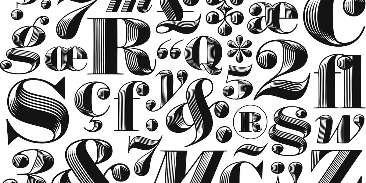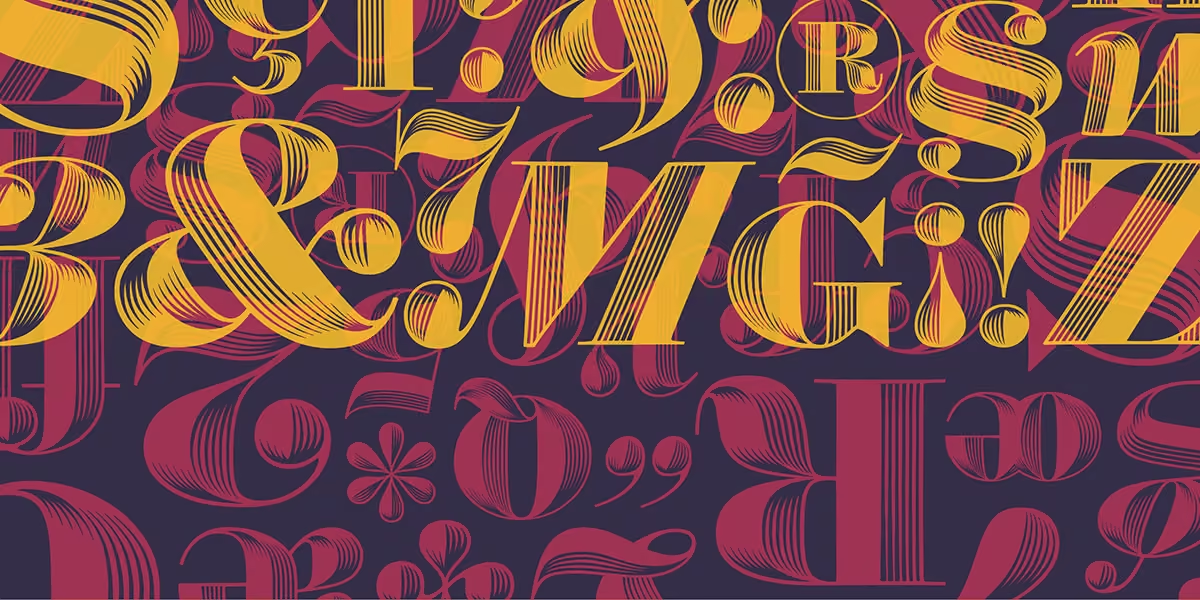
We are so proud to celebrate our partnership with Lippincott on the reimagined brand identity for NYC Pride!
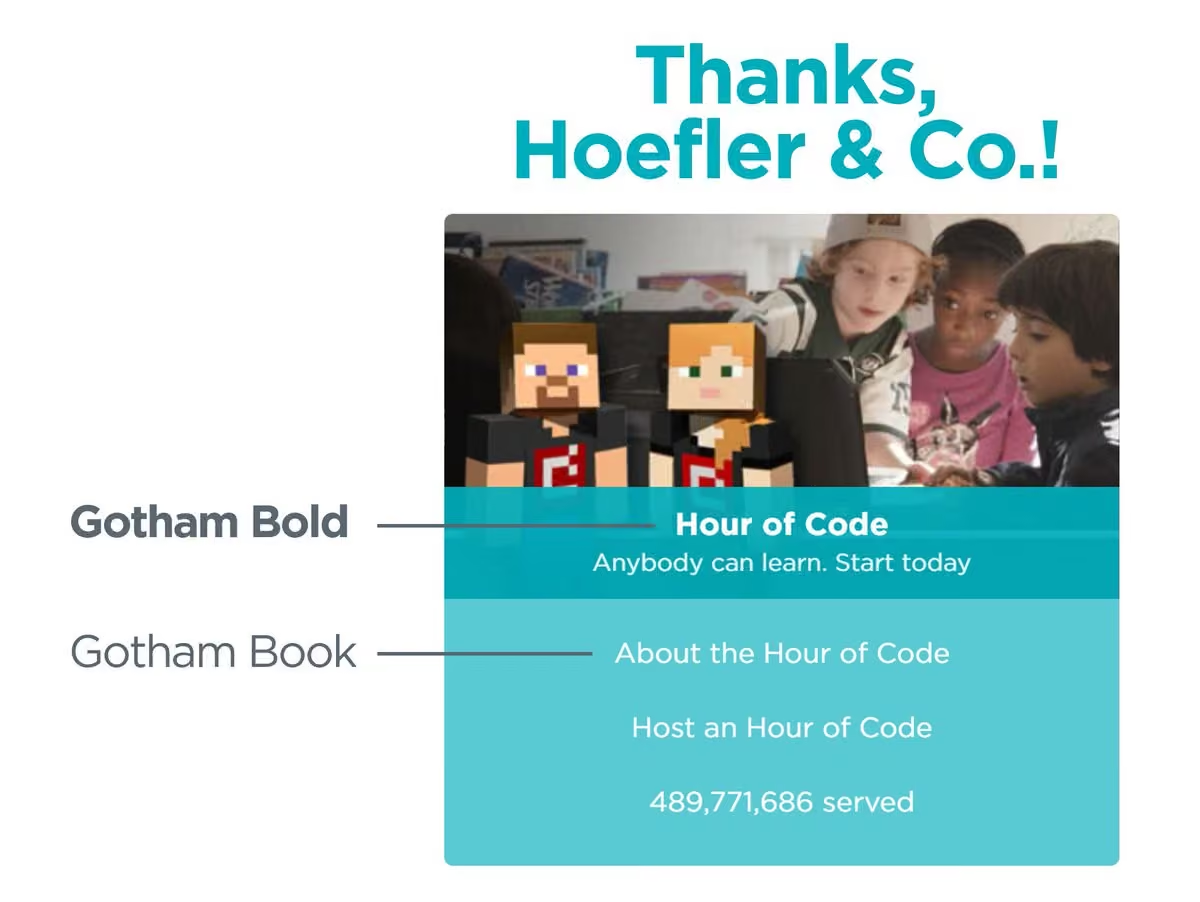
The inclusive new look uses two typefaces from our library, Knockout and Gotham. They lend a bold and direct, yet warm appearance.
Read more here: www.typography.com/blog/typography-for-nyc-pride
Hoefler & Co.
Hoefler & Co. (H&Co; stylized as Hoefler&Co.) is an American digital type foundry in Woburn, Massachusetts, founded by type designer Jonathan Hoefler. The company designs typefaces for clients and for retail on its website. More on Wikipedia
-
Hoefler&Co.
@HoeflerCo

-
Hoefler&Co.
@HoeflerCo
We’ve got some big news today: Hoefler&Co is joining the Monotype family. Here’s what we’ve got cooking! hflr.co/hcoxm 🧵➔
Post not available here, view on X
Hoefler&Co.
@HoeflerCo
To the designers who have trusted their work to my alphabets, the students who’ve taken the time to get in touch, and the ever-growing community of people around the world who have shared my affection for the craft: I am so deeply thankful. ➔
Hoefler&Co.
@HoeflerCo
I haven’t decided what the next step of my journey will look like, but I’ll be sharing things on @jonathanhoefler while the folks at Monotype take the reins here. Whatever comes next, I know it will involve letters, and I hope it will once again involve you. —JH
-
Hoefler&Co.
@HoeflerCo
Apparently not one to hold back, Historian Nicolete Gray, in just two pages, describes sans serifs of the period 1832–1838 as “crude”, “earnest”, “serious”, “gaunt”, “heavier”, “clumsier”, “dour”, “too fat”, “lumpish”… 🧵
Hoefler&Co.
@HoeflerCo
…“more threatening”, “lugubrious”, and made by an England that’s “awake to the conditions of unmitigated hardship,” “sternly evangelical,” and possessed of “tyrannical dogmatism” and “the will to face the dreariest facts.”
! -
Hoefler&Co.
@HoeflerCo
Something I actually asked today: “How are we coming with the Turkish Glaswegian Italic?”
-
Hoefler&Co.
@HoeflerCo
An acute summary of the design process, too:
Edward Zwick
@EdwardZwick1
A SCREENWRITER’S OMNIBUS
Tips, tricks, & tirades -
Hoefler&Co.
@HoeflerCo
I don't know how I’d never seen this lettering before, from one of the “type Kaufmann” 50 deustschemark notes (1948–1960). That is some fraktur.
-
Hoefler&Co.
@HoeflerCo
As a teenager, when given an opportunity to play the pipe organ at York Minster Cathedral, I panicked and forgot all the music I’d ever learned and instead performed “Jump” by Van Halen
Hoefler&Co.
@HoeflerCo
I’m not saying it didn’t totally shred
-
Hoefler&Co.
@HoeflerCo
I’m very fond of Northwestern University Library Preservation’s instagram (nul_prescons) — today they wrote up a case study of adapting a binding for digitization. I love seeing what goes into these projects!
sites.northwestern.edu/northwesternlibrary/2021/08/19/con… -
Hoefler&Co.
@HoeflerCo
This goes for mobile OSes generally. I have an elderly relative who’s resourceful and quick-witted, but ***constantly*** confounded by apparent UI dead ends, because some checkbox or button is outside the bounding box thanks to a 1.5x font size. 🧵 ↓
Kitty Giraudel
@KittyGiraudel
I have terrible eyesight, so I use Twitter’s largest font size (from their Display settings) and I can tell you no one is testing the interface with that setting.
Hoefler&Co.
@HoeflerCo
Also not helping: visually prioritizing new features and promos above functionality. If your user is 81 and needs a ride to the eye doctor, this might not be the moment to confront her with an upsell for “Uber E”[ats], especially if the “no/got it/screw off” link is unreachable.
-
Hoefler&Co.
@HoeflerCo
!
Beyond Wordplay
@beyondwordplay
In Japanese, the Iroha is a perfect pangram poem from 1079, using each syllabary character once.
以呂波耳本部止
千利奴流乎和加
餘多連曽津祢那
良牟有為能於久
耶万計不己衣天
阿佐伎喩女美之
恵比毛勢須
It’s also an ordering device, like the ABCs, used in some contexts today.
5/6 -
Hoefler&Co.
@HoeflerCo
One more thought here: designers, if you don’t give your designs nicknames, your clients will. This doesn’t necessarily go well.
-
Hoefler&Co.
@HoeflerCo
In a related story, we also have a font for anyone whose surname is “Great Primer Uncials”
-
Hoefler&Co.
@HoeflerCo
!!!!!
Present & Correct
@presentcorrect
See also: Typography & Logos in Knitted Structures.
www.researchgate.net/publication/278410243_Typography_and… -
Hoefler&Co.
@HoeflerCo
I’ve been tweeting about ink traps, “daggers” (aka “light traps”), and thinking about other transmogrifications for saving type. And then this thing pulls up outside. Are there no strategies for defending vinyl against the elements?
-
Hoefler&Co.
@HoeflerCo
If you’re curious what “anti-aliasing” looked like back in the day. No fooling!
Hoefler&Co.
@HoeflerCo
This is from “Digital Formats for Typefaces” by Dr. Peter Karow, 1987, a book chocked full of fascinating answers to optical problems.
-
Hoefler&Co.
@HoeflerCo
Here’s a Photoshop mockup simulating the effects of overexposure (blur; normalize levels.) The “daggers” affixed to the letterform help preserve the corners. (Probably even better on the typesetter than in the .psd!)
→ @MSilvertant @Illegal_Aileen @JaniPaavola @inkxel -
Hoefler&Co.
@HoeflerCo
Hey @Tosche_E, do I remember that you were looking for names for a “reverse ink trap?” Here’s one I hadn’t seen before: “daggers,” from Osterer & Stamm’s wonderful book about Adrian Frutiger. Enjoy!
Hoefler&Co.
@HoeflerCo
For those who haven’t read @Tosche_E’s article about ink traps (and what he called “light traps,” a term I like), here it is:
tosche.net/blog/ink-traps-and-pals -
Hoefler&Co.
@HoeflerCo
Dammit I never remember how “the lady or the tiger” goes
Hoefler&Co.
@HoeflerCo
I think you have to ask the iCal calendar what the other calendar would say, knowing that one calendar always lies, so it’s that one
-
Hoefler&Co.
@HoeflerCo
How is there no Wikipedia entry for Photo Lettering?
en.wikipedia.org/w/index.php?title=Photo_Lettering_Inc.
cc @houseindustries @TypeLettering @NickSherman -
Hoefler&Co.
@HoeflerCo
“Small Cap.”
I’ll show myself out
Capybaras
@CapybaraCountry
-
Hoefler&Co.
@HoeflerCo
I would also like to thank @szkolny, @colinmford & @JordanTBell for letting me cajole them into giving this new typeface fourteen different ampersands. Twenty-one if you include italics. And 168 if you count all eight weights.
-
Hoefler&Co.
@HoeflerCo
I won’t say that we’re investing too much time in this typeface, but I would ask that every man, woman, and child on earth please buy four copies of it
-
Hoefler&Co.
@HoeflerCo
Ah yes! @kelvinhoefler is my brother-from-another-mother-and-father, which is to say we’re probably unrelated and have never met. But OLYMPIC MEDAL, holy smoke! Parabéns!🇧🇷
Anah 🐊
@anah_assumpcao
Congrats Kelvin Hoefler! In addition to having won the silver medal in Skate for Brazil, you also carry the name of one of the best type foundries in the world (and also my favorite!) @HoeflerCo
#prata #typography #fonts #skateboarding -
Hoefler&Co.
@HoeflerCo
If I ever meet Linus Torvalds, we’re going to have some words about Git.
-
Hoefler&Co.
@HoeflerCo
This Day in History, 21 July 2021: The scale tool was used to successfully modify a glyph drawing, and no further manual adjustments were needed. The post office is going to mark the occasion with a special commemorative stamp
-
Hoefler&Co.
@HoeflerCo
At long last, adjudication from the @APStylebook: use an apostrophe with “virus,” but a foot mark with “Dickens,” “Hercules,” or “Kansas.”
APStylebook
@APStylebook
AP style for possessives. SINGULAR COMMON NOUNS ENDING IN S: Add ’s: the virus’s reach, the virus’s spread.
SINGULAR PROPER NAMES ENDING IN S: Use only an apostrophe: Dickens' novels,Hercules' labors, Kansas' schools. -
Hoefler&Co.
@HoeflerCo
While I’m at it, don’t forget to kern “//” and “://” for, well, you know what.
Hoefler&Co.
@HoeflerCo
Tip: remember to kern the pairs “®,” and “®.”
Ditto ™, ™. ℠, ℠. and probably also ®„ ™„ ℠„.
Oh, and .* *. ,* *, *—. The way you do .” .’ ,” ,” —”. etc. Then *” ”* *’ ’*, and again with † and ‡.
In fact just go ahead and kern all these horrible insects to one another. -
Hoefler&Co.
@HoeflerCo
Tip: remember to kern the pairs “®,” and “®.”
Ditto ™, ™. ℠, ℠. and probably also ®„ ™„ ℠„.
Oh, and .* *. ,* *, *—. The way you do .” .’ ,” ,” —”. etc. Then *” ”* *’ ’*, and again with † and ‡.
In fact just go ahead and kern all these horrible insects to one another. -
Hoefler&Co.
@HoeflerCo
Yes, the chairs in Quark's Bar came from Ikea, according to star-trek.design that sleuths the origin of Star Trek props. They've just redesigned using our Tungsten typeface that's used in the new LCARS in "Picard!"
-
Hoefler&Co.
@HoeflerCo
A type specimen book I don't have in my collection:
www.ebay.com/itm/254874879597 -
Hoefler&Co.
@HoeflerCo
So are we all redesigning our sites to work around the "URL footer" in Safari for iOS 15, or are we all waiting for Apple to inevitably change their mind about this intrusive bit of UI?
-
Hoefler&Co.
@HoeflerCo
New at typography.com: the stories behind “Numbers,” a set of fifteen fonts inspired by non-typographic sources. hflr.co/yv13u
-
Hoefler&Co.
@HoeflerCo
This is promising. Thanks to @markboulton for the tip!
www.itsnicethat.com/news/facebook-ai-textstylebrush-digit… -
Hoefler&Co.
@HoeflerCo
Top this Wikipedia image.
Hoefler&Co.
@HoeflerCo
I do love that the image for "humans" is the meeting between Nixon and Brezhnev.
-
Hoefler&Co.
@HoeflerCo
Can confirm
-
Hoefler&Co.
@HoeflerCo
“European ideas of African illiteracy are persistent, prejudiced and, as the story of Libyc script shows, entirely wrong”
aeon.co/essays/africas-ancient-scripts-counter-european-i… -
Hoefler&Co.
@HoeflerCo
Remembering that the first sans serif printing type appeared in 1815, take a moment to appreciate this expertly realized sans serif, on a bronze medallion, from 1446. That’s a decade before Gutenberg.
Hoefler&Co.
@HoeflerCo
The markings on coins are often mentioned as examples of lettering that prefigures typography, but these large medallions make for their own interesting study: they were the products of superior artisans, and struck in limited and more controlled circumstances. Fascinating.
-
Hoefler&Co.
@HoeflerCo
Some new things are making their way to typography.com this week. hflr.co/6u52a
-
Hoefler&Co.
@HoeflerCo
I know which term I'm choosing.
-
Hoefler&Co.
@HoeflerCo
High on my list of Favorite Things are Erik’s drawings. (@letterror). Check them out!
www.instagram.com/p/CPI1XPbBA1h/ -
Hoefler&Co.
@HoeflerCo
I can now confirm that the author of my refrigerator’s service manual is, in fact, this clam
-
Hoefler&Co.
@HoeflerCo
Are there non-ugly electric pencil sharpeners in current production?
-
Hoefler&Co.
@HoeflerCo
Become a type designer!
• Help shape the fabric of the world’s communications
• Immerse yourself in a fascinating cultural history
• Get to draw the Ultra Italic tabular ASCII tilde -
Hoefler&Co.
@HoeflerCo
Turning to punctuation news,
www.washingtonpost.com/local/obituaries/john-richards-dea… -
Hoefler&Co.
@HoeflerCo
Says so much.
-
Hoefler&Co.
@HoeflerCo
I really can’t wait to see this thing.
OMATA
@omata
Typ. P prototype with @HoeflerCo Decimal and Sagittarius (if youblook very closely..) #rideomata #productdesign #typography
-
Hoefler&Co.
@HoeflerCo
A belated congratulations to Johannes Gutenberg on this august honor
-
Hoefler&Co.
@HoeflerCo
Hey @yatil (& others), can you recommend a good reference regarding HTML entities and screen readers? I'm trying to advise a colleague on how "№" will be interpreted in speech. Thank you! #a11y
-
Hoefler&Co.
@HoeflerCo
Really outstanding research by @typeoff into German 19th century sans serifs. Rigorous, transparent, written with clarity and vitality, and the typefaces are enchanting. A great read to learn about how type history is studied! www.typeoff.de/2021/04/research-results-sans-serif-type-i…
-
Hoefler&Co.
@HoeflerCo
Great fun this weekend at @kellianderson’s Riso animation workshop! The digital-analog round trip was a wonderful whirlwind (as is nine font families in three seconds.) And thanks to Keegan at @thearm for hosting our virtual visit!
Hoefler&Co.
@HoeflerCo
(Sentinel, Tungsten Rounded, Deuce, Knockout, Ringside, Decimal, Inkwell Script, Verlag, and Cesium, if you’re playing along at home. All for a ginned-up "16mm film leader," which felt like a good fit for my juddering freshman animation.)
-
Hoefler&Co.
@HoeflerCo
My annual read of www.mcsweeneys.net/articles/the-four-horsemen-of-gentrifi….
-
Hoefler&Co.
@HoeflerCo
I tapped. The offensive content? I kid you not: a polite discussion about merge conflicts in git.
Yet I totally understand the trigger warning. -
Hoefler&Co.
@HoeflerCo
Progress.
White House 46 COVID-19 Response Team Archived
@WHCOVIDRes46
Before President Biden took office, he set a goal of administering 100 million doses of COVID-19 vaccines in his first 100 days, which meant increasing vaccine supply and then turning vaccines into vaccinations. Today, on his 58th day in office, we have reached that goal.
-
Hoefler&Co.
@HoeflerCo
I appreciate the removal of "Re: Re: Re: Fwd: Re: Antw: Re: Re: Fwd: Re:" from the subject line, but nonetheless, this is getting ridiculous.
-
Hoefler&Co.
@HoeflerCo
From the 1905 type specimen book of Fonderie Typographique, Maison Van Loey-Nouri. My French is a little rusty, but I believe the caption translates as “another satisfied customer.”
-
Hoefler&Co.
@HoeflerCo
That logo, though: hot.
southpaw
@nycsouthpaw
The DC Circuit has announced that it is officially anti-Garamond.
-
Hoefler&Co.
@HoeflerCo
In which the Judiciary discovers that Point Size is Not a Reliable Indicator of the Apparent Magnitude of a Type-Face
southpaw
@nycsouthpaw
The DC Circuit has announced that it is officially anti-Garamond.
Hoefler&Co.
@HoeflerCo
If this doesn't get @typogforlawyers back to Twitter, nothing will.
Incidentally, if you're a lawyer, or even not a lawyer, you'll benefit from reading practicaltypography.com. -
Hoefler&Co.
@HoeflerCo
Tuesday morning, join me and more than 1,700 attendees (!) for an inside look at the Biden-Harris typography — a discussion with @robynkanner from the campaign and @TasteLemonaid from the @WhiteHouse. — online.sxsw.com/event/sxsw-online/planning/UGxhbm5pbmdfMz…
-
Hoefler&Co.
@HoeflerCo
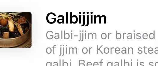
Here’s one for our typographic Grand Guignol, courtesy of @SamSifton in this morning’s @nytimes cooking newsletter. A harmonic convergence of dots!
Hoefler&Co.
@HoeflerCo
This one’s even better! en.m.wikipedia.org/wiki/Galbi-jjim
-
Hoefler&Co.
@HoeflerCo
My thanks to @JohnMayer for writing our FAQ:
-
Hoefler&Co.
@HoeflerCo
Nice work by @GabrieleWilson — I was pleased to see our Chronicle Display typeface in such good company, and make the final cut!
spinemagazine.co/articles/gabriele-wilson -
Hoefler&Co.
@HoeflerCo
Quality umlaut!
-
Hoefler&Co.
@HoeflerCo
Political design junkies: come join me at #sxsw2021 on 3/16, where I’ll be talking Biden-Harris Typography with @robynkanner from the campaign & @TasteLemonaid from the @whitehouse. 🇺🇸 hflr.co/sxsw21
-
Hoefler&Co.
@HoeflerCo
Don’t miss this today! The way Barbara Glauber thinks about typography has had such a profound influence on me — I promise you’ll dig it, too.
-
Hoefler&Co.
@HoeflerCo
Recommended! @maria_doreuli & @kristaradoeva have thoughtful observations borne of experience, which will be invaluable to anyone new to designing Cyrillic.
Cyrillicsly
@cyrillicsly
Only a couple of tickets left for the Full Program of our workshop!
✏️The practical part is limited to 12 spots, so that we have plenty of time to go into detail for each project. www.eventbrite.com/e/cyrillics-theory-and-practice-ticket… -
Hoefler&Co.
@HoeflerCo
Did you watch the 3½ minute video, from the cameras aboard @NASAPersevere, during the touchdown on MARS? It is breathtakingly moving:
ARCHIVED - NASA's Perseverance Mars Rover
@NASAPersevere
Your front-row seat to my Mars landing is here. Watch how we did it.
#countdowntomarsThis media couldn't be displayed. See it on the original post.
Hoefler&Co.
@HoeflerCo
As a distant, distant, distant aside: right to the top of the list of “places I never imagined I’d see our fonts” goes the video of @POTUS's call to @NASA. “The Perseverance Rover landed on Mars” — what a headline!
President Biden Archived
@POTUS46Archive
On Thursday, I joined the world and watched in awe as the Perseverance Rover touched down on the surface of Mars. It was a remarkable feat — one made possible by the hard work and ingenuity of the team at @NASA.
I called to congratulate them on their historic landing. -
Hoefler&Co.
@HoeflerCo
And here’s the full rundown of what characters are managed by Sagittarius's ‘discretionary ligatures.’ (Accents, too!) hflr.co/mc3i8
-
Hoefler&Co.
@HoeflerCo
Speaking of rounded typefaces, if you’re bothered by those little divots between adjacent hairlines, here’s the fix. Try it! — hflr.co/86rnw
-
Hoefler&Co. reposted
St Bride Foundation
@stbridefdn
Sudbury Town station was built in 1932 when Johnston’s 1916 Underground typeface was under review. A new face was commissioned from Percy Delf Smith. The experiment failed, but Smith’s serif face remains in situ today. A no. of his original petit-serif drawings are at St Bride.
-
Hoefler&Co.
@HoeflerCo
AND the Kerry-Edwards one mixed Georgia with ITC Berkeley, for, really, no imaginable reason.
Morgan Searcy
@morgansearcy_
Doing some research today and found a 2004 @nytimes op-ed from @sdadich and Paula Scher on logos of the 2004 presidential campaign.
-
Hoefler&Co.
@HoeflerCo
I am so charmed by this late 30s poster from the collection of the Library of Congress. www.loc.gov/item/98514560/
-
Hoefler&Co.
@HoeflerCo
Hey @PANTSSteve, I’ll donate $500 to your favorite charity if you promise to sneak this photo into the next printing of “Everything’s Coming Up Profits.” We can gin up some credible credits.
Batman 66 Labels
@BatLabels
COFFEE THE WORLD'S BEST WAY TO STAY AWAKE
-
Hoefler&Co.
@HoeflerCo
“During the development of the fonts… I often found myself unwittingly humming space-age pop songs.” Now you can, too! Enjoy this Spotify playlist for Sagittarius, our new typeface. 🤖🎧👂🐛 hflr.co/smusic
-
Hoefler&Co.
@HoeflerCo
Please welcome our new typeface, SAGITTARIUS. For beauty, wellness, and galactic conquest. ⑇
hflr.co/sgt -
Hoefler&Co.
@HoeflerCo
Now on Spotify: the soundtrack to the next H&Co typeface. hflr.co/smusic
-
Hoefler&Co.
@HoeflerCo
I can’t help but read this @MerriamWebster entry in the voice of Strong Bad.
-
Hoefler&Co.
@HoeflerCo
A wonderful bit of lore from Wikipedia — for which I can’t find any corroborating evidence whatsoever. 100% of google hits either post-date the Wikipedia page or quote it directly.
-
Hoefler&Co.
@HoeflerCo
Crestfallen that this illustration is about scanning tolerances for bank checks, and not, as I'd hoped, a specification for Magnetic Ink Character Recognition typefaces with Old-Style Figures, which would be: 🤘.
-
Hoefler&Co.
@HoeflerCo
Finally picking up the book that arrived on Monday, and I notice this on the last page.
Print-on-demand really is kind of incredible. -
Hoefler&Co.
@HoeflerCo
Appearing on Instagram, a little H&Co work-in-progress: two manicules I drew for our next typeface. hflr.co/i
Hoefler&Co.
@HoeflerCo
Input welcome!
-
Hoefler&Co.
@HoeflerCo
“Wakamai Fondue”, by @PixelAmbacht, is so wonderfully useful, elegant, and ridonculously easy to use. Drag a font into the browser, and see what your font can do: hflr.co/934np
Post not available here, view on X
Hoefler&Co.
@HoeflerCo
Ditto a reminder of which characters are substituted by standard OpenType transformations like “Stylistic Alternates” (here’s Obsidian):
Hoefler&Co.
@HoeflerCo
And finally a randomly generated sample of possible glyph combinations, to reveal the missing kerning pairs that will keep me up at night (and @JordanTBell, because this is Inkwell Script):
Hoefler&Co.
@HoeflerCo
Seriously, thank you for building this and sharing it, Roel! It's a really nice piece of work.
Hoefler&Co.
@HoeflerCo
Oh! One more: how handy is it to see what’s inside a font of Ornaments? This is Sentinel Bright Ornaments, for which I still owe the world a character map. Until then:
-
Hoefler&Co.
@HoeflerCo
This really feels like a rebuke to Beatrice Warde. #crystalgoblet
-
Hoefler&Co.
@HoeflerCo
And I was feeling so good about this one!
-
Hoefler&Co.
@HoeflerCo
I wonder how many people got the meta-meme in this one?
-
Hoefler&Co.
@HoeflerCo
There’s a Part 3 somewhere in my mentions, but I can’t find it.
-
Hoefler&Co.
@HoeflerCo
That kerning really bugs people. Part 2.
Chris Pommer
@mrpommer
@POTUS Great work on the website, but can we work on kerning for the in-house signage? Maybe appoint a Typographer in Chief? @frerejones @HoeflerCo
-
Hoefler&Co.
@HoeflerCo
That kerning really bugs people. Part 1.
-
Hoefler&Co.
@HoeflerCo
Nothing paralyzes me more than having to choose between the latest edition of a reference book, and the one that will actually bring me delight every time I see it.
-
Hoefler&Co.
@HoeflerCo
I grew up with the @IATSE logo, since my dad, a theatrical set designer, was a member of the United Scenic Artists union (local 829). It’s stirring to see them post about something to which we contributed: these are our Mercury & Decimal fonts in the hands of a union artist!
-
Hoefler&Co.
@HoeflerCo
All I’m saying is that my generation would be a lot less anxious if our childhood terror of an inscrutable president with “his finger on the button” had meant this:
Hoefler&Co.
@HoeflerCo
Also where might I obtain such a button
-
Hoefler&Co.
@HoeflerCo
Every few years I’m reminded that @MerriamWebster maintains a card catalog of words typed backwards, but I always forget why. Each time, it’s delightful to relearn the answer, so thank you @PeterSokolowski! → hflr.co/sdorw
-
Hoefler&Co.
@HoeflerCo
-
Hoefler&Co.
@HoeflerCo
He looks good at that desk.
Hoefler&Co.
@HoeflerCo
Photo by Doug Mills for The New York Times (www.nytimes.com/2021/01/20/us/biden-executive-orders.html)
-
Hoefler&Co.
@HoeflerCo
Thank you, Bryce. And I’ll tell you what else: I’m also enormously comforted, proud, and relieved to have seen how ON IT the entire Biden-Harris Transition Team was with *everything*. I’m taking this as a good harbinger of the years ahead.
Bryce M. Ulmer
@bmulmer
I noted it four years ago today, so here we go...it's nice to see @WhiteHouse website return to @HoeflerCo typefaces. Seems fitting after four years of poor quality leadership and design.
-
Hoefler&Co.
@HoeflerCo
A breath of fresh typographic air at whitehouse.gov. Kudos to @benostrower and @WideEyeCo for the redesign, cleverly flipping the Mercury and Decimal typefaces that were used in the campaign. →
Post not available here, view on X
Hoefler&Co.
@HoeflerCo
So it was fun talking to Ben about the White House, when he proposed this very same thing, and at the very same time: that the serif Mercury felt more like the voice of the institution, and that the sans serif Decimal could assist: →
Hoefler&Co.
@HoeflerCo
When three designers come to the same conclusion from different perspectives, you've got to hope that you're on to something. My enormous thanks to ALL of the teams who have put such hard work into the campaign, the transition, and the new White House website!
-
Hoefler&Co.
@HoeflerCo
-
Hoefler&Co.
@HoeflerCo
Now to watch an old movie with a friend! :)
Greta Thunberg
@GretaThunberg
He seems like a very happy old man looking forward to a bright and wonderful future. So nice to see!
-
Hoefler&Co.
@HoeflerCo
Americans, this is your moment: VOLUNTEER. It was the most meaningful thing I did last year, and to all who do, you are my sisters and brothers forever. ❤️🇺🇸
-
Hoefler&Co.
@HoeflerCo
I’m really without words.
-
Hoefler&Co.
@HoeflerCo
We made it.
-
Hoefler&Co.
@HoeflerCo
Also, AMANDA GORMAN. ❤️
-
Hoefler&Co.
@HoeflerCo
Hope.
-
Hoefler&Co.
@HoeflerCo
On the next iPhone, you should be required to insert and turn two keys simultaneously in order to activate "live mode" photography. No one individual should have access to such destructive power.
Hoefler&Co.
@HoeflerCo
But thank you, dear relative, for the "photos" of the new kitchen, each of which is a shaky one-second clip with talk radio blaring in the background.
-
Hoefler&Co.
@HoeflerCo
Well would you look at this charming New York City bodega! While you're there, don't forget to order a cinnamon raisin bagel with lox — it’s a favorite, here in The Big Apple.
Andrew Yang🧢⬆️🇺🇸
@AndrewYang
New York City loves its bodegas! The 14,000 bodegas are vital to our city - let’s support them and keep them open. 👍❤️🗽
This media couldn't be displayed. See it on the original post. -
Hoefler&Co.
@HoeflerCo
Historic: Trump is the first president to have been first IMPEACHED, and later IMPFACHED. I never thought I’d see the day.
-
Hoefler&Co.
@HoeflerCo
Hey @ultrasparky, my fellow Calypsomaniac: have you seen this? So close, and then, that G...
-
Hoefler&Co.
@HoeflerCo
Took me a moment to decipher this on @daringfireball. Nicely done.
-
Hoefler&Co.
@HoeflerCo
Just a note to say how lovely Lydia’s work is, and how much I enjoyed working with her for a typography.com project last year. Give her a ring!
Lydia Hill🍃
@lydiakahill
It's #portfolioday!
I'm currently available to take on projects from March 1st!
Character based/app/landing pages illos in the thread ⤵️
Reach out at:
🌐 lydiakahill.com/contact -
Hoefler&Co.
@HoeflerCo
This project by @kellianderson is absolutely charming!
vimeo.com/498429105 -
Hoefler&Co.
@HoeflerCo
Before your Sunday news binge, might I recommend this thread:
-
Hoefler&Co.
@HoeflerCo
This. Especially for my fellow Americans: this is an agonizing time. You’re not alone; if nothing else, I’m there too. As is Erik in Den Haag, below. Hang in there.
-
Hoefler&Co.
@HoeflerCo
First Trump. Then we investigate law enforcement. And then we investigate why these documents use three different serif fonts.
Hoefler&Co.
@HoeflerCo
With fake small caps, and stretched type, I might add
-
Hoefler&Co.
@HoeflerCo
In “Capital Scripts” by David Wright (The Oxford Handbook of Latin Palaeography), the topic of the “virgule” is taken up through the example of the Verona Virgil, after which there’s a palimpsest called the Paris Prudentius, and I’m not sure the author isn’t messing with us.
Hoefler&Co.
@HoeflerCo
In any case I am reading all of this in the voice of Danny Kaye.
-
Hoefler&Co.
@HoeflerCo
Wikipedia, you old devil.
-
Hoefler&Co.
@HoeflerCo
This was the blog post I had the most fun with this year.
www.typography.com/blog/text-for-proofing-fonts
Hoefler&Co.
@HoeflerCo
Also fun: working with illustrator @lydiakahill on our little pangrammatic zoo of hyraxes and jonquils, etc. It was also satisfying to shoehorn ten new styles to our CMS for the bold small caps, footnotes, etc — I'm grateful to H&Co’s @jimmy0x52 and his team for making it so!
-
Hoefler&Co.
@HoeflerCo
It was offline for a while, but I’m so glad it’s back: this four minute video about @theapparatus, which sets the high water mark for thoughtful narration:
hflr.co/1u2yb -
Hoefler&Co.
@HoeflerCo
Great piece by @lilly_smith48 in @FastCompany about the Biden design program. Step 1: don’t design for designers, design for voters.
www.fastcompany.com/90583515/design-for-all-americans-how… -
Hoefler&Co.
@HoeflerCo
PRO TIP: looking for a way to create an Adobe Illustrator document that will take 40 minutes to open? All you need to do is use 1,078 different fonts. It works! cc @AdobeDesign
-
Hoefler&Co.
@HoeflerCo
I really want to know who at @Illustrator thought these were intuitive options.
Post not available here, view on X
Hoefler&Co.
@HoeflerCo
Not being a jigsaw puzzle guy, I'm at least glad I can spend snowy weekends indoors by scrolling through this list of 63 fonts in non-alphabetical order.
Hoefler&Co.
@HoeflerCo
🤔🤔
-
Hoefler&Co.
@HoeflerCo
Adobe Illustrator is in a state of high dudgeon today.
-
Hoefler&Co.
@HoeflerCo
33 days.
-
Hoefler&Co.
@HoeflerCo
Every time I open the terminal, I remember the day that @andyclymer gingerly broached the possibility that maybe what if Operator Mono might consider having some cursive elements and OH HELL YES rolled out of my mouth unbidden. Thanks for this, my friend. hflr.co/oper
-
Hoefler&Co.
@HoeflerCo
I'm amazed that we made it all the way through the election without *anyone* noticing that. Props to my team at H&Co for adjusting "the J", which was actually forty Js (10 wts × caps/smallcaps × roman+italic) and about a million kerning pairs.
Will Dutchuk 🪷
@Will34890
Another that I think goes overlooked is the face that @HoeflerCo made a modified version of Decimal to remove the top bar (is that what it’s called?) on the J. I think that was super cool.
-
Hoefler&Co.
@HoeflerCo
There are times I think it’s possible that John Gruber @daringfireball actually notices everything.
daringfireball.net/linked/2020/12/16/biden-branding -
Hoefler&Co. reposted
For All
@forallhq
Our #georgiaonmymind design uses the gorgeous Obsidian font from @HoeflerCo, inspired by engraved lettering found on 19c maps. We were excited to use it for GA's changing electoral map! You can wear (or carry) it & support @fairfightaction! #gapol #gasen forall.studio/collections/ga-on-my-mind
-
Hoefler&Co.
@HoeflerCo
.@UniWatch shared this for the jersey, but I’m here for the background lettering. Yum!
Hoefler&Co.
@HoeflerCo
Alerting @EephusLeague that the sports/type streams have been crossed!
-
Hoefler&Co.
@HoeflerCo
Is it just me, or has everyone’s Twitter feed suddenly become a slurry of birdbrained promotional posts? It’s easily a third of what I’m seeing.
It’s like someone brought OutBrain home for Christmas, and the dinner table has become even more loud and exhausting.
Hoefler&Co.
@HoeflerCo
Today: Insurance, a gaming console, a charity, an idiotic gift I’d never conceive of giving a loved one, the same insurance ad, gear for a phone I don’t own, Apple (note to learn more about this intriguing new company), a You-Won’t-Believe post, a What’s-The-Secret-Behind post…
-
Hoefler&Co.
@HoeflerCo
Tap the photos.
-
Hoefler&Co.
@HoeflerCo
Pulldown menu for phone numbers: click to see the whole thing. This, in so very many ways, is: insane
Hoefler&Co.
@HoeflerCo
Looking at you, @Fortnums.
-
Hoefler&Co. reposted
Randall Munroe
@xkcd
Learning new things from Google
-
Hoefler&Co.
@HoeflerCo
An extraordinary image of newly-discovered ice age paintings, thought to be 12,500 years old. I’m struck by how modern these feel: they certainly remind me of the Maya codices, but also of Eames textiles. Really striking. www.theguardian.com/science/2020/nov/29/sistine-chapel-of…
-
Hoefler&Co.
@HoeflerCo
“Ideas cross all borders,” a hypnotically beautiful poster by Nadine Chahine, to help support a good cause:
Nadine Chahine 🇱🇧
@arabictype
My poster with @typeji for the #designacrossborders exhibit in Barcelona! You can buy these posters to help buy dignity kits for 277 Syrian women and girls here: www.acrossborders.es/charity/
-
Hoefler&Co.
@HoeflerCo
Wishing an especially Happy Thanksgiving to everyone who works in one of New York City’s challenging and overcrowded cranberry bogs.
-
Hoefler&Co.
@HoeflerCo
Years ago, I took an Italian class that met on Monday evenings. Every class began with each of us going around the room describing our weekends, in Italian. This is basically how it went.
The New York Times
@nytimes
We asked GPT-3 to write a Modern Love column. It wrote dozens; like all romances, some turned out better than others. www.nytimes.com/2020/11/24/science/artificial-intelligenc…
-
Hoefler&Co.
@HoeflerCo
“The Guy Who Decides Packaging” is a chilling three-minute exposé
youtu.be/iPf529urxw8 -
Hoefler&Co.
@HoeflerCo
Great thanks to @ilovetypography for including our type specimen in their typographic gift guide. It’s back in stock! $15, shipping free in thirty countries, and fully credited toward the purchase of fonts.
designshop.typography.com/collections/frontpage/products/… -
Hoefler&Co.
@HoeflerCo
I just backed “tat*” by WhyNotAssociates on @Kickstarter. You should, too! www.kickstarter.com/projects/1649001578/tat?ref=thanks-tweet
-
Hoefler&Co.
@HoeflerCo
I just backed Jaroslav Benda 1882–1970 Typographic designs and letterforms on @Kickstarter — you should, too! www.kickstarter.com/projects/783759658/jaroslav-benda-188…
-
Hoefler&Co.
@HoeflerCo
Bookmarked: that rare sentence that works either with or without the Oxford comma.
-
Hoefler&Co.
@HoeflerCo
I’ve just got to say thank you, as we all should, to @robynkanner & @TasteLemonaid & the #bidenharris2020 design team. You have no idea how much these folks sacrificed, or how hard they worked, for the public good. →
Hoefler&Co.
@HoeflerCo
This was demanding work, often without any reassurance, dedicated solely to making a vital political change for good in this country. Please take a moment to acknowledge that they did this, rather than taking plush jobs at dot coms, which every one of them had as an option. →
Hoefler&Co.
@HoeflerCo
And now that we’re here, please give every one of them as much support as you can, in whatever ways you can. They fought the hard fight, and as a citizen (as well as a designer) I’m forever in their debt. xxx J
-
Hoefler&Co.
@HoeflerCo
Howdy #aigadesignconf! I hope you’ll tune for tomorrow’s conversation about the #bidenharris2020 identity by @robynkanner, @TasteLemonaid and their smart & talented team, moderated by @jenniferkinon. Good vibes guaranteed.🇺🇸
AIGA
@AIGAdesign
JUST ANNOUNCED: Join us a special conversation about brand + design work from the 2020 election with the Biden For President (@TeamJoe) Design Team tomorrow, 11/13 at 12 p.m. EST
Day passes are still available for Day 5 of #aigadesignconf: aigadsgn.org/2GVZGBT -
Hoefler&Co.
@HoeflerCo
Surprising results on this, the only open election in America that still matters right now, except for Georgia.
Hoefler&Co.
@HoeflerCo
The character I’d most like to boot out of the Mac OS Roman character set, and replace with something more useful, is
-
Hoefler&Co.
@HoeflerCo
And the character that’s diabolically absent from the Mac keyboard, but which I wish I could access easily, is:
-
Hoefler&Co.
@HoeflerCo
The character I’d most like to boot out of the Mac OS Roman character set, and replace with something more useful, is
-
Hoefler&Co.
@HoeflerCo
I’m just saying, a “foundry” is a place that casts metal: there’s no such thing as a “wood type foundry.” When you’ve got whirring routers and aerosolized wood shavings, there’s not much call for volcanically hot liquid metal.
Hoefler&Co.
@HoeflerCo
You may now post your Terminator 2 gifs.
-
Hoefler&Co.
@HoeflerCo
Remarkable and beautiful. Looks a little like a Fred Tomaselli painting, or an aerial view of the 64 World’s Fair.
-
Hoefler&Co.
@HoeflerCo
Specifics are refreshing.
buildbackbetter.com/priorities/covid-19/ -
Hoefler&Co.
@HoeflerCo
omg THE PROPHECY
-
Hoefler&Co.
@HoeflerCo
Good thread.
-
Hoefler&Co.
@HoeflerCo
Hey @BCDreyer, what are your favorite up-to-date sources for usage notes about words? My spidey sense is tingling about a word that I keep reaching for, but there’s nothing about it in MW or American Heritage.
-
Hoefler&Co.
@HoeflerCo
The Transition team is GO. Great work from @benostrower’s team for the new administration!
buildbackbetter.com/the-transition/ -
Hoefler&Co.
@HoeflerCo
Everyone’s asking about the sky typography tonight, which I wasn’t involved with. The answer is — well, wow: @VergeAero
-
Hoefler&Co.
@HoeflerCo
What a night.
-
Hoefler&Co.
@HoeflerCo
Damn right. @BritishGQ.
-
Hoefler&Co.
@HoeflerCo
I can’t get enough of this “Four Seasons Total Landscaping” story. Best overheard comments so far: “wow, someone’s totally getting fired.” / “Someone did, honey!”
-
Hoefler&Co.
@HoeflerCo
This day, I tell you.
Press Association
@PA
Donald Trump's wax figure has been re-dressed into golf attire at Madame Tussauds, London, after Joe Biden was named the winner in the #uselectionresults2020
-
Hoefler&Co.
@HoeflerCo
This is a quality tweet
-
Hoefler&Co.
@HoeflerCo
Watching all the footage from all the neighborhoods.
-
Hoefler&Co.
@HoeflerCo
I LOVE NEW YORK!
Matt McDermott
@mattmfm
Incredible: Applause breaking out over the Manhattan skyline as networks call the election for Joe Biden & Kamala Harris.
Hoefler&Co.
@HoeflerCo
I’m going to be playing this all day.
-
Hoefler&Co.
@HoeflerCo
-
Hoefler&Co.
@HoeflerCo
I think I got a deck of cards around here somewhere.
-
Hoefler&Co.
@HoeflerCo
Hey @meganjasper, can you help?
Tony Thorne
@tonythorne007
I'm preparing my #youth #slang #glossary for open access publication very soon. Please donate any examples of recent youth slang via Twitter or via my website: language-and-innovation.com/2017/04/03/uk-youth-slang-now/
-
Hoefler&Co.
@HoeflerCo
Preparedness.
Contrast this with the Trump transition team, who hearing the H&Co web fonts licensed to the Obama White House expired 1/20/17, called us in January to ask if we could help them change copy and photos on the site, because no one knew how.
buildbackbetter.com
Hoefler&Co.
@HoeflerCo
I should also add that Trump’s loathsome communications have regularly used Gotham over the years, which — I know this will come as a terrible shock, you might want to sit down — nobody ever bought.
Hoefler&Co.
@HoeflerCo
My experience working with the Biden team is that they are On It, consistently planning for outcomes, thinking carefully about courses of action, and acting decisively. It’s a philosophy that runs deep, and is just another reason for confidence in the new administration.
Hoefler&Co.
@HoeflerCo
ps — don’t especially need to hear from any Trump revisionists or bots, but I’ll leave comments open so you can embarrass yourselves in public, which remains on brand.
-
Hoefler&Co.
@HoeflerCo
Promising work from a first-timer: this calligraphy is the debut work of lettering artist Joe Biden of Delaware. One to watch; this guy’s going places.
-
Hoefler&Co.
@HoeflerCo
Looks like a great day to be in Two Rivers hosting the @hamiltonwoodtyp Awayzgoose, which H&Co proudly supports. Also a great day to be from Wisconsin!
-
Hoefler&Co.
@HoeflerCo
This has been one of the two weirdest days of my life.
-
Hoefler&Co.
@HoeflerCo
In #omen news:
Manhattan Bird Alert
@BirdCentralPark
Plenty of BALD EAGLES flying over Manhattan today, and this is one of them.
-
Hoefler&Co.
@HoeflerCo
Just under the wire, the @JoeBiden creative team drops a couple of manicules (pointing fists) from Mercury Text, which might be the glyph I most loved designing.
-
Hoefler&Co.
@HoeflerCo
Lots of love for you all tonight.
-
Hoefler&Co.
@HoeflerCo
Took long enough, but it looks like “Whistler’s Mother” finally got a redesign
Hoefler&Co.
@HoeflerCo
Yes I know the name is “Arrangement in Grey and Black No. 1,” don’t @ me
-
Hoefler&Co.
@HoeflerCo
A treat from the Biden campaign: @robynkanner & her team share my fondness for the Numero symbol, & made this button using the № in Decimal. ¶ Must thank @EephusLeague for her fellow Numero enthusiasm, galvanizing my plan to put ’em in all our fonts! hflr.co/n76i9
-
Hoefler&Co.
@HoeflerCo
This, apparently, is a thing, from a stencil kit I’m being advertised on Facebook.
-
Hoefler&Co.
@HoeflerCo
Interesting developments in language translation, in this research project being opensourced by Facebook. Notably, English isn’t being used as an intermediary:
www.technologyreview.com/2020/10/19/1010678/facebook-ai-t… -
Hoefler&Co.
@HoeflerCo
If you’re looking for some steadying, reassuring perspective, check this out: 200 million miles away, we just landed a spacecraft on an asteroid. #scientistsftw
www.nytimes.com/2020/10/20/science/osiris-rex-mission.html -
Hoefler&Co.
@HoeflerCo
This is really a terrific resource.
Center for American Politics and Design
@politicsndesign
🚨 Update: Our 2020 logo archive is live! 🚨 politicsanddesign.com features the logos from the 2020 + 2018 Congressional + Presidential races and can be filtered by color, typography, iconography, party affiliation, district lean, gender, state, office, and incumbency.
-
Hoefler&Co.
@HoeflerCo
What on earth went down at the Franklin Type Foundry in 1892?
-
Hoefler&Co.
@HoeflerCo
Someone really misunderstood localization.
Hoefler&Co.
@HoeflerCo
However, you know what's the same in every language? “Paying $55 for a letter-sized piece of foam rubber.”
-
Hoefler&Co.
@HoeflerCo
Lots of nice Ed Benguiat stories today. So: who has a photo of the cockpit of his plane? Ed was an amateur pilot with his own plane, for which he famously redesigned all the instrumentation using fonts of his own choosing. I saw a slide once; it would be fun to get a closer look.
-
Hoefler&Co.
@HoeflerCo
A personal convergence of design Twitter, political Twitter, and Star Trek Twitter last night, when Wil Wheaton (@wilw) turned up for @TrektheVote with our Biden-Harris logo! Clearly, Ensign Crusher’s consciousness-raising explorations with the Traveler were not in vain. :)
-
Hoefler&Co.
@HoeflerCo
Ed Benguiat has passed away, just shy of his 93rd birthday. In memory of his generosity to me and so many other younger designers, and in honor of his extraordinary talent, let me show you a neat trick he shared with me when I was 18. →
Post not available here, view on X
Hoefler&Co.
@HoeflerCo
That was 32 years ago, and I still do this, and I still think of Ed *every* time I draw an italic. And I’ve never stopped thinking about kind he was to share this real secret of the guild with some kid. That was Ed. →
Hoefler&Co.
@HoeflerCo
So here’s to the memory of the talented, perspicacious, no-bullshit, and above all generous Mr. Ed Benguiat. Spend some time with his work, and you’ll learn a lot — I certainly did. Ed, we’re gonna miss you. —JH
-
Hoefler&Co.
@HoeflerCo
Macron with actual macron. #typeyuks
-
Hoefler&Co.
@HoeflerCo
Please don’t let me ever complain about how finicky Bézier curves can be.
-
Hoefler&Co.
@HoeflerCo
Thanks to @Harry_Stevens for this excellent herd immunity explainer in the @washingtonpost — clear, usefully interactive, and I hope persuasive:
www.washingtonpost.com/graphics/2020/health/coronavirus-h… -
Hoefler&Co.
@HoeflerCo
TIL today: “Titivillus was a demon said to work on behalf of Lucifer introduce errors into the work of scribes.” Clearly has branched out into programming, type design… en.wikipedia.org/wiki/Titivillus
Hoefler&Co.
@HoeflerCo
Thanks @JackieAShepherd for introducing me by name to this familiar demon!
-
Hoefler&Co.
@HoeflerCo
I love these subtle notes that Brian leaves in our Illustrator files.
-
Hoefler&Co.
@HoeflerCo
Now shipping: The Provisional Press, a home letterpress for $120. I learned of this from @ebecks927, who’s teaching printing via Zoom! hflr.co/prvprs
Hoefler&Co.
@HoeflerCo
By the way, let’s pause for a moment to appreciate just how challenging this is, and the extraordinary lengths to which teachers are going. Thanks Erin, and Steve and Liz Garst of The Provisional Press, and all the design educators out there.
-
Hoefler&Co.
@HoeflerCo
Designer: “So for the logo, we’re thinking ‘satan holding a composing stick.’”
Client: “Perfectly enshrines the brand promise, let’s do it.”
Kudos to the Cincinnati Type Foundry for signing off on their logo, which appeared on the title page of their 1860 specimen book. -
Hoefler&Co.
@HoeflerCo
Still the creative and generous city it’s always been. I♥NY.
Jennifer Smith
@JenSmithNYC
Just mourning the death of NYC with some incredible stoop-side Brahms in Brooklyn
-
Hoefler&Co.
@HoeflerCo
Writers who are genuinely fine writers, and not merely the progenitors of a genre: who’s on your list?
Mine begins with H. G. Wells. Last night I revisited Arthur Conan Doyle, discovering that I’d never read the novels, only the short stories: they’re a welcome surprise.Post not available here, view on X
Hoefler&Co.
@HoeflerCo
Also I never closed the quote in that second tweet and it’s gonna HAUNT ME
Hoefler&Co.
@HoeflerCo
”
-
Hoefler&Co.
@HoeflerCo
TFW @taylorswift13 renders a logo you designed, in icing. Nice job on those Decimal Rs!
-
Hoefler&Co.
@HoeflerCo
Trying to quiet the whirring fan on a MacBook Pro really feels like trying to soothe an angry dog. You formulate a plan, you do things, you hope they help, and eventually the situation improves, without your ever really knowing if anything you did made a difference at all.
Hoefler&Co.
@HoeflerCo
To be clear, it’s not the sound of the fan, it’s the *presence* of the fan on a freshly-rebooted computer. Activity Monitor isn’t pointing fingers. But it sounds like it’s taxiing for take off, so I assume the bastard child of Chrome and Spotlight is running somewhere.
-
Hoefler&Co. reposted
Lubalin Center
@lubalincenter
Just learned that Roman bakers stamped/branded their bread.
www.ancientresource.com/lots/roman/roman-byzantine-bread-… (images further down the page) -
Hoefler&Co.
@HoeflerCo
Turning it off, and rewatching last week’s Lower Decks. It’s cute, and there’s even a font joke.
-
Hoefler&Co. reposted
Tyler Pager
@tylerpager
Joe Biden boards a plane to Cleveland for his first debate with President Trump. The Biden campaign has a new plane with the Biden/Harris logo on the side.
-
Hoefler&Co.
@HoeflerCo
New today: “Fonts for Cartography,” a selection of typefaces recommended for maps (or inspired by mapmaking) — with a tour of the less obvious features that suggest specific kinds of fonts for specific kinds of maps. → hflr.co/7dc9s
-
Hoefler&Co.
@HoeflerCo
Seriously, though: to know that he stepped out of the way so that the design team could do a professional job — just imagine how a Biden administration will manage the NIH.
Hoefler&Co.
@HoeflerCo
AND he’s that rare client who can distinguish personal preferences from the needs of the design project.
-
Hoefler&Co.
@HoeflerCo
AND he’s that rare client who can distinguish personal preferences from the needs of the design project.
-
Hoefler&Co.
@HoeflerCo
We're hiring! H&Co is looking for a front-end developer with ReactJS experience, a predilection for design, and a _very_keen_eye_ for details, to help us on a contract basis. If this is you, get in touch! Introduce yourself, and include some favorite work samples, by writing…
Hoefler&Co.
@HoeflerCo
More at hflr.co/react2020.
Please, no recruiters, etc. -
Hoefler&Co.
@HoeflerCo
Jeez
-
Hoefler&Co.
@HoeflerCo
A breath of fresh air from the U.S. Court of Appeals for the Fifth Circuit, which has officially adopted Matthew Butterick’s “Equity” typeface as the official font for its opinions and orders:
Hoefler&Co.
@HoeflerCo
Judge Don Willett explains: “Our job is not just to present clear opinions, but to present our opinions clearly.… We must present our best opinion, not merely a passable one. And that presentation begins before the first word is ever read.”
Hoefler&Co.
@HoeflerCo
Always nice when a jurist describes a typeface as “a fully loaded Ford F-150).” It’s Texas. :)
-
Hoefler&Co.
@HoeflerCo
Finally, a worthy successor to William Carlos Williams:
Chuck Grassley
@ChuckGrassley
If u lost ur pet pidgin /it’s dead in front yard my Iowa farm JUST DISCOVERED here r identifiers Right leg Blue 2020/3089/AU2020/SHE ///LEFT LEG GREEN BAND NO PRINTED INFO. Sorry for bad news
-
Hoefler&Co.
@HoeflerCo
-
Hoefler&Co.
@HoeflerCo
Behold the combined power of mathematics and graphic design:
-
Hoefler&Co.
@HoeflerCo
Retweeting this not only for the image, but for John’s salient subsequent comments about fit. Read on.
Tiro Typeworks
@TiroTypeworks
Examples of 10th Century letterforms produced in coin dies using a combination of graver and triangular or round punches. From Grierson, _Catalogue of the Byzantine Coins in the @DumbartonOaks Collection_, Vol.3 Part 1, p.184.
-
Hoefler&Co.
@HoeflerCo
Here are a few to get you started! (1) Johnston’s “Alphabets to Order” is one of my favorites: it assesses type specimens as literature, rather than catalogs: hflr.co/alph2order →
Post not available here, view on X
Hoefler&Co.
@HoeflerCo
(9) These are more about typefounding than specimens per se, but you should have E. R. Mores' “Dissertation” (hflr.co/mores) and T. B. Reed’s “History of the Old English Letter Foundries” (hflr.co/tbreed). Happy hunting! —JH
Hoefler&Co.
@HoeflerCo
Oh, one more: André Jammes’ “Collection de spécimens de caractères 1517-2004” is more of a coffee table book, but it’s full of delights, and a nice slice through visual history. hflr.co/jammes
-
Hoefler&Co.
@HoeflerCo
Sometimes an Å just gets you right here.
Colin M. Ford
@colinmford
You've done well when Jonathan @hoeflerco draws this on your proof
-
Hoefler&Co.
@HoeflerCo
Can't say that I really recommend typing “/slackfont Nitro-Turbo” into Slack, but it’s nice to see the two italics battling it out. Also to hear everything in the voice of Don LaFontaine.
-
Hoefler&Co.
@HoeflerCo
Enjoyable distraction of the day: trying all of our fonts in Slack. I think this might be a keeper, though: /slackfont RingsideCondensedSSm-Book lets me devote FAR less screen real estate to the app. Fun!
-
Hoefler&Co.
@HoeflerCo
Man, it’s been an entire day of Yak Shaving, and I can’t even complain about it artfully because there’s no yak emoji. So apparently the yak shaving continues.
-
Hoefler&Co.
@HoeflerCo
When we were prepping the Sentinel Pro fonts, @colinmford and I worked to make sure that “32-1/4” would be rendered as “32¼,” but “9/2/20” would remain a date. It’s difficult to outthink users and their applications — just ask these geneticists:
www.engadget.com/scientists-rename-genes-due-to-excel-151… -
Hoefler&Co.
@HoeflerCo
This is really well done, both as a UI and as a civic act. (Also pleased because our Ringside ScreenSmart fonts are part of the mix!)
Elizabeth Warren
@ewarren
Everyone's watching the top of the ticket—and rightfully so. Donald Trump is a threat to our rights, values, and democracy. But change must also grow from the ground up.
Read up on the amazing local candidates I've endorsed, and sign up to help them win: elizabethwarren.com/Endorsements -
Hoefler&Co.
@HoeflerCo
Highly recommended types of social media accounts to follow, to ward off despair:
🌺 Gardeners
🦅 Birders
🔬 Art conservationists
🎺 Ensemble musicians, any genre
📖 Authors & illustrators of children’s books
🌌 Astronomers
👑 Historians with nutty specialties
🤖 Absurdist bots
Hoefler&Co.
@HoeflerCo
Also:
📚 Lexicographers
🔖 Bookshops and publishers
🧮 Mathematicians
☁️ Poets
🍞 Chefs, restaurateurs, & foodies generally
😂 Satirists -
Hoefler&Co.
@HoeflerCo
This looks really charming! Congratulations to @tylerclarkburke on the publication, and thanks so much for making our Ideal Sans typeface a part of the project. Definitely the smile I needed this morning.
-
Hoefler&Co.
@HoeflerCo
This is ingenious.
(*And* a way to justify emoji to the emojiphobic!)
Kelly Vaughn
@kvlly
I saw a post on LinkedIn that recommended adding an emoji at the beginning of your name because you could see who was using some sort of automation tool to send out connection requests.
I can now confirm it works. -
Hoefler&Co.
@HoeflerCo
If you though the imperial measurement “the foot” was lunacy, you’ll love this: there are actually two competing standards for the length of the foot. Both are still in use.
#onlyinamerica
www.nytimes.com/2020/08/18/science/foot-surveying-metrolo… -
Hoefler&Co.
@HoeflerCo
I’m so pleased to see that Henry James, long out of work, has found a position at the @nytimes
Editing TheGrayLady
@nyt_diff
Change in Abstract
-
Hoefler&Co.
@HoeflerCo
I can’t believe Trump’s www.keepamericagreat.com had the hubris to use the Biden fonts!!!
Hoefler&Co.
@HoeflerCo
Made you look.
-
Hoefler&Co.
@HoeflerCo
Of the many reasons to be apprehensive about the new Amazon appliance, which renders images of you in your underwear and then tattles about your emotional state (click to buy chocolate), here’s one by one of my favorite lexicographers: the science is, in a word, crap. Read on:
-
Hoefler&Co.
@HoeflerCo
The next time I get frustrated working in Illustrator, I’ll need to remember that it’s still easier than working in lawn.
Nick Jackson
@nbj914
can I get a ruling on this? how'd they do with the kerning?
-
Hoefler&Co.
@HoeflerCo
Congratulations to the @typemedia class of 2020! If you’re a friend of type, please consider supporting the fundraiser to provide for an exhibition and catalog of their work: hflr.co/tm2020
-
Hoefler&Co.
@HoeflerCo
One way is to open a type foundry
Conor Nolan
@conor_draws
How do I make a career out of drawing many varieties of the same thing?
-
Hoefler&Co.
@HoeflerCo
Removing the crabapple trees from the White House is not only an act of philistinism and an ugly rebuke to a beloved first couple, it’s bad design: Bunny Mellon didn’t plant them arbitrarily. But it sounds like they could return — here’s hoping the next tenant takes an interest.
Kate Bennett
@KateBennett_DC
Notably absent from updated Rose Garden are the ten crabapple trees - five per side - that were part of the original 1962 design. The trees, I am told, were removed to the off-campus White House gardening center for care. They will eventually be replanted on the WH grounds.
-
Hoefler&Co.
@HoeflerCo
There are already about 500 highlights of tonight’s @DemConvention, but boy did I enjoy this background, which I’m pretty sure is by Paula Scher @pentagram
-
Hoefler&Co.
@HoeflerCo
When this whole thing is over, I can’t wait to see more of this country.
Hoefler&Co.
@HoeflerCo
Thank you, delegates to the #dnc2020convention.
-
Hoefler&Co.
@HoeflerCo
They should always do the convention this way. It is stirring.
-
Hoefler&Co.
@HoeflerCo
Over at pixel envy, @nickheer takes the occasion of the 2020 election to meditate on the typography of the White House website. Here’s chronology of some of the fonts it used during the Obama years: hflr.co/w1cp6
Pixel Envy
@pxlnv
Typography for the Biden-Harris Campaign pxlnv.com/linklog/biden-harris-typography/
-
Hoefler&Co.
@HoeflerCo
Q: You must have known it was Harris for a long time, huh
A: Nope, found at the same time as you.
Q: Then how did the logo happen?
A: Here's the scoop: hflr.co/4uq25 -
Hoefler&Co. reposted
Center for American Politics and Design
@politicsndesign
Campaign update: Official Biden Harris logo. All caps, red and blue. Evolution of Biden's previous logo using @HoeflerCo's Decimal typeface. #bidenharris #biden2020
-
Hoefler&Co. reposted
Rob Flaherty
@Rob_Flaherty
We found this button from the VP's campaign in '78 and decided to bring it back (In The New Font). store.joebiden.com/classic-joe-button-2-pack/
-
Hoefler&Co.
@HoeflerCo
I love the easter egg. Read on…
Rob Flaherty
@Rob_Flaherty
🚨 New website!! 🚨
www.joebiden.com -
Hoefler&Co.
@HoeflerCo
Congratulations to @robynkanner and her team on launching the new @JoeBiden website. As both typographers and citizens, we’re grateful for all your hard work! →joebiden.com
-
Hoefler&Co.
@HoeflerCo
So true! (Also, if you’re not familiar, google “Wilhelm Scream.” You are welcome.)
How Bowers
@GoAwayGreen
I’m beginning to think Chicago is the Wilhelm Scream of typography, used as an in-joke by designers. It shows up on al kinds of signs.
-
Hoefler&Co.
@HoeflerCo
If you’re feeling the need for a dose of the natural world during these challenging times, I recommend checking in with Walter Kitundu (@birdturntable) who shares the most splendid photographs.
-
Hoefler&Co.
@HoeflerCo
I won't lie, this is a thrilling headline to see. But the credit (and the award, if we win!) belongs to the team at which I'm at the very bottom: it starts with @sdadich, @TremoloDocs & Dave O'Connor, director Brian Oakes; @Paulachowles & Allie Fisher, and @anthonyzazzi; →
Post not available here, view on X
Hoefler&Co.
@HoeflerCo
Telling the story of typeface design is HARD, and it's rare to tell it correctly or well. These people made our wackadoo industry come alive for design enthusiasts in a way I never imagined, and I'm so rooting for the Emmy to wind up on their shelf!
Hoefler&Co.
@HoeflerCo
Mind you, if we do win, I am totally taking a small part of it home, perhaps busting off a foot, or wrenching off one of the electrons
-
Hoefler&Co. reposted
Cloud Typography
@cloudTypography
Project publishing issues have been resolved and it is safe to publish changes and updates to your cloud projects!
-
Hoefler&Co. reposted
Cloud Typography
@cloudTypography
We’re working on an issue that’s affecting some Cloud.typography customers who are currently making adjustments to their projects. (Font delivery to websites is NOT affected.) Sorry for the trouble — keep you posted!
-
Hoefler&Co.
@HoeflerCo
A good exchange between @LauraKalbag & @fj about the perils of calling out an event for a lack of diversity. First-time speakers, please reach out to veteran speakers if we can help! I WILL go to bat for you, and I encourage others to do the same.
-
Hoefler&Co.
@HoeflerCo
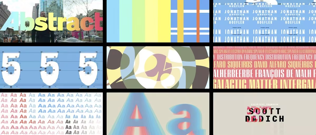
Congratulations to the @AbstractNetflix team — especially the incredibly talented @anthonyzazzi — for Abstract’s Emmy nomination for Outstanding Main Title Design! www.emmys.com/awards/nominees-winners/2020/outstanding-ma…
-
Hoefler&Co.
@HoeflerCo
The internet’s version of “which this margin is too narrow to contain”
Hoefler&Co.
@HoeflerCo
-
Hoefler&Co. reposted
Ayanna Pressley
@AyannaPressley
*mic check*
As we mark #ada30 and fix our eyes on the continued struggle for disability justice, we uplift CBC Chairman Major Owens.
Told that the ADA was too ‘radical’, he fought to make it law & built a powerful coalition affirming that disability rights are civil rights.This media couldn't be displayed. See it on the original post. -
Hoefler&Co.
@HoeflerCo
New from H&Co! Please welcome Sentinel Pro, an expansion of the family to include not only small caps, tabular figures, and more — but also a pair of fonts containing 250 ornaments.
hflr.co/p28fa -
Hoefler&Co.
@HoeflerCo
Is it just me, or is @SlackHQ starting to show only some images in the app? Others, when I click, open a browser that demands a login, a 2FA confirmation, etc… Why? It's a 396k PNG pasted from the clipboard.
-
Hoefler&Co.
@HoeflerCo
Two typefaces — and a typographic system — created for the Biden campaign: hflr.co/riwo7
-
Hoefler&Co. reposted
Jake Lahut
@JakeLahut
Senior creative adviser @robynkanner:
"Decimal’s main inspiration comes from the typefaces used in wristwatches. It’s true as time. Mercury’s primary use has been used in print, for various magazines and newspapers. It holds the truth of a written word."
www.businessinsider.com/biden-campaign-new-fonts-decimal-… -
Hoefler&Co.
@HoeflerCo
I couldn’t be more proud that the @JoeBiden campaign has adopted our Decimal and Mercury typefaces, and to see these fonts used in a campaign of sophisticated ideas, nuanced thinking, and indomitable courage. →
Hoefler&Co.
@HoeflerCo
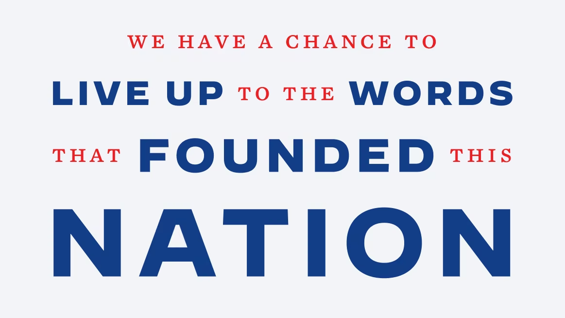
Working with Senior Creative Advisor @robynkanner and her team has been a bright moment in a challenging time, a constant reminder that our best days, truly, lie ahead. “We have a chance to live up to the words that founded this nation,” says the VP: I couldn’t agree more. —JH
-
Hoefler&Co. reposted
Alphabettes
@alphabettes_org
New on the blog: “Reflections on ‘It’s Time to Act’” by @arabictype 👉 www.alphabettes.org/reflections-on-its-time-to-act/
-
Hoefler&Co.
@HoeflerCo
More from the typographic gallery at hflr.co/rnhyl starring Cesium, with guest appearances by Ringside and Idlewild. I found myself designing this one at the start of the quarantine, having received word… →
Hoefler&Co.
@HoeflerCo
…not to buy a face mask, so that supplies could go to medical personnel. Felt like the right moment to learn to sew, and try making one of my own. A hundred-some days in, I’ve become fascinated by the world of fabric construction: →
Hoefler&Co.
@HoeflerCo
it’s a craft that has TONS of parallels to programming, in terms of both procedural thinking and the rewarding sense of accomplishment when things work out. (If things work out!) Anyway, enjoy the fonts. And stay well. —JH
-
Hoefler&Co. reposted
Cloud Typography
@cloudTypography
Everything’s back to normal at @cloudTypography after <4 minutes downtime — sorry for any trouble!
-
Hoefler&Co. reposted
Cloud Typography
@cloudTypography
Some @cloudtypography users are experiencing issues loading fonts from the platform. I’m very sorry for the inconvenience — we’re working with our CDN provider and will update you with details as soon as we have them.
-
Hoefler&Co.
@HoeflerCo
New on the site! A typographic gallery, designed by me and Brian Hennings, showing our new Cesium typeface with a couple of old friends. hflr.co/rnhyl
-
Hoefler&Co.
@HoeflerCo
Ah! @gdcnational, in their survey of typefaces by Canadian designers, has a nice writeup on Quarto, by our very own @szkolny. hflr.co/xosy1
Hoefler&Co.
@HoeflerCo
If you’d like to take Quarto for a spin, you’ll find it here: hflr.co/ziqy0, along with an in-depth look at its many hidden features.
Hoefler&Co.
@HoeflerCo
Also nice to see Quarto make an appearance on the Canadian Women in Design insta — www.instagram.com/womencandesign/
-
Hoefler&Co.
@HoeflerCo
A reminder that @propublica is archiving the tweets that public figures later delete. Bookmark: hflr.co/hyl6c
-
Hoefler&Co.
@HoeflerCo
I’m always heartened when someone outside our industry adopts the official nomenclature #weirdogothletters
Brooks Otterlake
@i_zzzzzz
Q is too high up in the alphabet. I respect it but it has no place between P and R. Should be at the end with the weirdo/goth letters
-
Hoefler&Co.
@HoeflerCo
I’m so sorry to read that Milton Glaser has died. Missing from this obituary is that he was extraordinarily kind, and deeply sincere. I’ll always remember him for these things most.
www.nytimes.com/2020/06/26/obituaries/milton-glaser-dead.…
Hoefler&Co.
@HoeflerCo
I had the pleasure of meeting him at a dinner, when by chance we were seated together. He was such good company, in a room full of luminaries who would doubtless have better repaid his attention. So kind & genuine, that I kept forgetting OMG this is Milton Effin’ Glaser.
-
Hoefler&Co.
@HoeflerCo
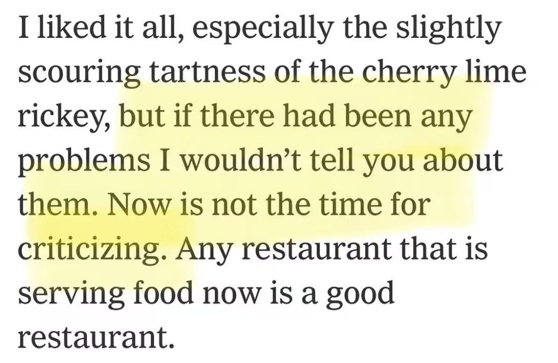
This is Pete Wells writing about a restaurant in the New York Times, but really it applies to almost anything right now. Be gentle with one another, my friends.
-
Hoefler&Co.
@HoeflerCo
Filmmaking, like type design, requires disproportionate effort for tiny details. This 1 second transition, where an unmanned camera racks focus from Jordan's computer to Troy and me, used a remote control follow focus and an HDMI monitor on a 300' cable. hflr.co/h6mfc…
Post not available here, view on X
Hoefler&Co.
@HoeflerCo
The following year, working w/ the @AbstractNetflix crew, I got to learn about the "First Assistant Camera" or "1AC," who's responsible for pulling focus. Watching someone with the muscle memory to spin a dial and hit things with tack sharp focus was amazing: he’s a pro athlete.
Hoefler&Co.
@HoeflerCo
Graham Deneen was Abstract's fantastic 1AC, working under DP Claire Popkin. You can see some of their work behind-the-scenes on my episode of @AbstractNetflix, here: hflr.co/ds3bf
-
Hoefler&Co.
@HoeflerCo
Great data visualization (the graphic, not the trend!) from @propublica. I can’t recall seeing this kind of cellular matrix of US states before.
Hoefler&Co.
@HoeflerCo
Though I can’t help but wonder how it plays in Kansas, which is apparently now in the Southwest.
-
Hoefler&Co.
@HoeflerCo
Decades ago, @LeslieSavan gave a lecture documenting examples of casual implied racism in advertising, an eye-opening talk that I’ve never forgotten. Thinking of it today, in this @WSJ chart that uses brown to mean “more dangerous.” Intentional or not, it’s worth reconsidering.
-
Hoefler&Co.
@HoeflerCo
But because these are expressed as absolute numbers not relative ones, isn’t this chart effectively a list of states ranked by population, with rates that generally correlate with size?
-
Hoefler&Co. reposted
Susan Simpson
@TheViewFromLL2
In honor of Juneteenth, a brief story about the America that almost was.
I was at the Federal Archives once, searching for a very different document, when I came across a stack of papers titled "Joint Resolutions Proposing Amendments to the Constitution of the United States." -
Hoefler&Co.
@HoeflerCo
We’re underwriting the cost of admission, to make TypeLab at @TypographicsNYC a FREE event for all attendees.
Americas → hflr.co/tlamer
Europe → hflr.co/tleur
Asia → hflr.co/tlasia
It’s live right now — tune in! 2020.typographics.com -
Hoefler&Co.
@HoeflerCo
Some news for @_akshayverma_, @anexasajoop, @sudhirj & friends: Sentinel is about to get a Rupee symbol. Stand by! #₹ hflr.co/acqi9
-
Hoefler&Co.
@HoeflerCo
And something in my in box this week also reminded me of this article of ours, “Typographic Doubletakes.”
www.typography.com/blog/tag/Pairing+Fonts -
Hoefler&Co.
@HoeflerCo
Something in my in box this week reminded me of this article of ours, “How To Use Clashing Fonts.”
www.typography.com/blog/fonts-that-clash -
Hoefler&Co.
@HoeflerCo
Hi Pooja! The ₹ is now part of our spec, and you’ll find it in Operator, Ringside, Inkwell, Whitney Narrow & Condensed, Peristyle, Isotope, Decimal, Cesium, and all our forthcoming releases and updates. It’s become a favorite to draw, so we’d be delighted to see it in use!
Pooja Saxena
@anexasajoop
Hoefler&Co.
@HoeflerCo
Award for our "Most Agonizing but we’re Glad We Drew It" Rupee goes to Ringside, which has 192 of them;
Hoefler&Co.
@HoeflerCo
And the “Most Fun to Design, though we May Never See It Get Used” Rupee has to go to Cesium. :) www.typography.com/fonts/cesium/overview —JH
-
Hoefler&Co.
@HoeflerCo
I’ve been spending time with the archived versions of the website for the Obama White House, and put together a little chronology of the fonts they used, now at hflr.co/bs37a. A refreshing walk through a time of dreams and achievements.
-
Hoefler&Co.
@HoeflerCo
Nice of you to get around to this. Thank you.
-
Hoefler&Co.
@HoeflerCo
Lettering FTW.
Belaaz News
@TheBelaaz
🇺🇸 — VIDEO: Local muralists and city staff are painting “Black Lives Matter” in massive letters on 16th Street in front of the White House.
-
Hoefler&Co.
@HoeflerCo
That this country celebrated Booker T. Washington on the half dollar in the 1940s — in Jim Crow America! — speaks to how abominably WORSE racism has become in our lifetimes. Dr. King’s long arc of history bending toward justice is turning out to be circuitous. I’m sad; I’m ANGRY.
-
Hoefler&Co.
@HoeflerCo
Hey, if I have any friends on Twitter who typeset cookbooks on a regular basis, could you drop me a DM? I’d like to ask your opinion about something. Thank you!
-
Hoefler&Co.
@HoeflerCo
I so totally and completely agree with this. I’d also like these same designers to take a hard look at the phrase “x% of profits donated to…”, when “profits” are unknowable by us poor pigeons. You know what’s better? →
Post not available here, view on X
Hoefler&Co.
@HoeflerCo
One of the joys of working with charities is that over time, you get to know each other, and learn what you can contribute that they never knew they needed. “Graphic design, what is that?” That’s your opportunity to step in, and you WILL wow the rest of us with your talent.
Hoefler&Co.
@HoeflerCo
If you don't know where to begin, pick a local cause that’s dedicated to an issue you care about. Civil rights, reproductive health, environmental responsibility, animal welfare, refugee assistance, hunger, childhood education, literacy... There’s a lot for us all to do.
-
Hoefler&Co.
@HoeflerCo
Ahoy! We’re looking for an experienced React architect who’s familiar with webpack & babel to help us on a contract basis. If this is you, and you’re a person (not a recruiter), drop us a line at:
-
Hoefler&Co.
@HoeflerCo
Splendid! (2 of 2) Not just the idea, the musicianship, the arrangement, the nostalgia, and the Hasselhoffian getup, but those smiles that creep into all eight frames at the 1:00 mark. So great.
Samara Ginsberg
@samaracello
Knight Rider - had quite a few requests for this one and no wonder because it's a total banger
This media couldn't be displayed. See it on the original post.
Hoefler&Co.
@HoeflerCo
Also that glissando at :50 YES I AM WATCHING IT AGAIN
-
Hoefler&Co.
@HoeflerCo
Splendid! (Part 1 of 2.) And what a treat to see the technique of eight musicians up close.
BBC Philharmonic Orchestra
@BBCPhilharmonic
Apart, but still making music together, members of our viola section ❤️
💃🕺Dance of the Tumblers from The Snow Maiden by Nikolai Rimsky-Korsakov, arr. for 8 violas by Matthew Compton.
Violas: Steve, Matthew, Fiona , Alex, Nick, Ruth, Roisin & Rachel
#bbcphilathomeThis media couldn't be displayed. See it on the original post. -
Hoefler&Co.
@HoeflerCo
As always, the answer is: @benschott. (This is from the splendid “Schottenfreude,” which you should have: hflr.co/schbuch)
-
Hoefler&Co.
@HoeflerCo
I can’t remember who introduced me to the splendid term ‘schnapps-word;’ it seems ungooglable. So it was either a snickering typeface designer at a conference, or an old article in Word Ways magazine. In any case: enjoy a good schnapps-word now and then!
hflr.co/8ajdz -
Hoefler&Co.
@HoeflerCo
“Typographic Sirloin” is a spectacular term, that I learned from one of Alastair Johnston’s books: he found it in one of Dibdin’s, from 1817. It describes certain phrases that appear in type specimen books; definition in footnote 3, below.
hflr.co/d5wvf -
Hoefler&Co.
@HoeflerCo
Thanks, Nerea! And to anyone who’s not subscribed, I’d be delighted to have you join us — sign up at typography.com/subscribe.
Nerea Domènech
@nereadch
Hi there! 👋🏽 This is just an appreciation comment. Just got another newsletter with valuable tips on choosing fonts, and I need to say your content is great, all the info you share is very useful and generous. Thank you for your time!
-
Hoefler&Co.
@HoeflerCo
I’ve decided to open source some of the proofs I’ve developed at H&Co, for the designers with whom I’ve been doing type crits on Twitter. Enjoy!
hflr.co/i65pv -
Hoefler&Co. reposted
Rosie White
@DrRosalindWhite
📚 A collection of 42 late 19thC faux miniature books, w/ an array of amusing titles inc: “The Cucumber’s Revenge”, “Cruel Gruel”, & ‘Ham’s without Homes’. Possibly fashioned for a dolls house 🏡 or made as ‘samplers’ to showcase a book binder’s skill set.
-
Hoefler&Co. reposted
Type@Cooper
@CooperType
Happily, #lubalinlectureseries continues as recorded talks until we can all gather in person again thanks to the ongoing support and generosity of @HoeflerCo. Watch @ArrowType speaking about the thinking behind recent release Recursive, a variable font
vimeo.com/417814920 -
Hoefler&Co.
@HoeflerCo
And, in some @Adobe apps, “Metrics” is called “Auto.”
Better options would be (1) “What’s In The Fonts,” and (2) “No, Let Me Help, Machine Know Best”
Nadine Chahine 🇱🇧
@arabictype
Dear @Adobe, please observe the confusion sowed by poor terminology in your apps. “Optical” is actually algorithmic, and “metrics” is optically and laboriously designed and crafted by the font creator. We’ve raised these issues many times. About time you fixed them.
-
Hoefler&Co.
@HoeflerCo
Not from my series “Flags of Alt Universe Scandinavian Nations,”
Post not available here, view on X
Hoefler&Co.
@HoeflerCo
Less Nordic, unless its for an EDM act,
Hoefler&Co.
@HoeflerCo
...is the paragraph mark, which I should probably call by one of its other names, “pilcrow” or “capitulum,” in order to sound: Fancy. Sticking with “paragraph mark.”
-
Hoefler&Co.
@HoeflerCo
If Captcha would do this, instead of asking me to spot the bicycles and traffic lights, I’d feel more productive. Also I can never see the traffic lights; might be a robot
-
Hoefler&Co.
@HoeflerCo
Another beloved glyph that I’ll probably never see, a favorite in any typeface but in Cesium most of all.
Hoefler&Co.
@HoeflerCo
My great thanks to @7roy and @szkolny for helping bring this one to fruition. My sketch was surrounded with notes like “doable? Bad idea?”, and it took the three of us to make it work. It would be a treat to someday see it in the wild!
-
Hoefler&Co.
@HoeflerCo
File under "glyphs that were satisfying to figure out, but I'll almost certainly never see in the wild," comes the Ẅ from our new Cesium typeface. Other joined accents had it easier (É, Ç), but this was the most fun. Welsh friends, let me know if you ever see it in use!
-
Hoefler&Co.
@HoeflerCo
This is the devil’s handiwork.
Hoefler&Co.
@HoeflerCo
I mean, even more than shuffleboard generally.
-
Hoefler&Co.
@HoeflerCo
Anything else, 2020?
www.nytimes.com/2020/05/02/us/asian-giant-hornet-washingt… -
Hoefler&Co.
@HoeflerCo
I suspect some of my readers might have ideas here — please contribute!
(Especially if you have that signpainting book that diagrams the light board outside the old St. Regis hotel — my copy is back at the office, under quarantine)
David Cole
@irondavy
Obscure question, but: anyone know of interesting alternative segment display systems besides the conventional 7/9/14/16 segment displays?
-
Hoefler&Co.
@HoeflerCo
I imagine that Bagging, Random Forest, Single Tree and Lasso might also be air fresheners. Or turntablists. Or both.
-
Hoefler&Co.
@HoeflerCo
Meet CESIUM, a new typeface. hflr.co/cst
-
Hoefler&Co.
@HoeflerCo
What a lovely interactive module this is — a terrific use of animation in an “explainer,” handled with an especially light touch:
www.chess.com/forum/view/fun-with-chess/shortest-games-po… -
Hoefler&Co.
@HoeflerCo
How is it possible that "Words into Type" is out of print?
Hoefler&Co.
@HoeflerCo
Useful.
Hoefler&Co.
@HoeflerCo
Helpful!
Hoefler&Co.
@HoeflerCo
Aha. @espiekermann has argued this for years and I’m still not sure I concur, but it’s good to have another source.
Hoefler&Co.
@HoeflerCo
From a section on “trite phrases.” So good.
Hoefler&Co.
@HoeflerCo
Great stuff.
Hoefler&Co.
@HoeflerCo
Interesting!
Hoefler&Co.
@HoeflerCo
Good to know.
-
Hoefler&Co.
@HoeflerCo
Fifth time. Dammit.
Hoefler&Co.
@HoeflerCo
That Thing where there’s a tool you never quite finished writing, but have since thought of a better way, so you return to the project and write it again from scratch, and get exactly as far as you did last time before becoming overwhelmed/exhausted. And it’s the fourth time.
-
Hoefler&Co.
@HoeflerCo
That Thing where there’s a tool you never quite finished writing, but have since thought of a better way, so you return to the project and write it again from scratch, and get exactly as far as you did last time before becoming overwhelmed/exhausted. And it’s the fourth time.
-
Hoefler&Co.
@HoeflerCo
Today, as periodically from 2000-2008 and 2016-present: thank you, Aaron Sorkin, for “The West Wing.” cc @BradleyWhitford @JoshMalina
-
Hoefler&Co.
@HoeflerCo
I’ve lost my patience for people who punt. Political leaders, people who work for colossally powerful companies — it doesn’t matter. If you don’t act, you are a coward.
-
Hoefler&Co.
@HoeflerCo
Say, does anyone have a favorite iPad app that serves as a realtime, remote, collaborative whiteboard, but isn’t beleaguered by lag? Asking for a me.
-
Hoefler&Co.
@HoeflerCo
I’d love to see more of this: it’s the IBM Selectric “golf ball” typing element for the Laban dance notation! www.ibm.com/blogs/industries/selectric-typewriter-dancers/
Hoefler&Co.
@HoeflerCo
@PeterBilak, seems like an intersection of interest for you as well — ever heard of this?
-
Hoefler&Co.
@HoeflerCo
Recommended Reading from H&Co! hflr.co/reads
Meet a lexicographer, a copy chief, a competitive Scrabble player, a lettering artist, and a designer of typographic props for film. Featuring @KoryStamper @BCDreyer @stefanfatsis @TypeLettering @AnnieAtkins. -
Hoefler&Co.
@HoeflerCo
“Cool video!” was my cover story, when sharing this with a neighbor, a relative, and a friend, all of whom needed a gentle reminder. #design
Ohio Dept of Health
@OHdeptofhealth
Social distancing works. We are all #inthistogetherohio. www.coronavirus.ohio.gov
-
Hoefler&Co.
@HoeflerCo
I'd do both! The goal is always to equalize the space between counters; in the original version (above), the R-A has a greater volume than the A-I. Below, I've cranked the R&A together to give it more of the space of the A&I. See what you think! —JH
Hoefler&Co.
@HoeflerCo
Possible that I've gone too far on the R-A, so here's another way of looking at this: make the R-A as tight as you're comfortable with, and then allow its kerning to dictate the other pairs in the mark.
-
Hoefler&Co.
@HoeflerCo
Hey @WilliamsSonoma: asking for my email address with the promise of 15% off, and then in the next screen requiring my cellphone number so you can text me, as a condition of the deal, is what’s called a “dark pattern” in UX circles, and what I call “not shopping with you ever.”
Hoefler&Co.
@HoeflerCo
I call it other things, too, but this is a family show.
-
Hoefler&Co.
@HoeflerCo
Yes! A nice one for my colleagues at @HoeflerCo: David Smith has used our wristwatch-inspired Decimal typeface for this splendid personalization of the Apple Watch.
David Smith
@_DavidSmith
Decimal has been great, it naturally lends a ‘watch-ey’ feel to an app all about showing data on a watch face. It also actually turned out be a great UI font for use within the watch app itself too. Thanks for making it. apps.apple.com/us/app/watchsmith/id1483088503?ls=1
-
Hoefler&Co.
@HoeflerCo
[Spoiler alert] If you enjoyed the episode of Abstract, here’s a little follow up material: additional “typographic illusions,” and some things I learned during the filming:
hflr.co/ntflx2 -
Hoefler&Co.
@HoeflerCo
I can’t stop watching this. hflr.co/galactus
Hoefler&Co.
@HoeflerCo
I, too, have twenty years of files called “Notes.txt” that just contain a list of technology names followed by question marks
Hoefler&Co.
@HoeflerCo
Just watched it for the eighth time today. Rock solid.
-
Hoefler&Co.
@HoeflerCo
You and me both, mate:
-
Hoefler&Co.
@HoeflerCo
The Kübler-Ross Stages of Logo Justification begin with circles and squares, progress to the golden ratio, and from there to Compressible Flow
Andrew Higgins
@A_J_Higgins
Teaching my compressible flow course online is giving me the opportunity to answer some long-standing questions, such as: Just how fast *is* that eagle in the @USPS logo going? Turns out, about Mach 4.9...
-
Hoefler&Co.
@HoeflerCo
It feels like a good time to follow @nyt_diff, and a bad time for cowardice.
Editing TheGrayLady
@nyt_diff
Change in Headline
-
Hoefler&Co.
@HoeflerCo
Looking into ETAOIN SHRDLU, the two leftmost rows of keys on the Linotype keyboard (commonly struck to mean “discard this line”), I wondered if the qwerty keyboard's equivalent, “QAZWSX” had ever been pressed into service.
Florida Man to the rescue: www.names.org/n/qazwsx/about -
Hoefler&Co.
@HoeflerCo
How did I never notice this moment in “The Hudsucker Proxy?”
www.youtube.com/watch?v=Bfw1WfpYzJ4 -
Hoefler&Co.
@HoeflerCo
One of my favorites, too. And in its 1931 Random House edition, designed by the estimable W. A. Dwiggins, a splendid example of what happens when a designer doesn’t read the manuscript: hard to connect Wells’ haunting dystopia with WAD’s merry borders: www.tumblr.com/search/w.a. dwiggins
-
Hoefler&Co.
@HoeflerCo
I’m wondering how my #dataviz colleagues feel about the continued use of log scales (left) vs linear ones (right) in the media. It’s hard not to feel that compressing the data is encouraging people to infer the wrong conclusions about the severity of the situation.
Hoefler&Co.
@HoeflerCo
Source: 91-divoc.com/pages/covid-visualization/
cc @visualisingdata, @EdwardTufte, @ben_fry, @REAS -
Hoefler&Co.
@HoeflerCo
Ahoy, designers! If you’re fighting cabin fever by designing a typeface, let me know if you could use a second pair of eyes. —JH hflr.co/crits
-
Hoefler&Co.
@HoeflerCo
Well in one bit of bright news, a collection of WPA posters that was once offline has reemerged, and the lettering remains as confident, optimistic, and splendid as ever. hflr.co/28zs6
-
Hoefler&Co.
@HoeflerCo
A thoughtful gesture from a thoughtful fellow, who was kind enough include me in “Helvetica.” A great time to catch up on @gary_hustwit's œuvre, and for me to trot out the œ diphthong.
Gary Hustwit
@gary_hustwit
In light of the COVID-19 crisis, I'm streaming my films for free to viewers stuck indoors anywhere in the world. I'll be streaming a new movie every week, launching each Tuesday. Stay strong, we'll get through this.
Watch Helvetica free till Tuesday:
www.ohyouprettythings.com/free
Hoefler&Co.
@HoeflerCo
As to whether the Œ rates as a diphthong, a ligature, a bigram, a grapheme, or all of the above, I will be providing a special mailing address for our Complaints Department; please stand by
-
Hoefler&Co.
@HoeflerCo
It's incredible how many banks and insurers that had no digital products last month are suddenly prepared to let us transact electronically. “Incredible.”
-
Hoefler&Co.
@HoeflerCo
Great question. I’d advise organizations to stick to their usual visual language, so it’s clear that their voice remains intact, and that the sentiment isn’t artificial or insincere.
Hoefler&Co.
@HoeflerCo
(We could also do with a moratorium on “Keep Calm” riffs!)
-
Hoefler&Co.
@HoeflerCo
Is ours the only company that institutionally prefers conversations (audio only) to video chat? “Phone calls,” as we used to call them, invited looking at things while listening to people; video punishes you for not gazing at the speaker. Plus, bathrobe-friendly.
Hoefler&Co.
@HoeflerCo
Wasn’t kidding about the bathrobes. If people are taking care of kids and parents and neighbors and pets, and their personal routines become massively disrupted, taking the time for a work call is enough. No one needs to be laundry shamed.
-
Hoefler&Co.
@HoeflerCo
Next time a journalist calls me for a quote about Gotham and political campaigns, I’m totally sending this in. None of you out me, you swine
Capybaras
@CapybaraCountry
a late entry into the presidential race
-
Hoefler&Co.
@HoeflerCo
So @gray is doing his part to keep us all sane by assembling a list of in-universe websites created for television shows. Please come and help him with this important research.
Daniel Benneworth-Gray
@gray
If you watch Better Call Saul I’m about to make your day. freewill-baptistchurch.com
-
Hoefler&Co.
@HoeflerCo
You can’t keep humans down. ❤️
-
Hoefler&Co.
@HoeflerCo
Thank you, @DrMarioRGarcia, for sharing this remarkable moment for our Knockout typeface: these are the six major Spanish newspapers, all running the same cover, in a gesture of unprecedented solidarity. For all our folly, we humans are extraordinary, and we will persevere.
-
Hoefler&Co.
@HoeflerCo
From time to time, I've done impromptu type clinics on Twitter. I thought I might try and make this a regular feature, so if you’re working on letterforms and could use a second set of eyes, feel free to DM me. —JH
Hoefler&Co.
@HoeflerCo
I’d be especially happy to hear from students, and designers who don’t have anyone to bounce ideas off of. (So this goes not only for people working independently, but also the lone type fanatic in an organization!)
Hoefler&Co.
@HoeflerCo
Update! Here’s a running list of these type crits. Enjoy! — hflr.co/crits
-
Hoefler&Co.
@HoeflerCo
Ahoy, @alexyorkdesigns! Thanks for your work-in-progress. Even though we’re not supposed to be touching our typefaces, I had a few thoughts from the quarantine — see what you think. —>
Post not available here, view on X
Hoefler&Co.
@HoeflerCo
Its diagonals struck me as out of character with the other letters, but I see your conundrum: giving it a vertical stem would mean shortening the top stroke on both sides, leading to very stubby arms. But, —>
Hoefler&Co.
@HoeflerCo
...that might be ok. We went back and forth on this issue with the Tungsten typeface, ultimately agreeing that compact and consistent spacing was better than equal widths. That approach might work for you as well, and not just in the T: —>
Post not available here, view on X
Hoefler&Co.
@HoeflerCo
Here are a few ideas — help yourself if they’re productive. You can push this character farther than many others, since its meaning will be easier to infer from context, but watch out for confusion with 8 * # Z X and all the currency marks. —>
Hoefler&Co.
@HoeflerCo
I’ll leave you with some additional notes on the punctuation — in general I’d be looking for places to square things up, remove outboard space, & simplify when you can. This is definitely the hard part, but it’s going to be a huge accomplishment when you’re there. Good luck! -JH
-
Hoefler&Co.
@HoeflerCo
If you never got rid of your old computer, tablet, or phone, now’s not a bad time to donate it to someone who needs it. Remote learning is going to be a challenge for families who aren’t adequately wired.
-
Hoefler&Co.
@HoeflerCo
Superb distillation by @_rospearce pearce, visual data journalist at @TheEconomist, about when to break doctrine to communicate more effectively. (As someone who's red-green colorblind, I'm especially grateful for her ¶5, about how to make these colors work for everyone.)
Rosamund Pearce
@_rospearce
We need rules to help us avoid common mistakes in #dataviz. But we shouldn’t be afraid of breaking them if it makes our chart clearer or more engaging
I’ve written a blog for @ECONdailycharts exploring when, why, and how to ignore some of these rules
medium.economist.com/why-you-sometimes-need-to-break-the-… -
Hoefler&Co.
@HoeflerCo
A beautiful new C from @mengesdesign after our chat (hflr.co/crit7). I just love the way you’ve got things thinning out at 7:00 & 12:00 — an even more elegant and personal solution than I’d imagined. Bravo! -JH
-
Hoefler&Co.
@HoeflerCo
Great question! Inverting it generally works, and it’s often necessary — even in far more sober fonts. Compare out the crossbar heights of the E, K, and R in Landmark, here: www.typography.com/fonts/landmark/overview
@chenry@mastodon.social
@chenryhen
Is it recommended to keep the major/minor top-to-bottom ratio the same for each letterform, or would you be able to reverse it (in this case, small top, big bottom) and keep a consistent look and tone?
-
Hoefler&Co.
@HoeflerCo
Ahoy, Dylan — this is a really nice one! I *might* have a fix for your C — see what you think of the following. My first thought was...
Post not available here, view on X
Hoefler&Co.
@HoeflerCo
Whether you reduce your A and B to components, or exaggerate them (forgive my grotesque caricatures!), you’ll see a nice drama between their halves. So, ...
Hoefler&Co.
@HoeflerCo
Could the C get the same treatment? I like the idea of a more dynamic imbalance, but I’m not crazy about my sketch yet, because it’s made of the wrong geometry. That is, ...
Post not available here, view on X
Hoefler&Co.
@HoeflerCo
So here’s where I landed. My crap coffee shop sketches are the easy part; it’ll take you some work to get the weight, angle, and proportion right, but I think this might have legs. Anyway, good luck! I really want to see how the Q, S, ?, 3, 5, and 8 turn out, —>
Hoefler&Co.
@HoeflerCo
...as well as the difficult letters: I have a feeling that H, L, T, and V might demand some additional ideas. Let me know how this goes, though — I really think it’s going to be splendid. Kindest Regards, Jonathan
-
Hoefler&Co.
@HoeflerCo
Come see our alum @andyclymer in NYC!
Type Directors Club
@typedirectors
We’re really excited to welcome @andyclymer to our upcoming TDC conference where he’ll be speaking about code as a design tool. Program this date into your schedule: March 27th! tdc.org/event/type-drives-culture-conference-2020-formation/
-
Hoefler&Co.
@HoeflerCo
Ahoy, @Kron98_! Jorge, thank you for this project — it’s intriguing. Some background for anyone listening in: Jorge is designing a typeface inspired by the school in his mother’s village, as part of a project to highlight depopulation in rural Spain. ->
Post not available here, view on X
Hoefler&Co.
@HoeflerCo
I think that’s where your project might find its strength. What are the unexpected qualities in the school fascia that merit your interpretive skills as a designer, and produce a versatile outcome? A few that came to mind for me were the following... ->
Hoefler&Co.
@HoeflerCo
The short arm of this E. It’s unusual; maybe it’s worth preserving? ->
Post not available here, view on X
Hoefler&Co.
@HoeflerCo
I’d like to look at the lowercase together after you’re 100% happy with the caps — I have a feeling that adjusting the proportion of the lc might happen as you look at the caps from the sign itself. ->
Hoefler&Co.
@HoeflerCo
I hope this helps — let me know how it develops! (And draw that giant asterisk! I wouldn’t be able to resist.) Kindest Regards, Jonathan
-
Hoefler&Co.
@HoeflerCo
A further thought, here: if the connecting lines (shown here in orange and green) aren't parallel, it's worth noting. It could mean that one or another of the pulls is too long or too short: look for spots on the sides of the S that are too heavy.
Hoefler&Co.
@HoeflerCo
Draw a line between the opposing off-curve points that define each half. The location where this line intersects the curve is the place to drop your inflection points. :) Usually works, or indicates something about the curves that needs attention. —>
-
Hoefler&Co.
@HoeflerCo
Ahoy, @JoshApos! I really like where your typeface is going. It’s an interesting moment to look at this together, because your drawings are in great shape, but there’s a missing piece that will make your life easier. (And I have an S trick to share.) —>
Post not available here, view on X
Hoefler&Co.
@HoeflerCo
In theory — I’ll qualify this in a moment — once you’ve settled on a fit for the N and O in which they’re both centered, and produce the same color and rhythm, you can evaluate all the other letters in this context: nn_nono_oo: —>
Hoefler&Co.
@HoeflerCo
Here fwiw are some “control strings” from some of our fonts, in which I was especially pleased with the fit. The thing is, though, there’s only one way of confirming your conclusion, and that’s to add one more letter: —>
Post not available here, view on X
Hoefler&Co.
@HoeflerCo
Draw a line between the opposing off-curve points that define each half. The location where this line intersects the curve is the place to drop your inflection points. :) Usually works, or indicates something about the curves that needs attention. —>
Hoefler&Co.
@HoeflerCo
I hope some of this is useful to you. Let me know how things turn out! Regards, Jonathan
-
Hoefler&Co.
@HoeflerCo
Hey @PaulvonExcite: germane to our conversation earlier about how hard it is to make that script N-E join, here’s an R-E that joins, but only because of the extreme distance between letters. (From a Chris Burden piece at @MOCAlosangeles, btw)
-
Hoefler&Co.
@HoeflerCo
I understand the rationale, absolutely. Take a look at some upright scripts & see how they handle this: I’m away from my books at the moment, but ATF Romany comes to mind.
Paul von Excite
@PaulvonExcite
I am digging this stroke idea a lot. Not sure about altering the angle of the connection as it would harm the consistency since it is based on the same angle.
Hoefler&Co.
@HoeflerCo
If you try sketching it, I think you’ll find that it’s nearly impossible for the exit stroke of the N to flow into the E without (1) an impossibly small counter, (2) slanting everything, or (3) lots of letterspacing (which might make this look like a 1950s car badge.)
-
Hoefler&Co.
@HoeflerCo
Ahoy, Paul! Happy to offer a second set of eyes. I like where this is going: personally I’m not seeing anything wrong with the E-T join, but maybe this is what you’re seeing (& a way out)? —>
Paul von Excite
@PaulvonExcite
Something I am cooking up for a small sewing business from France. — the e to t connection is causing some troubles but love the retro vintage look.
Post not available here, view on X
Hoefler&Co.
@HoeflerCo
Another way of looking at this E is to compare the “speed” of these two curves. Maybe this adjustment helps make them more comparable? (If it’s something you want, that is.) —>
Hoefler&Co.
@HoeflerCo
Some other thoughts, in case they’re useful. A few adjustments to the fit might help: I’m especially feeling that the first E is drifting right, between the N and T, and that C-A could be looser. See the small size version to get the overall gestalt of the fit. —>
Post not available here, view on X
Hoefler&Co.
@HoeflerCo
I found myself noticing that you’re using two different approaches to the terminals: the A is very round, its right side curving back in to meet the hairline, where the C is more lachrymal (50¢ word, “tear-shaped) instead. Not a problem, but perhaps an oppty for resolution? —>
Hoefler&Co.
@HoeflerCo
Anyway, that’s what I’ve got. Hope this helps! I really like the personality of this mark. Get your client to commission a lighter version, too: it’ll be useful at smaller sizes, but moreover you’ll have fun drawing it. :) —Jonathan
-
Hoefler&Co.
@HoeflerCo
Ahoy, Jessica! Nice talking to you just now. Here’s a thought or two about the S & friends; feel free to use or discard. I wondered if you‘re seeing what I’m seeing... —>
Jessica Hische
@jessicahische
posting by request. Working on the full lowercase so this is just typeset to show context
Post not available here, view on X
Hoefler&Co.
@HoeflerCo
One last thought: to my eye anyway, the bottom of the E feels a little heavier than the top. If it’s intentional, maybe push it further? (If not, pull it back?) I think this will be cheerful either way, the question is just what you’re looking for. —>
Hoefler&Co.
@HoeflerCo
Anyway, that’s my 2¢, in case it’s useful. Either way I look forward to seeing where this goes! xx J
-
Hoefler&Co.
@HoeflerCo
Registration for @TypographicsNYC is open! Very pleased to see that the speakers include so many new faces, many designers I’ve long wanted to meet, and our alum @andyclymer. Come to NYC this June! 2020.typographics.com
-
Hoefler&Co.
@HoeflerCo
There’s still work to be done distinguishing the international “blackletter” from the exclusively German “Fraktur.” Only one is shared by Oktoberfest and nationalist thugs: the other belongs to newspapers, churches, hip hop, gravestones, diplomas, antique shops...
Hoefler&Co.
@HoeflerCo
Nonetheless, I was pleased to see @99piorg wade into typographic waters, and grateful that they talked to @hardwig and @typeoff for some historical perspective, rather than simply guessing. 99percentinvisible.org/episode/fraktur/
-
Hoefler&Co.
@HoeflerCo
Ken Barber already knew his stuff when we became friends twenty-some years ago, yet somehow he’s become an even finer artist in the decades since. Please join me in congratulating @TypeLettering & @houseindustries on the new book, and then go order one!
House Industries
@houseindustries
Preorder your copy today of the new House Industries Lettering Manual by Ken Barber: houseind.com/hi/house-industries-lettering-manual
-
Hoefler&Co.
@HoeflerCo
An interesting day, dealing with a lot of people from different professions, and a striking takeaway: the ones who *really* get empathy, and truly, *reflexively* understand that everything should be about your audience’s needs, not your own, are: designers. Take a bow.
-
Hoefler&Co.
@HoeflerCo
For our new five-font Type Capsules, we worked in reverse: designing the kinds of things that could benefit from better typography, and *then* selecting the fonts that best fit the bill. Here’s some of what you can do with just five font styles: hflr.co/tc1h2u
-
Hoefler&Co.
@HoeflerCo
New from H&Co: TYPE CAPSULES. $99 font collections, each including $125 in discounts toward larger families. Here's Type Capsule No. 1, “Foundation,” a basic toolbox for communications: hflr.co/tctw
-
Hoefler&Co.
@HoeflerCo
Actually 11/02/2011 was the last day we officially celebrated Not Checking The Math
-
Hoefler&Co.
@HoeflerCo
Thanks, Francis! There's also a transcript with illustrations, here: www.typography.com/blog/uncharacteristic-characters
-
Hoefler&Co.
@HoeflerCo
Great news — tell your clients! New international law requires using spaces when you supply long codes to users (e.g. "14Z9 28X9 2030"), but ignoring them upon validation. Apparently punishable by imprisonment, fines, and hard labor, so let's all start implementing this today.
Hoefler&Co.
@HoeflerCo
whoops I forgot #headlinesiwouldliketosee
-
Hoefler&Co. reposted
SuperHi
@superhi_
✨ New! ✨ We chatted with type designer @7roy from @HoeflerCo, on his journey into the world of type design and the importance of continuing education www.superhi.com/blog/troy-leinster-type-designer-hoefler-co
-
Hoefler&Co.
@HoeflerCo
BTW: For typography/scifi fans, I have two great books for you: the wonderful and entertaining "Typeset in the Future" by @daveaddey www.amazon.com/exec/obidos/ASIN/1419727141/typographycom-20, and…
Hoefler&Co.
@HoeflerCo
…the fascinating and useful "Make It So: Interaction Design Lessons from Science Fiction" by @chrisnoessel: www.amazon.com/exec/obidos/ASIN/1933820985/typographycom-20
-
Hoefler&Co.
@HoeflerCo
Confirming: Three centuries hence, Starfleet will have licensed our Tungsten typeface for inclusion on the LCARS operating system. Operated here by @SirPatStew himself!
Hoefler&Co.
@HoeflerCo
.@Mario_Moreira72, do I have you to thank for this? :)
Hoefler&Co.
@HoeflerCo
Also a shout out to @CutForTime + @BenjaminAhr at #greatestgen: Uxbridge-Shimoda was down with Tungsten *years* ago! Big Rod is totally biting your style! Come on, let's get this rap beef going, this is Twitter ffs
-
Hoefler&Co.
@HoeflerCo
Ten different fonts render on this page of the @nytimes iOS app, and none of them is the italic for Imperial, their text face.
-
Hoefler&Co. reposted
Hannes
@hannes_famira
I have been dreaming of putting this "Greek and Cyrillic Extension to Latin Type Families" class together for a long time. So I will continue to shamelessly advertise it and I hope you guys will re-tweet and sign up: coopertype.org/event/greek_and_cyrillic_extension_to_lati…
-
Hoefler&Co.
@HoeflerCo
. @WanderingGaia, whose "Evolution explains why we act differently online" was one of the most memorable things I read that year, has a new book out this Tuesday, to which I'm looking forward immensely:
Gaia Vince
@WanderingGaia
TRANSCENDENCE is coming out in North America! Order your copy now amazon.com/Transcendence-………
Hoefler&Co.
@HoeflerCo
Oh — AND it uses our Historical Allsorts & Tungsten typefaces! It's a rare treat to not notice that until afterwards.
-
Hoefler&Co.
@HoeflerCo
I’m curious: what are the indispensable, must-be-at-arms-reach reference books in your life?
-
Hoefler&Co.
@HoeflerCo
Leaving this here for future reference: professions like "singer-songwriter" and "designer-developer" are "compound noun phrases," which properly take a hyphen, not a slash or an en-dash, according to @ChicagoManual 17th ed. ¶7.89 §2. #relaxingsunday #thats20minutesgoneforever
-
Hoefler&Co.
@HoeflerCo
A little shout out to the #greatestgen Friends-of-Desoto right here at typography.com. www.typography.com/blog/abstract-typography-episode
Hoefler&Co.
@HoeflerCo
cc @BenjaminAhr @CutForTime @billtilley1973 @stonecoldkilzer &co!
-
Hoefler&Co.
@HoeflerCo
Wondering what the betting line is on “eventually, all new fonts will be variable”
-
Hoefler&Co.
@HoeflerCo
Tweeting at windmills, but: @NewYorker, what’s the rationale behind using small caps this way?
-
Hoefler&Co.
@HoeflerCo
I’m pleased that Roger’s year begins as mine ended, staring in bafflement at a barista who refused to touch my $5 bill, explaining, “I’m sorry, I’m catholic.” Was it some saint’s day on which money isn’t handled? ApplePay worked. Upon exiting, I note the sign: “We’re cashless”
Roger Luckhurst
@TheProfRog
2020 going swimmingly.
Server: do you have a Costa Card?
Me, incredulously: ‘“DO I HAVE A CUSTARD TART?”?’
Server: No: ‘Do you have a Costa Card?’
Me: ‘“DO I GAVE A CUSTARD CARD?” What would that be?’
Server: Never mind
Me, 10 mins later, half a mile away: COSTA CARD! -
Hoefler&Co.
@HoeflerCo
A timely question, because my rubric has *always* been “could I imagine Vaughan Oliver using it?” It’s a rule that will survive.
JoelMarsh.bsky.social
@JoelMarsh
@HoeflerCo What is your strategy for deciding which font ideas would make “good business sense” before production truly goes forward?
-
Hoefler&Co.
@HoeflerCo
To be clear, this is what happens: someone pitches the idea of a custom typeface, and justifies it with the straw man of “savings,” usually by firing up a type foundry’s website and exploring the most expensive possible options: all the fonts, all the usage, etc. Savings! →
Hoefler&Co.
@HoeflerCo
I wish journalists would stop repeating this inane idea that there are brands paying “millions of dollars a year” to use a font. It’s not even imaginable that there could be circumstances in which this is possible. Please give it some thought & scrutiny.
Mashable
@mashable
Why Apple, Google, and other big tech companies create their own fonts
mashable.com/article/tech-company-fontsPost not available here, view on X
Hoefler&Co.
@HoeflerCo
Figure out where your vendor makes their money, and plan accordingly. Some provide the same font to many clients, others supply one font to each client. Both are valid, just understand how the money needs to be distributed. —JH
Hoefler&Co.
@HoeflerCo
One last data point: the person who bought Gotham in PostScript back in 2001 can today log in to typography.com and download — at no cost — a modern OpenType font that features Greek, Cyrillic, tabular figures, fractions, & extended symbols.
-
Hoefler&Co.
@HoeflerCo
I wish journalists would stop repeating this inane idea that there are brands paying “millions of dollars a year” to use a font. It’s not even imaginable that there could be circumstances in which this is possible. Please give it some thought & scrutiny.
Mashable
@mashable
Why Apple, Google, and other big tech companies create their own fonts
mashable.com/article/tech-company-fonts -
Hoefler&Co.
@HoeflerCo
This year I lost two of my design heroes, Vaughan Oliver and Walter Hamady. Both were wry and clever, and created beautiful and elliptical typography that seemed to speak from the unconscious. I wouldn’t have thought to love type without you.
-
Hoefler&Co.
@HoeflerCo
If you need a hit of typography to make it through the holidays, spend 43 minutes with our episode of @AbstractNetflix. AND THEN: a look behind the scenes, published this morning at hflr.co/ia.
-
Hoefler&Co.
@HoeflerCo
This is a terrific list.
@2600@mastodon.online - @2600.com on Bluesky 🇸🇴
@2600
101 Things We Loved About #mrrobot:
1 "Hello, friend."
2 Real hacks that make sense
3 The episode titles
4 Getting a subversive message onto a network called USA
5 Janice -
Hoefler&Co.
@HoeflerCo
A really extraordinary side of Nick Benson’s work that I’d never considered: a pitch-perfect replica gravestone in period style. www.instagram.com/p/B6X6pX_gZ_S/
-
Hoefler&Co.
@HoeflerCo
@TheIneptBirder Don’t you love the colorful, theatrical splendor of the pheasant?
Hoefler&Co.
@HoeflerCo
So easily identified by two unmistakable details, the iridescent color of its neck and its resplendent tail plumage.
-
Hoefler&Co.
@HoeflerCo
A year ago I was on a soundstage, to shoot a segment of @abstractnetflix. Next week’s H&Co email (signup at hflr.co/join!) goes behind the scenes with filmmaking-vs-fontmaking, & covering such typographic topics as graveyard footwear and dodging the @SecretService.
Hoefler&Co.
@HoeflerCo
Thanks @Clairpopkin for that first photo!
And thanks People of Earth for not minding that I wrote “signup” instead of “sign up.” I enter this holiday season confident that it will go unmentioned by the forgiving and good-humored people of Twitter -
Hoefler&Co.
@HoeflerCo
Oh man this is going to push @RyanGosling over the edge.
-
Hoefler&Co.
@HoeflerCo
They’re back! The maybe-safe-for-work “Wood Type Catchwords” that I designed for the @hamiltonwoodtyp. $10 from the museum itself, and 100% of proceeds benefit their mission. www.typography.com/blog/wtf
-
Hoefler&Co. reposted
CodeAI
@codeorg
A big thank you to @HoeflerCo, which helps us maintain our brand with the Gotham font family. Gotham is an important part of our identity and helps make us recognizable to millions of students all around the world (especially during #hourofcode)! www.typography.com ❤️🖥️
-
Hoefler&Co.
@HoeflerCo
If designers follow you on Twitter, I'd be grateful if you'd retweet the poll below — I'd love to see how large a sample we can get. Thanks!
Hoefler&Co.
@HoeflerCo
The word "applications." When someone says "a range of different design applications," what comes immediately to mind?
-
Hoefler&Co.
@HoeflerCo
The word "applications." When someone says "a range of different design applications," what comes immediately to mind?
-
Hoefler&Co.
@HoeflerCo
Very concise! And no interrobang needed.
mike cook
@mtrc
Was looking up how algebraic chess notation works, as I never completely understood it, and they have little suffix notes for the quality of a move. I especially like the difference between !? and ?!
-
Hoefler&Co.
@HoeflerCo
Noted for typography peeps:
Fermat's Library
@fermatslibrary
This equation uses each of the digits 1 to 9 only once.
-
Hoefler&Co.
@HoeflerCo
Wonderful news for design! Congratulations @sdadich, @TremoloDocs, Dave O’Connor, & the entire @AbstractNetflix team.
International Documentary Association (IDA)
@IDAorg
The @netflix series ‘Abstract: The Art of Design’, which brought us into the world of groundbreaking creativity, wins this year’s Best Episodic Series Award! #idadocawards
-
Hoefler&Co.
@HoeflerCo
Sometimes, with a logo, if you listen very carefully, you can actually hear the entire conversation between client and designer.
-
Hoefler&Co.
@HoeflerCo
Our Typographic Ticket Book sold out within the hour!
A reminder that the H&Co type specimen is also in short supply, so if you’re interested, don’t wait too long. It’s $15, shipping included, and fully credited toward your next purchase of fonts. hflr.co/cat11 -
Hoefler&Co.
@HoeflerCo
When the text hands you an opportunity like this, you take it.
-
Hoefler&Co.
@HoeflerCo
Makes sense; that was the family name before it was changed at Ellis Island.
ᴺᴼᵀ Jony Ive
@JonyIveParody
.@HoeflerCo “Horseflesh&Co.”
-
Hoefler&Co.
@HoeflerCo
A really interesting open question by @alexpghayes, so far apparently without answer. If you have something sincere to contribute, please do (or write said book yourself!)
alex hayes
@alexpghayes
is there a book that teaches modern not-quite-technical computer skills? things like:
- naming and organizing files/folders
- ISO dates
- using password managers and ad blockers
- markdown
- how to share stuff online
- basic memes
- troubleshooting / effective google -
Hoefler&Co.
@HoeflerCo
This is solid advice.
Adam Ellis
@adamtotscomix
PSA: If you’re doing shopping for artsy kids this holiday season, avoid these art sets. Every artist I know got these as a kid and LOATHED them, because the quality sucks. Instead, find out what medium the kid likes and get nice versions of that specific thing.
-
Hoefler&Co. reposted
Colin M. Ford
@colinmford
One of the unexpected benefits of running a separate insta for my truck photos (instagram.com/trukwerk) is that I mostly only follow (and am followed by) found typography accounts in different cities and it makes my feed... so relaxing!
-
Hoefler&Co.
@HoeflerCo
Wry political typography for the one remaining election of 2019, targeted at the only 535 voters who count. Nice seeing our Mercury & Whitney typefaces trying to make a change for the notgoodnotworse.com
-
Hoefler&Co.
@HoeflerCo
What a wonderful Thanksgiving surprise: kind words from designers in Somalia, sharing my love of type! Thank you @daauusAgency & @AbstractNetflix.
-
Hoefler&Co.
@HoeflerCo
Two life list achievements unlocked today. First, an @TheIneptBirder annotation of one of my high-quality nature photos:
The Inept Birder
@TheIneptBirder
Ha! I’m glad you were able to sneak up on this one and get a pic! I borrowed some Sibley notes and annotated your photo.
Hoefler&Co.
@HoeflerCo
And second,
-
Hoefler&Co.
@HoeflerCo
Thread. (1/10) We *do* need procedural thinking AND artistry, but I didn't read @mulegirl's post as attack on craft. On the contrary: it's the defense we need against "the new logo sucks!": people are critiquing the artifact, not the more meaningful context of a system. →
Brian Collins
@briancollins1
These attacks on craft, on building tangible portfolios of achievement, will kill design quicker than you can say decentering. My experience? Those who champion “systems!” over “artifacts” were not good at making artifacts in the first place. But we now need excellence in both.
Post not available here, view on X
Hoefler&Co.
@HoeflerCo
(7/10) The same is happening as designer/developers seek to become "strategists" rather than makers. It's a trap. →
Hoefler&Co.
@HoeflerCo
(8/10) Erika writes that “we lack the scaffolding upon which to ascend to higher levels of discourse” — I think we would all agree. Design is more sophisticated than anyone understands, and can do more than it's ever tasked to do. Our battle is to make it understood. —JH
Hoefler&Co.
@HoeflerCo
(9/10) Hey I finished in eight posts instead of ten, look at that. My system thinking sucks too sometimes!
Hoefler&Co.
@HoeflerCo
(10/10) This tweet intentionally left blank
-
Hoefler&Co.
@HoeflerCo
So… Twitter just unthreaded something. Fixing, be right back.
-
Hoefler&Co. reposted
Eye magazine
@eyemagazine
For those of you coming to tonight’s (sold out) #typetuesday: we have a few spare copies of Hoefler & Co.’s catalog no. 11 to give away.
(Ask Janet at the Eye stall at St Bride.)
We’ll also be selling bargain back issues and copies of the latest, #eye99
#typedesign #indiemags -
Hoefler&Co.
@HoeflerCo
Fantastic piece by @amandapetrusich about Beck. Really a piece of writing to savor.
www.newyorker.com/magazine/2019/12/02/beck-is-home -
Hoefler&Co.
@HoeflerCo
The new H&Co type specimen! $15, fully credited toward your next purchase of fonts from H&Co. Supplies are preposterously, disgracefully limited. hflr.co/cat11
-
Hoefler&Co.
@HoeflerCo
Minute, watchcase length magnetism kinetic kinematics. Radium? Occultation? Coiling dismantling, medium.
marc nash
@_marc_nash_
My Wife just gave me a hard time for “reading” the new @HoeflerCo type specimen book to my seven-month-old
Hoefler&Co.
@HoeflerCo
(Moonwatch, second superocean bronze decentering, driving timekeeper & garnet certification.)
-
Hoefler&Co.
@HoeflerCo
In the future, everything will be a font for fifteen minutes.
-
Hoefler&Co.
@HoeflerCo
Enjoy our seasonal Pumpkin Spice Homepage. typography.com
Hoefler&Co.
@HoeflerCo
With thanks to my fellow designer @brianhennings at H&Co. And apologies to the coffee purists out there, including my fellow designer @brianhennings at H&Co.
-
Hoefler&Co.
@HoeflerCo
Here’s the resolve and encouragement we all need these days. Thank you @GWOMaths for sharing these neglected and essential biographies.
Your Daily Epsilon of Math
@Daily_Epsilon
GREAT WOMAN OF MATHEMATICS: Katherine Johnson (born 1918 and still going strong). Brilliant mathematician who graduated high school at age 14 despite the hardship of no local public school being available for black students. Took every available maths course at West #gwom 1/5
-
Hoefler&Co.
@HoeflerCo
Anaïs Nin put it well: “Had I not created my whole world, I would certainly have died in other people’s.” For me, self-employment means getting to set the company name in 7.8pt on a catalog cover — something no boss anywhere would ever have allowed. :)
-
Hoefler&Co.
@HoeflerCo
👉
Paul Graham
@paulg
When you copy other people, they know that you copied them, and you don't know how they know.
Whenever you copy something, you copy features its creator knows are random. You don't know which those are, but the creator knows. -
Hoefler&Co.
@HoeflerCo
By end of day, I expect #gophers will be trending on Twitter.
Hoefler&Co.
@HoeflerCo
cc @jnack, @dankmccoy
-
Hoefler&Co.
@HoeflerCo
Generation [
-
Hoefler&Co.
@HoeflerCo
The redesign of @TheAtlantic by @mendelsund & Oliver Munday is the most exciting thing in magazines I've seen in forever.
-
Hoefler&Co.
@HoeflerCo
Other popular tracks include:
— It Mostly Interpolates
— Kerning Should be Easy
— The Website should take a Day -
Hoefler&Co.
@HoeflerCo
H&Co General Order #1 is to never use the word "done" to describe a typeface, since it usually means "the part I'm focussing on is resolved." I was horrified to hear myself saying "Parliament is done" on Netflix — but it's even worse: it's the very TITLE used in the soundtrack.
Hoefler&Co.
@HoeflerCo
For those playing along: Parliament is pretty far from "done."
-
Hoefler&Co.
@HoeflerCo
Step-by-step instructions for designing a typeface. On Spotify. hflr.co/playlist1
-
Hoefler&Co.
@HoeflerCo
I really do love this thread.
Henry Sotheran Ltd
@Sotherans
Today's topic is "unfortunate animal engravings from 1794" starting with my personal favourite.
WRITER: so I need a shark for this book
ARTIST: yes I am familiar
WRITER: make sure you get the potato sack body right
ARTIST: yes
WRITER: and the teeth inside the beak -
Hoefler&Co.
@HoeflerCo
I swear this headline was written by @NoraReed's algorithmic @ThinkpieceBot
-
Hoefler&Co.
@HoeflerCo
We're hiring! Come and join web development at H&Co. ➝ hflr.co/dev19
-
Hoefler&Co.
@HoeflerCo
Another maddening typographic illusion, No. 8 in a series of 10. From of a set of free tools to teach or study type design, now at hflr.co/illusions.
-
Hoefler&Co.
@HoeflerCo
And I'd only just gotten used to calling it the Liberty Comma
Nisei Lounge Chicago
@NiseiLounge
So... @RepKellyCassidy... we know you and your colleagues are super busy next week but what do you say? #officialstatecomma #teamoxfordcomma
-
Hoefler&Co.
@HoeflerCo
Another witmaster, of course, is @michaelbierut. Look at these cheerful little guys! One degree off and this wouldn’t have worked, but this — how can you not laugh. “Hi, everybody!”
-
Hoefler&Co.
@HoeflerCo
I just love these. Stefan is that rare designer who aims for wit and gets a perfect bullseye!
-
Hoefler&Co.
@HoeflerCo
New: six lessons about typographic illusions that wound up on the @AbstractNetflix cutting room floor — a set of free downloads for anyone who teaches or studies typography. Enjoy! hflr.co/illusions
-
Hoefler&Co.
@HoeflerCo
John Boardley (@ilovetypography) was kind enough to spend some time with our Decimal typeface, going icons-deep & helping assuage my regret for spending the summer drawing. Hit the ▶ under the §§§: it does not conjure Bouncy Variable Fonts. hflr.co/um8qr Thanks, JB! —>
Hoefler&Co.
@HoeflerCo
BTW, a disclosure: H&Co is a sponsor of ILT, as we encourage everyone in our industry to be!
-
Hoefler&Co.
@HoeflerCo
Essential reference for those working on their Halloween costumes today:
Lubalin Center
@lubalincenter
“Typeface designer”
-
Hoefler&Co.
@HoeflerCo
Further evidence that the @OED urgently needs an entry for "rando."
Jesse Sheidlower
@jessesheidlower
Oh noes! Two random people online don't like the new @OED entries, and the @DailyMailUK gets a whole article out of it! #dictionary
www.dailymail.co.uk/news/article-7570655/Oxford-English-D… -
Hoefler&Co.
@HoeflerCo
Ahoy, Louisville! AIGA Lou is doing a movie night on Monday (bourbon, popcorn) and through the miracle of telephonic electro-video I’ll be cabling in to say hello. louisville.aiga.org/event-internal/movie-nite/
-
Hoefler&Co.
@HoeflerCo
Aw! Thanks @BenjaminAhr for the kind words. There's secretly a #greatestgen–@AbstractNetflix connection in my episode that I'll be revealing in the coming week — watch this page… www.typography.com/news
-
Hoefler&Co.
@HoeflerCo
Who was that guy saying that he'd seldom seen lowercase, or italics, on a watch? That was me. Somehow I'd forgotten about the Submariner, only, oh, one of the most famous watches in history. Italics and lowercase *together!* They're weird, but they count.
-
Hoefler&Co.
@HoeflerCo
My thanks to @AlmostStephen & the @HODINKEE team for having me on their podcast today. (Audio: the best medium for typography! :) www.hodinkee.com/articles/hodinkee-radio-episode-58-jonat…
-
Hoefler&Co.
@HoeflerCo
Why the PAGE symbol was the most diabolical thing to design in the entire Decimal typeface: www.instagram.com/p/B3CnOVEBnkC/
-
Hoefler&Co.
@HoeflerCo
Try not to be charmed! A wonderful short video by @nytimes on the history of ABC videos on @sesamestreet: "Keeping the alphabet fresh after 50 years" hflr.co/vnzl3
-
Hoefler&Co.
@HoeflerCo
We are go! Abstract Season 2 is live, and what a welcome in Times Square. I love the animation: to see my markups and sketches turned into typography is very affecting; to see type conveying all disciplines of the Season 2 subjects is magnificent!
This media couldn't be displayed. See it on the original post.
Hoefler&Co.
@HoeflerCo
Beautiful work by @sdadich @godfreydadich @anthonyzazzi @chase.mcbride @ericheintzimaging @kirstgold and @rgogel. Now to the show!
-
Hoefler&Co.
@HoeflerCo
I'm very pleased to present DECIMAL, our new sans serif. What started as a project to revive the lettering on vintage wristwatches took some unexpected turns — read on! www.typography.com/fonts/decimal/overview
Hoefler&Co.
@HoeflerCo
Here are some design notes about the Decimal project. And more, of course, will be revealed tomorrow on Netflix, when season 2 of Abstract drops. The research was a delight! — www.typography.com/fonts/decimal/design-notes
-
Hoefler&Co.
@HoeflerCo
Heading toward the finish line with our next typeface, just in time for Netflix to tell the story on Wednesday. Here’s a sneak peek at Decimal — catch the backstory on Abstract season 2 this week (and then, hopefully, the fonts at typography.com!)
Hoefler&Co.
@HoeflerCo
And thank you to my colleagues at @hoeflerco — everyone has had a hand in this one: @szkolny @colinmford @7roy @JordanTBell on the fonts, @reedreeder @jimmy0x52 @brianhennings + Yongji Chen on the website. More to come!
-
Hoefler&Co.
@HoeflerCo
TYPEFACE DESIGN ON @NETFLIX! I'm delighted to announce that I'm one of the six designers profiled in season 2 of @abstractdesign, the Emmy-nominated documentary series that returns on September 25. hflr.co/doc ➼
Hoefler&Co.
@HoeflerCo
I hope you'll spend an hour getting to know my team at H&Co (and two of our unpublished typefaces) — as well as all of the other extraordinary designers representing truly fascinating realms of design. ☛
Hoefler&Co.
@HoeflerCo
I'm indebted to everyone who made it possible, starting with the creators of the show @godfreydadich, and director Brian Oakes, who had the vision to bring the abstruse craft of typeface design to a worldwide audience. #abstractnetflix #abstractseason2
-
Hoefler&Co.
@HoeflerCo
Here’s our Ringside typeface but who cares: sign it anyway. my.elizabethwarren.com/page/s/ew-gun-safety-om
-
Hoefler&Co.
@HoeflerCo
Alternately, it should decompose “‽” to “[awk — rewrite]”
-
Hoefler&Co.
@HoeflerCo
A clay-footed question for type twitter, math twitter, and lex twitter: I feel certain there's a term that refers collectively to both numerators and denominators, no? My mind is a wash of subtrahends and coefficients and -yllion systems and cold brew.
-
Hoefler&Co.
@HoeflerCo
This is wonderful, joyful lunacy!
Liz Henry @lizhenry
Who knew there was a sort of hanky code for hexadecimal. Thanks Datamation magazine from 1968 #prelingerwiki
-
Hoefler&Co.
@HoeflerCo
Something in my email this morning reminded me of "Wanderlust," the first theme we published on Discover.typography back in 2014. Still so fond of the illustration that @brianhennings and I created, and the platform made by our dev team. More to come! discover.typography.com/theme/wanderlust/
-
Hoefler&Co.
@HoeflerCo
Great piece about how databases and typography collided to accidentally invent a neighborhood in Queens. Welcome to “Haberman!” regexking.info/2019/08/05/haberman.html
-
Hoefler&Co.
@HoeflerCo
These are the places I like to see our fonts! Warren with Ringside.
-
Hoefler&Co.
@HoeflerCo
In 1991, I published the booklet "Every Art Director Needs Her Own Typeface," with a "His" version for the male 40% of my list. Glad to see my industry finally starting to catch up: at @alphabettes_org, conferences that better represented women designers: hflr.co/63d7s
Hoefler&Co.
@HoeflerCo
Conference organizers, take note of @fox's suggestions for making your event accessible, diverse, and transparent — virtues your conferees will recognize as Welcoming, Honest, and Relevant: x.com/fox/status/948049543978823687
-
Hoefler&Co.
@HoeflerCo
At uglygerry.com, a font based on gerrymandered congressional districts. #theseviolentdelightshaveviolentends
-
Hoefler&Co.
@HoeflerCo
I can hardly believe that no one I know has snapped up this "type homonym card" from Present&Correct. (www.presentandcorrect.com/collections/prints/products/syn…)
-
Hoefler&Co.
@HoeflerCo
I thought it was just me.
Terence Eden is on Mastodon
@edent
Is there a name for those weird acronyms which just seem to take random letters out of a sentence?
I've just seen something which was, more-or-less, this:
MAGICS
"Major fActors in aGIng doCtors and nurseS" -
Hoefler&Co.
@HoeflerCo
Saw this at @presentcorrect, and reacted with actual lust.
-
Hoefler&Co.
@HoeflerCo
Ditto people who say “an order of magnitude” when they mean “ten.”
Kurt Andersen
@KBAndersen
Is there any reason, apart from trying to sound smart, to say "25 basis points" rather than "a quarter of a percent"?
-
Hoefler&Co. reposted
I Am Devloper
@iamdevloper
Therapist: And what do we do when we feel like this?
Me: buy a domain name for the side project idea we've had for 15 seconds
Therapist: No -
Hoefler&Co.
@HoeflerCo
As if I wasn't stoked enough for #picard, here's our Knockout typeface in the trailer! Good to see that humanity and H&Co have both survived the Borg, both with senses of humor intact.
-
Hoefler&Co.
@HoeflerCo
Here's a throwback we didn't expect: our vintage 1990 fax cover sheet in the hands of the @lubalincenter. Last time our fax machine was famous was on November 16, 1995, during an episode of Seinfeld, when… ➔
Lubalin Center
@lubalincenter
Flashback to 1995 @HoeflerCo
Post not available here, view on X
Hoefler&Co.
@HoeflerCo
That night and the following morning, we received a bunch of inquiries about buying the number. Dollar signs swam in my head! The highest offer received — and remember, these were the heady dot-com years — was ➔
Hoefler&Co.
@HoeflerCo
$250.
-
Hoefler&Co. reposted
The Onion
@TheOnion
Courtroom Sketch Artist Has Clear Manga Influences local.theonion.com/courtroom-sketch-artist-has-clear-mang…?
-
Hoefler&Co.
@HoeflerCo
How many years until the AOL email address achieves the same charming patina as a telephone exchange?
-
Hoefler&Co.
@HoeflerCo
Delighted to learn about (& order!) @Tosche_E’s new book. His research into (& love for) this material is profound. Congratulations, and thank you for sharing!
Toshi Omagari
@Tosche_E
Arcade Book Typography, my first book, is coming out in October! Recommended for designers, gamers, anyone who wants something nice to look at in their toilet, or and anyone who complains 1000 UPM is not high enough for type design. www.amazon.com/Arcade-Game-Typography-Pixel-Type/dp/05000…
-
Hoefler&Co.
@HoeflerCo
Timely: the words “illicit alligator” are the perfect text to proof a typeface on the drawing board that’s having some trouble with its letters i and L. (Pay no mind to the actual alligator swimming around Chicago today.)
-
Hoefler&Co.
@HoeflerCo
Thanks to @andyclymer + @hannes_famira for reminding me of this, and to @aleksamul and the **many** contributors below: an indispensable collection of articles about the design of diacritical marks.
@AleksandraSamulenkova@typo.social
@aleksamul
Thread: my current list of sources concerning diacritics and special characters of the Latin script.
1. An essay by @jvgtype: scripts.sil.org/cms/scripts/page.php?site_id=nrsi&id=Prob…
2. An article by @MrBrezina: ilovetypography.com/2009/01/24/on-diacritics/
3. A great book about Central European diacritics: theinsectsproject.eu -
Hoefler&Co.
@HoeflerCo
Thread!
Henry Sotheran Ltd
@Sotherans
Today's topic is "unfortunate animal engravings from 1794" starting with my personal favourite.
WRITER: so I need a shark for this book
ARTIST: yes I am familiar
WRITER: make sure you get the potato sack body right
ARTIST: yes
WRITER: and the teeth inside the beak -
Hoefler&Co.
@HoeflerCo
ARCHITECTS, please stop setting everything in all caps, let alone in Arial Narrow. Look how upper- and lowercase (Ideal Sans Office here) makes things easier to read, and relaxes your clients at site meetings. No reason to be at DEFCON-1 when you're talking about light bulbs.
Hoefler&Co.
@HoeflerCo
If you're unhappy with the fonts you have available, here are some of ours that are optimized for spreadsheets and word processors: www.typography.com/fonts/styles/office
-
Hoefler&Co.
@HoeflerCo
Sure, we invented ScreenSmart fonts for pixel-perfect web typography, but our friends at @whalebonemag made these stitch-perfect lovelies using our Cyclone typeface. SockSmart fonts!
-
Hoefler&Co.
@HoeflerCo
A Twitter record: asked a silly question, got a great (fascinating, correct!) answer in twelve seconds. TWELVE. This is the Twitter we were promised. Thanks, @fvguima!
Hoefler&Co.
@HoeflerCo
Ponderous trademarks for prescription medicines are one thing, but does anyone know what's up with the their equally bizarre scientific names? Guselkumab? Lxekizumab?? Looking your direction, @UniWatch @toddpruzan @emilyoberman @jessicahelfand (+ def NOT alerting @NYT_Crossword)
-
Hoefler&Co.
@HoeflerCo
Ponderous trademarks for prescription medicines are one thing, but does anyone know what's up with the their equally bizarre scientific names? Guselkumab? Lxekizumab?? Looking your direction, @UniWatch @toddpruzan @emilyoberman @jessicahelfand (+ def NOT alerting @NYT_Crossword)
Hoefler&Co.
@HoeflerCo
I do hope that @RZA's getting a cut of those Skyrizi™ profits, though.
-
Hoefler&Co.
@HoeflerCo
In a related story, I never contracted polio, and I think that people who did suffer from polio should... have to... wait... pay... wait how does this work
Newt Gingrich
@newtgingrich
If leftistss want to forgive student debt shouldn’t they also propose giving back the money to everyone who worked hard and paid off their student loans.
-
Hoefler&Co.
@HoeflerCo
Ahoy! Our alum @andyclymer is doing a “Python for Designers” workshop at Cooper — there’s no better way to get started. Starts Tuesday!
Type@Cooper
@CooperType
Python for Designers w/ @andyclymer begins July 2. In this 5-week Tuesday evening class, designers and artists will learn to code using the free @drawbotapp @cooperunion Learn more and enroll today coopertype.org/events/python_for_designers-2
-
Hoefler&Co.
@HoeflerCo
Enjoying the insights of my brush- and pen-wielding colleagues on this one. www.instagram.com/p/By-L6VUBMvG/
-
Hoefler&Co.
@HoeflerCo
I am deeply concerned that scientists have created a sustainable matrix of font humor and Star Trek humor.
Hoefler&Co.
@HoeflerCo
* @BenjaminAhr and @CutForTime may not actually be scientists, if you want to get all technical about it
-
Hoefler&Co.
@HoeflerCo
Couldn’t be prouder to help. Thanks to Cara & Sasha & everyone at Cooper for once again putting together such a terrific event!
Typographics
@TypographicsNYC
1/3 There are so many people to thank for the support, the talent, the sweat, the $, the gifts, their time and their wisdom. Let's start with the sponsors! @HoeflerCo @AdobeFonts @googlefonts @Monotype @a2aStudio @jadigital @HMCTartcenter @commercialtype @mo_ri_sa_wa @glyphsapp
-
Hoefler&Co.
@HoeflerCo
Because #itsthelittlethings, a little (huge) thanks to our Brian Hennings & Brandon Durham for one of many nice touches on our website redesign: fonts on your "favorites" list are always shown in a size appropriate to the design. #thankyou
-
Hoefler&Co.
@HoeflerCo
I really wanted to keep everything in the new discover.typography.com theme feeling very Cold War, but I couldn't resist doing a contemporary airline paperback that's "based on a true story," and the Peristyle typeface was perfect. Q: Why can't we do gold embossing in CSS?
-
Hoefler&Co.
@HoeflerCo
I'm not sure it's possible to draw a fist for a typeface without hearing the opening bars of the "Mad Men" theme.
-
Hoefler&Co.
@HoeflerCo
I really wanted to have a chance to play with a couple of recent fonts on discover.typography.com, and an "evidence photo of a vintage tape deck" obliged. This is Isotope for "Recortron", and… well you'll have to come look for the "r"-mark itself.
-
Hoefler&Co.
@HoeflerCo
Our discover.typography.com theme had a backstory about a rivalry between two fictional nations. I hoped to characterize their personalities through their currency: here's the progressive nation of Tasavalta (featuring Beatrice Warde :) Compare the Varosarnan money, on the site.
-
Hoefler&Co.
@HoeflerCo
Do you need vintage typefaces to produce period props? I have summer blockbusters on the brain, and at discover.typography.com tried my hand at a 1940s ticket using Ringside and Inkwell, both fonts from 2017.
-
Hoefler&Co.
@HoeflerCo
████ on discover.typography.com: █ ████ ███ ███ ███████ ██ ██ ‘the typography of intrigue,’ a ████ ██ ██████ ██ ██████ ██ █████ █ ████ unseen typefaces.
-
Hoefler&Co.
@HoeflerCo
discover.typography.com returns tomorrow, with some new skills. #intrigue
-
Hoefler&Co.
@HoeflerCo
#intrigue, part 3.
-
Hoefler&Co.
@HoeflerCo
#intrigue, part 2.
-
Hoefler&Co.
@HoeflerCo
#intrigue, part 1.
-
Hoefler&Co. reposted
Dribbble
@dribbble
This week! Come hang out with 600 designers and our friends from @HoeflerCo at #hangtimenyc. See you there! dribbble.com/hangtimes/2019
-
Hoefler&Co.
@HoeflerCo
This is true. Also: bring back the lost art of the “leave-behind,” unless of course you want to give me your iPad Pro, which tbh would also be welcome.
jesse reed
@youngstownjesse
unsolicited advice: when interviewing for a design job, bring a portfolio (image courtesy @michaelbierut)
-
Hoefler&Co.
@HoeflerCo
Some encouraging data (with solid data visualizations) in the @guardian today:
Hoefler&Co.
@HoeflerCo
Hoefler&Co.
@HoeflerCo
Meanwhile, in our own little Orwellian hellscape, www.nytimes.com/2019/05/27/us/politics/trump-climate-scie…
-
Hoefler&Co.
@HoeflerCo
I’m knighting this guy to be a Typeface Designer.
Lee Edwards
@ledwards
My only question is why the Picard family vineyard switch from VSP trained vines to the Guyot system between TNG episode “Family” and this series. As LaBarre is in Bourgogne, I’d have expected Guyot the whole time, but why switch?
-
Hoefler&Co.
@HoeflerCo
Let That Be Your Last Battlefield
-
Hoefler&Co.
@HoeflerCo
This is a good read on the how people report the relationship between graphic designers and typeface designers: hflr.co/smdiff
-
Hoefler&Co.
@HoeflerCo
Many odd connections in this article by @LaRossa, of which the strangest to me is its very topic: “the odd tension between the fields of graphic and type design.” What tension? www.designobserver.com/feature/the-tension-between-graphi…
Post not available here, view on X
Hoefler&Co.
@HoeflerCo
Anyway, since quite a number of type designers are also graphic designers, and more and more graphic designers are trying their hands at type design, I’m not sure where to enlist if there’s going to be a battle or a bake-off or something
Hoefler&Co.
@HoeflerCo
Sorry for the lowercase “i” that appears a few times here. Hasty typing; late hour. But it’s clear now that type designers and graphic designers can come together to fight a common foe: the iPhone keyboard
-
Hoefler&Co.
@HoeflerCo
I sit in the corner writing the alphabet over and over again
Mike Essl
@essl
Rectangle wrangler.
-
Hoefler&Co.
@HoeflerCo
Witty Instagram friends. Hashtag Blessed, etc., etc. www.instagram.com/p/BxSMIkiBcav/
-
Hoefler&Co.
@HoeflerCo
A quick note for typography.com visitors: we'll be taking the site offline this morning to make way for some new things. It should be back up within 2-4 hours.
Hoefler&Co.
@HoeflerCo
And we're back! ➔ Meet typography.com, v. 4.0.
-
Hoefler&Co.
@HoeflerCo
Accch, that the @nytimes Bee won’t accept “yogh” — in the very puzzle that accepts “philology!” #ʒ
-
Hoefler&Co.
@HoeflerCo
Struck by how uncharacteristically interesting and contemplative Twitter is tonight; discovering that I’ve idly slipped into reading months of tweets from a single author.
-
Hoefler&Co.
@HoeflerCo
Damn you're good, @UniWatch.
-
Hoefler&Co.
@HoeflerCo
I’m heartened by the comments here, that others use, as I do: the cursor, other windows, Post-It Notes
Chris Coyier
@chriscoyier
shout out to all my homies who measure slow moving progress bars by being all like “the meter about lined up with the letter L in the text below it, I’ll check back soon to see if it’s past that spot”
-
Hoefler&Co.
@HoeflerCo
One upside of running a small creative business is that you constantly get to learn new things. One downside is that you tend to learn these things just in time to never need them again.
-
Hoefler&Co.
@HoeflerCo
Oh god, Paris. No.
-
Hoefler&Co.
@HoeflerCo
I really want to see Trump&Trump LLC on Behance
-
Hoefler&Co.
@HoeflerCo
Don’t keep us hanging for the bullet-pointed end-of-chapter summary! Spoiler Alert: Jane’s Turnaround Plan included 1) Recognized a classic Table-Type dilemma, 2) Saw the merit of flipping the table, 3) Created an effective action plan to successfully flip the table
David Demaree
@ddemaree
I told Jane, “it’s not enough for you to flip the table. Everyone on your team has to flip the table too. Your whole management chain up to the CEO needs to flip the table. Then you’ll start to see traction.”
Jane nodded and said she’d try. -
Hoefler&Co.
@HoeflerCo
I appreciate the obligatory question about the fonts, the obligatory answer to the questions, and most of all that Harry's using Operator Mono. Thank you, @csswizardry!
Harry Roberts
@csswizardry
I feel like `counter-increment` never got enough airtime. Using it right now to automatically number the FIGUREs in some documentation I’m writing/designing.
-
Hoefler&Co.
@HoeflerCo
I’m telling you people for the last time: there is no “Gotham Serif,” that was just lettering I did for Obama/Biden — wait never mind
Mitch Gerads
@MitchGerads
. @DCComics JULY 2019 solicitations are out and here’s your first look at my cover to BATMAN #74!
THE SHERIFF OF GOTHAM aka “The most @mitchgerads cover ever made…” -
Hoefler&Co.
@HoeflerCo
Having lived through a million of these things, I assure you it was “we want to tweak it, to make it distinctive, to make it [air-quotes] ownable.” Result: the only people who notice are keen-eyed designers, and they, correctly, disapprove. Tell your clients: #donttweaktype
BMWD 🫠
@bradleywajcman
Not understanding the motivation to tweak the O’s. I don’t see a direct relation between them and the details in the icon’s holding shape – only intent I can fish out.
-
Hoefler&Co.
@HoeflerCo
@gruber is on a roll tonight. Insightful, yes; funny naturally; but WITHERING is my favorite flavor. xn--df-oiy.ws/f0f, xn--df-oiy.ws/f0e
Hoefler&Co.
@HoeflerCo
OK now you'd better update the URLs…
-
Hoefler&Co.
@HoeflerCo
Doesn’t matter if it’s the rebels or the empire trying to quash Serif Gothic, I support that side. #singleissuejedi
Mike Essl
@essl
THE RISE OF SERIF GOTHIC
-
Hoefler&Co.
@HoeflerCo
I adore this exchange.
-
Hoefler&Co.
@HoeflerCo
Reupped a little inventory over at the H&Co Design Shop (designshop.typography.com) — come on by!
-
Hoefler&Co.
@HoeflerCo
Apparently a two-factor authentication code is more secure if you jam all the numbers together into one impenetrable string. And repeat as many similar-looking numbers as possible.
-
Hoefler&Co. reposted
MIT CSAIL
@MIT_CSAIL
Left: MIT computer scientist Katie Bouman w/stacks of hard drives of black hole image data.
Right: MIT computer scientist Margaret Hamilton w/the code she wrote that helped put a man on the moon.
(image credit @floragraham)
#ehtblackhole #blackholeday #blackhole -
Hoefler&Co.
@HoeflerCo
Flag outside your office or it didn't happen.
Pentagram Design
@pentagram
In the spirit of @elizejackson’s #comicsanstakeover, we’ve redesigned our logo in Comic Sans, a more legible typeface #aigadesignconf @AIGAdesign
-
Hoefler&Co.
@HoeflerCo
When even the outtakes from this experiment into AI-generated fonts are on par with Melania Trump's "Be Best" logo, I'm left to wonder: how quick is Melania's heuristic improving? Will she evolve fast enough to destroy humanity? #liquidmetal
-
Hoefler&Co.
@HoeflerCo
This looks really interesting. Congratulations to the authors!
rapha
@rapha_gl
My 1st @GoogleAI Residency paper is finally on arxiv!
We train a powerful generative model of fonts as SVG instead of pixels. This highly structured format enables manipulation of font styles and style transfer between characters at arbitrary scales!
👉🏽 arxiv.org/abs/1904.02632 -
Hoefler&Co.
@HoeflerCo
Our ridiculously talented, smart, and patient alumnus @andyclymer is conducting a "Python for Designers" workshop this summer at @TypographicsNYC. Come learn DrawBot! Make PDFs! I may be attending in disguise; you should come, too: hflr.co/z5yi0
-
Hoefler&Co.
@HoeflerCo
Hey @NewYorker: slanted Romans are not italics, and slanted *italics* are a grotesque parody. Kindly reëngineer whatever naïve and uncoöperative CSS is misbehaving. Yours etc., loyal readers everywhere.
-
Hoefler&Co.
@HoeflerCo
Just getting started with the new Twilight Zone, but already the Bernhard Modern titles are a touching connection to the original series. High hopes! (And, you know, @JordanPeele!)
-
Hoefler&Co.
@HoeflerCo
I find myself reading Git error messages in the voice of Kathy Bates's character from "Misery."
-
Hoefler&Co.
@HoeflerCo
I never knew “magnetic zones” existed. (Also, if only there was a way for this car to know automatically, perhaps using its GPS, Google Maps integration, and both Bluetooth and WiFi connections with my iPhone.)
-
Hoefler&Co.
@HoeflerCo
Did Pinterest recommend this page for me because @PauloBarnesi is an old friend? www.pinterest.com/topics/pole-barns/
Hoefler&Co.
@HoeflerCo
Possibly the best recommendation since Amazon suggested the following, an obvious nod to @jfporchez
-
Hoefler&Co.
@HoeflerCo
Sketches by Lubalin & Carnase, which @michaelbierut recently shared. I so love the beautiful (& underrated) SKETCH behind the original: it's this kind of stuff that inspired me to create the Inkwell typeface. More written letters in typographic styles! hflr.co/ink
-
Hoefler&Co.
@HoeflerCo
I suspect this sushi menu has been hijacked by a @NoraReed Shakespearean Insult Generator. (Thou large sweet shrimp, with tempura’d head!)
-
Hoefler&Co.
@HoeflerCo
Just if reminder that if you love design, you likely love W. A. Dwiggins. And if you love Dwiggins, you should order Bruce Kennett’s book & follow him here. BK, thanks for sharing all these things!
Bruce Kennett
@WADwiggins
Exhibition notice for Charles Hovey Pepper, 1928.
-
Hoefler&Co.
@HoeflerCo
A question for designers, on behalf of our dev team: on your mouse or trackpad, what kind of scrolling do you have turned on?
-
Hoefler&Co.
@HoeflerCo
As hoped, Bethany is getting some thoughtful responses here. Worth reading & weighing in!
FontReviewJournal
@fontreviewjourn
Question for FRJ readers! I want to debut a handful of new reviews in the book, and I'm curious what typeface genres I should be exploring. Do I need some more classics (Helvetica, Akzidenz Grotesk, Futura, Clarendon)? Something else? How can i make it most useful for you?
-
Hoefler&Co. reposted
Hoefler&Co.
@HoeflerCo
An object that echoes what type designers call "optical size," and web designers call "responsive design." hflr.co/i
-
Hoefler&Co. reposted
Troy Leinster
@7roy
@JordanTBell from @HoeflerCo will be our special guest tonight at Principles of Typeface Design #potd. We’ll be exploring idea generation and rapid sketching techniques for our major projects.
-
Hoefler&Co.
@HoeflerCo
So when I said there were two errant characters in that Inkwell art, and the first to find them would win the fonts? @yamthatiam handily spotted them in about half an hour. And then @oelna spotted an additional one that WE DIDN'T. Solid! Fonts headed your ways, o eagle-eyed ones!
-
Hoefler&Co.
@HoeflerCo
How keen is your typographic eye? I'll give a free set of Inkwell Fonts to the first person who can identify the two characters that Jordan slipped in here accidentally, which aren't actually part of the release versions of Inkwell. #makinglemonade
-
Hoefler&Co.
@HoeflerCo
Whoa! That's impressive. And if this is your Valentine's Day game, well, the rest of us really need to step it up. (hflr.co/tryobs for anyone who wants to typeset their paramour's name in Obsidian, free!)
-
Hoefler&Co.
@HoeflerCo
From today's "Exploring Typography," the thought that maybe, when it comes to Optical Size, we have it all backwards. More at hflr.co/news002
(And sign up at hflr.co/signup!) #typefacedesign -
Hoefler&Co.
@HoeflerCo
We're very pleased to introduce Inkwell Condensed, six new fonts designed to feel like the work of a ‘capable but unstudied hand.’ More at hflr.co/inkcon! #newfonts #typefaces #typography
Hoefler&Co.
@HoeflerCo
Big, tall, loopy thanks to @JordanTBell, who was there with me every step of the way, trying to find a path between "now it's janky" and "now it's too slick." There's a lot of Jordan's hand in this one, and I think he nailed it. —JH
-
Hoefler&Co.
@HoeflerCo
Ok, I love this:
-
Hoefler&Co.
@HoeflerCo
Maps of the US that use Gill Sans are chilling. They’re like props from an alt universe tv show in which the British won the American Revolution.
-
Hoefler&Co.
@HoeflerCo
So everything I've ever learned about optical size may be wrong.
I'm writing about a mysterious paradox in tomorrow's Exploring Typography. If you're interested, subscribe at hflr.co/signup. -
Hoefler&Co.
@HoeflerCo
What depraved mind saw fit to change the typeface to render ‘𝐓-square,’ — but saw no reason to use typography to isolate the names of letters themselves, in a book about lettering no less? #styleguide
-
Hoefler&Co.
@HoeflerCo
Underscore, strike-through, same diff.
-
Hoefler&Co.
@HoeflerCo
This scrap of lettering feels positively postmodern to me — but it's from "Elements of Lettering, Lettering and Sign Painting, and The Formation of Lettering" published by the International Correspondence Schools in 1899. Nice drop shadows! #lettering
-
Hoefler&Co.
@HoeflerCo
It's just possible that this figure 2 is a little too zesty for the dish. But there are plenty of other charms to be found in this 1836 type specimen from Bower & Bacon. #typespecimens
-
Hoefler&Co.
@HoeflerCo
Had to scan this in before it headed to the framing shop. It'll be making an appearance in a forthcoming H&Co newsletter (hflr.co/signup) about painting, data visualization, and mysticism. #dataviz #spectrum #science #typography
-
Hoefler&Co.
@HoeflerCo
This surfaced from the files this weekend: the unused cover for our Catalog No. 4. Why on earth didn't I use it? (Probably bc no one tapped me on the shoulder to say, "it's done, stop working.") #knowingwhentostop #design #typespecimens
-
Hoefler&Co.
@HoeflerCo
Twitter fosters hostility through its design patterns. Looking to grab a link to a tweet to send to a friend, I opened the little disclosure triangle that universally signifies “more options.” Inside, five different and aggressive ways to end my relationship with the author.
-
Hoefler&Co.
@HoeflerCo
Erik van Blokland has a terrific new tool for designing font *families* in a more integrated way. So much more productive than the traditional approach of having your font relatives only check in from time to time. Get Skateboard! -JH
-
Hoefler&Co.
@HoeflerCo
Another nutty microscopic type from Nebiolo. Leave it to the Italians to handle a backslant, at six point, with such brio! #typespecimens
-
Hoefler&Co.
@HoeflerCo
Still one of the most trenchant things ever written about design criticism, as true as ever. Also, let me speak now the three forbidden words that I never utter: read the comments. From @michaelbierut:
designobserver.com/feature/graphic-design-criticism-as-a-… -
Hoefler&Co.
@HoeflerCo
I think we might be witnessing something new in the design of book covers. This one by Na Kim has a hint of Sachplakat, but in concept rather than style. It's really captivating, and heartening to see our Requiem typeface involved. #bookdesign #bookcovers
-
Hoefler&Co.
@HoeflerCo
Heyya, @ASHUTOSH1 — I'm noticing that I can no longer recolor groups of objects (!?) in Illustrator 23.0.1. Has something changed about how this works? Below: make differently colored objects, duplicate them, group them, and then the eyedropper stops working. OSX 10.14.2
-
Hoefler&Co. reposted
Jessica Helfand
@jessicahelfand
Portuguese and Spanish apothecary labels designed for pill bottle caps, from a Nineteenth-Century salesman's sample book. #pharmacyfonts #fontsunday
-
Hoefler&Co.
@HoeflerCo
Svante Myrick
@SvanteMyrick
The @ithacatimes made their front page a fully functional voter registration form. Take note, every newspaper and magazine in America.
#registercover -
Hoefler&Co.
@HoeflerCo
By way of thanks to my colleagues who allow me to drive them to madness by suggesting "just a few more characters" before we publish a typeface, here are some of the more esoteric and delightful ones you'll find in fonts by H&Co. Find a full reckoning at hflr.co/i.
-
Hoefler&Co.
@HoeflerCo
This is going to be a great class. @7roy has worked with me and @szkolny on Ringside, Peristyle, Isotope, and a new crazy crackpot thing that's coming out later this year. He's a great designer, a clear thinker, and just the nicest fellow. Sign up!
Type@Cooper
@CooperType
Spend 10 Wednesday evenings this summer w/@7roy Leinster of @HoeflerCo learning the Principles of Typeface Design @cooperunion. Register soon, this class has only a few places remaining coopertype.org/events/principles_of_typeface_design. Students are lead through a step-by-step process of making a font.
-
Hoefler&Co.
@HoeflerCo
I really struggle with how to react to things like this. I mean, obviously, I'm really hurt, as is everyone at H&Co. But it raises some productive (if difficult) questions about the price of being an innovator. Is it, in the end, worth it?
This post is unavailable. See it on X. -
Hoefler&Co.
@HoeflerCo
Pop over to Facebook to follow Marian @Bantjes: www.facebook.com/marianbantjes/
-
Hoefler&Co.
@HoeflerCo
Save $50 on your ticket to @TypographicsNYC this summer in NYC by using the code "HandCO_50" at hflr.co/pcb13. Tell your typeeps!
-
Hoefler&Co.
@HoeflerCo
If you’re at @robothonconf, you’re going to want to check in with our resident mad scientist @andyclymer, who’s made something crazy.
-
Hoefler&Co.
@HoeflerCo
How quickly do we recognize letters? Steven Pinker (@sapinker) seems to have some curiously measurable data:
-
Hoefler&Co.
@HoeflerCo
Hey @letterpressapp, it’s time to fix your dictionary. With love, @HoeflerCo & @bantjes
-
Hoefler&Co.
@HoeflerCo
A nice surprise at @Colossal: a beautiful redesign in Ringside and Sentinel. (And, I love this painting project by @DimitrisLad!) — hflr.co/r73qg
-
Hoefler&Co.
@HoeflerCo
New fonts today! We’re delighted to introduce ISOTOPE, our newest font family. Inspired by a style of lettering invented to convey precision and reliability, Isotope is designed to be both luxurious and fit. hflr.co/rpw8f
-
Hoefler&Co.
@HoeflerCo
On our blog, a three-minute film on the making of Peristyle, our newest typeface. Watch the full video here: hflr.co/51lb0
-
Hoefler&Co.
@HoeflerCo
Meet Peristyle, a family of stylish condensed typefaces hflr.co/x7d8q
-
Hoefler&Co.
@HoeflerCo
Delighted to be speaking at this year’s Wayzgoose conference, Nov. 3 - 5. Hope you can join us! -JH hflr.co/wzg #hwtwayzgoose
-
Hoefler&Co.
@HoeflerCo
New fonts today! Please say hello to INKWELL, a tiny universe of handwritten typefaces. hflr.co/yu8bv
-
Post not available here, view on X
Hoefler&Co.
@HoeflerCo
Ahoy @mantia. Nice work so far — here are some thoughts that might be useful. (Continues…)
-
Hoefler&Co.
@HoeflerCo
Our new Ringside family is up on Try.typography. Go make something! hflr.co/tryrs
-
Hoefler&Co.
@HoeflerCo
Meet the new font superfamily with the charm of a potluck sans: RINGSIDE, by H&Co. hflr.co/pkd39
-
Hoefler&Co.
@HoeflerCo
An object that echoes what type designers call "optical size," and web designers call "responsive design." hflr.co/i
-
Hoefler&Co.
@HoeflerCo
New fonts today — Meet Chronicle Hairline, six new typefaces born from fashion. hflr.co/6vyri
-
Hoefler&Co.
@HoeflerCo
Thing I'll use try.typography for the most: seeing what STYLISTIC SETS are in fonts. hflr.co/f5qis
-
Hoefler&Co.
@HoeflerCo
New! "Try.typography" lets you experiment with H&Co fonts in the browser. hflr.co/f5qis
-
Hoefler&Co.
@HoeflerCo
For years I've been asked, "what's the worst way you've ever seen your fonts used?" Finally, an answer: hflr.co/dt2
-
Hoefler&Co.
@HoeflerCo
Beautiful transitions, & our Quarto typeface, in this @TypeWolf SOTD by @LocomotiveMTL: hflr.co/mldr1
-
Hoefler&Co.
@HoeflerCo
If you haven't registered for @TypographicsNYC yet, use promo code "H_and_co_2016" for $50 off. To purchase, visit 2016.typographics.com/register/.
-
Hoefler&Co.
@HoeflerCo
Meet Operator and Operator Mono, two new type families from H&Co. hflr.co/pdczm
-
Hoefler&Co.
@HoeflerCo
Now you can use the H&Co fonts you love in apps, digital publications, eBooks, and more. hflr.co/n40u6
-
Hoefler&Co.
@HoeflerCo
A disturbing, clandestine move to close the @stbridelibrary, the foremost library for type: www.aepm.eu/news/st-bride-printing-library-further-restri… — Please share.
-
Hoefler&Co.
@HoeflerCo
Beautiful work by @nottoscalehq using our Quarto webfonts: nottoscale.tv/about-us/ (thx, @typewolf!)
-
Hoefler&Co.
@HoeflerCo
Yikes! A Newton/Leibniz moment: here's type-on-a-mug by us, and one designed by @kupfers last year. Sorry, Indra!
-
Hoefler&Co.
@HoeflerCo
What's New in Gotham: 60 new languages. hflr.co/6qidg
-
Hoefler&Co.
@HoeflerCo
MEGA props to H&Co's @andyclymer, the man behind the craziness that is Obsidian. www.typography.com/blog/introducing-obsidian
-
Hoefler&Co.
@HoeflerCo
Please welcome Obsidian, a new typeface from H&Co! hflr.co/v8y79
-
Hoefler&Co.
@HoeflerCo
New at @cloudTypography: now you can transform your webfonts at the touch of a button. hflr.co/3xaet
-
Hoefler&Co.
@HoeflerCo
Thank you @ilovetypography for this thoughtful review of our new Quarto typeface — ilovetypography.com/2014/11/13/new-fonts-1/
-
Hoefler&Co.
@HoeflerCo
Hey New Yorkers: are you showing up to hear @bantjes & @michaelbierut at The Strand tonight, 7PM? metropolisbooks.com/marian-bantjes-pretty-pictures/ (RT me, punks!)
-
Hoefler&Co.
@HoeflerCo
Friends, please welcome Cloud.typography, webfonts by H&FJ. typography.com